
omar
خبراء المخاطر والازمات في الشرق الاوسط وشمال افريقيا. Organisation - Span of Control. Author: Jim Riley Last updated: Sunday 23 September, 2012 In a business of more than one person, unless the business has equal partners, then there are managers and subordinates.

Subordinates are workers controlled by the manager. A hierarchy describes the structure of the management of the business, from the top of the company – the managing director, through to the shop floor worker, who reports to their foreman, in a manufacturing business. The hierarchy of a business is usually best understood by drawing an organisation chart showing which levels of management and employees report to whom. An example of a hierarchy is shown in the diagram below A span of control is the number of people who report to one manager in a hierarchy. An example of a narrow span of control is shown in the diagram below: The advantages of a narrow span of control are: An example of a wide span of control is shown in the diagram below: The advantages of wide span of control are:
Creating a score meter in Excel. As most people who know me will attest, I am a big fan of using gauge and bullet charts and / or altering the standard excel charts to make them more visually appealing.

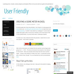
So when I was asked by a colleague if I could create a gauge style graph, with an arrow as an indicator of the result (kind of like a linear speedometer), my exact words were, challenge accepted. To make sure I fully understood what they wanted, I asked them to send me a picture. This is what I received: After further discussions, we realised that she wanted a percentage scale going from 1 – 100%. The blue arrow would move based on the indicator for that month. Step 1: Set up the data In this instance, my colleague had only 1 data point she wanted to display, a YTD indicator. However, to set up the coloured scale behind the indicator arrow, we would need more data to be plotted. For this reason, I set up two more columns: The first will be used to created the coloured scale. Step 2: Create the basic stacked column graph. How to create a Bullet graph using excel charts and within an excel cell. Bullet graphs were invented by Stephen Few to improve upon standard bar charts and gauges.

Instead of just showing the one value, you can compare that value to target values, previous values and objectives. For example: The current value is shown by the black bar in the centre (1100).The range is shown in colour: Very poor = dark grey, Poor = light grey, OK = dark bluePrevious year’s value (comparative value) is shown as the white line (desired outcome should also be above this) You can see how this is more desirable than say just a gauge chart, which doesn’t have any comparison to any other data (for example previous year): There are three main methods for recreating bullet charts (either single or multiple). Use a standard column chart (with additional line chart) Use a bar chart: Create the bullet graph within a cell using a formula There are definite advantages and disadvantages to the three methods, so I’ll go through each.
Use a standard column chart Advantages: Disadvantages: Advantages.
Downloads. Dashboards.