
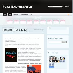
Plakatstil (1905-1930) • Escuela de Diseño en colores mate simples que se originó en Alemania en el siglo XX.• Estilo Reduccionista.• Énfasis en el minimalismo.• Reduce la comunicación a lo esencial.• Un color opaco al fondo, una imagen simplificada y grande y una rotulación sencilla y directa.
En Berlín, el poeta Lucien Bernhard, vio un anuncio para un concurso de carteles que patrocinaban las cerillas Priester. Erdt, Holhwein, Gipkens & co., el Plakatstil en la propaganda gráfica alemana durante la Primera Guerra Mundial. A finales del siglo XIX y durante el primer decenio del XX los nuevos vientos de la ciencia y de la técnica revolucionaron las sociedades europeas.
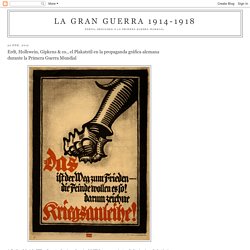
Los avances en medicina, química, electricidad y las comunicaciones permitían pronosticar un progreso imparable para las necesidades de las nuevas sociedades de masas, y vaticinaban un futuro prometedor para la humanidad. Pero la guerra que estalló en 1914 y sus funestos resultados desenmascararon la enorme asincronía entre progreso cientifico-técnico y el desarrollo harmónico de las sociedades humanas, que aún hoy perdura. Los vientos de cambio durante los años de 1900 y 1914 no fueron patrimonio exclusivo de las ciencias y de la técnica. El mundo de las bellas artes, y concretamente el ámbito del diseño gráfico vivieron su puesta de largo. El género no era nuevo, pero no fue hasta inicios del siglo XX cuando se orientó hacia la publicidad comercial alcanzando su plenitud. El título completo del documental era U-Boote heraus! Explorations in Typography / Typeface combinations. Type Connection.
Beautiful web type — the best typefaces from the Google web fonts directory. Lucius Annaeus Seneca60 AD Among the numerous faults of those who pass their lives recklessly and without due reflexion, my good friend Liberalis, I should say that there is hardly any one so hurtful to society as this, that we neither know how to bestow or how to receive a benefit.
It follows from this that benefits are badly invested, and become bad debts: in these cases it is too late to complain of their not being returned, for they were thrown away when we bestowed them. Nor need we wonder that while the greatest vices are common, none is more common than ingratitude: for this I see is brought about by various causes. The first of these is, that we do not choose worthy persons upon whom to bestow our bounty, but although when we are about to lend money we first make a careful enquiry into the means and habits of life of our debtor, and avoid sowing seed in a worn-out or unfruitful soil, yet without any discrimination we scatter our benefits at random rather than bestow them.
The Step-by-Step Guide for Pairing Fonts in UI Design (with examples) If you google for how to pair fonts, you’re going to get a lot of awful results.
A first-page result recommends pairings no experienced designer would touch with a 10-foot pole. Google Fonts hilariously recommends you pair literally everything with Open Sans and Roboto 🙄 In the article, I’m going to cut through the crap and give you a step-by-step plan for creating beautiful, professional-quality font pairings. Here’s the skinny (feel free to skip ahead): Let’s get started. 1. A font pairing that works great on one site may look ridiculous on another. The reason is because different sites and apps have different brands. Simply put, your brand is just a list of adjectives (or short phrases) that describe what you want your users to think of you. Some sites need a brand that’s “clean, simple, and modern”, others want to be “luxurious, modern, and classy”. But whatever your brand is, being able to list specific adjectives and phrases will make the process of choosing fonts easier. 2.
Awesome. The Ultimate Collection of Google Font Pairings (Displayed Beautifully with Classic Art) How this post came to be I have to be honest - I love the concept of Google fonts, but I find the execution to always be somewhat... lacking. I don't know. When compared to classics like Futura, Bodoni, Garamond - even Helvetica - they just fall short, and I rarely, if ever, end up using them.
Can you relate? Again, I love the concept of Google font pairings: the fast download of cool fonts (and even cute fonts) from their high-speed library is great, and has brought far more unique, web friendly fonts and font pairs to the internet than ever before. But because of that feeling of something "lacking" - I've stayed away from Google fonts. A while ago, my partner and co-founder of Reliable, David Tendrich, challenged me to do something about it.
"Make Google fonts work," he said. And so that's how this post was born. I wanted to create the best font pairings Google has to offer that even high-end agency designers would be tempted to use. Combiningtypefaces. Speedball hand-lettering.