
How to design like Leonardo da Vinci. Specialists and Generalists Last month I came across someone who described herself as an 'international expert on email management'.
As well as making me feel a little old — this job title never existed when I was at school — it also got me thinking about the profound specialisms that we work in nowadays. Our job titles and the jobs themselves are getting increasingly siloed. Yet at the same time, I often hear from organisations that seem to want to recruit a designer with the breadth of expertise of a Leonardo da Vinci. They want to recruit a genius designer who can create a user experience vision, carry out effective field visits, create personas the design team will believe in, identify the critical tasks for the system, set usability metrics to drive development, create paper prototypes, design and layout the screens so they are both beautiful and easy to use, and with a final flourish, prove it by running a usability test, analysing the results and wowing people with the data.
Dr. Beautiful UI styling with CSS3 text-shadow, box-shadow, and bord. By Henrik Helmers Introduction Previous articles have covered the basics of CSS3 transitions and 2D transforms and CSS3 borders, backgrounds and box-shadows; refer to those articles if you need to read up on the basics of using these properties.
This article takes things further, showing how to use these properties to create beautiful UI elements without the use of any images, JavaScript or Flash. This last line highlights the real beauty of CSS3 — many of its features are designed to save you time otherwise spent creating and updating graphics in Photoshop. It makes techniques such as drop shadows and animated UI elements accessible to web developers and designers without scripting smarts or mad Photoshop skills.
Contents: Where can they be applied? Support for these CSS3 features was introduced in Opera 10.50, and you’ll also be able to rely on most of them in the latest versions of Firefox, Safari and Chrome. For the Web at large, however, all is not lost. Take 1: Buttons Box 1: Surf’s up. 30 Examples of Excellent Website Navigation.
A website’s navigation allows visitors to get from page to page and discover content.
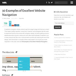
That makes it pretty important, I would say. However, some designers feel the need to experiment and try to be clever with navigation design, but when getting around a website becomes a puzzle, visitors will more often leave frustrated. A website’s nav or menu should look like a nav. It should stand out while still matching the rest of the design, and it should be in a location where users expect it. So to give you some inspiration in this area, here are 30 Examples of Excellent Website Navigation. The Idea Lists Collision Tobias Ahlin Carbonmade dConstruct 2010 Jeroen Homan Brizk Design Dribbble Buffalo TedxToronto David A. Fully Illustrated Live Books Rich Brown I Love Dust Blue Sky Resumes Soh Tanaka Kyle Myer Yaron Schoen Unconventional Guides Christopher Meeks Dan Wiersema Williamson County Casa Marie Catrib’s The Design Cubicle Exclusive Reels AFD Folio Veerle’s Blog Drexler About the Author Related Posts 266 shares Read More.