
Rancho Deluxe OT. Gelato Script. Gelato Script is a smooth-flowing typeface with an air of familiarity.
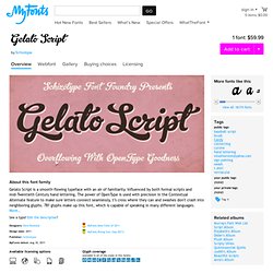
Influenced by both formal scripts and mid-Twentieth Century hand lettering. The power of OpenType is used with precision in the Contextual Alternate feature to make sure letters connect seamlessly, t’s cross where they can and swashes don't crash into neighboring glyphs. 781 glyphs make up this font, which is capable of speaking in many different languages. More… Alternate forms are grouped into stylistic sets to make it easy to change the mood of the text. For example, ss01 makes droopable letters drop below the baseline to break it up a little if required. Engage ss06 for the underline feature. Sets 7 and 8 are for alternate ampersands, and ss09 swaps the script r for a regular shaped r. There are swash capitals available for most uppercase letters, and the OpenType programming makes sure there is room for them under or over the following letters. Gelato Script is a highly usable, powerful typeface. ✐ Practice Foundry—Fabrica. Format: OTF Platform: MAC / PCLicensing Information Your download will begin shortly after new page is loaded, you can then click into our secured Paypal checkout if you want to Pay-What-You-Want or receive the font for free!
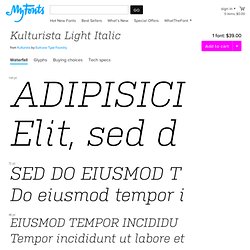
$0 or Pay-What-You-Want! Process. Mark Boulton. Code Pro. Klim / Retail / Karbon Samples. 24 typographies qui passent en téléchargement gratuit ! :) Kulturista Light Italic. From Kulturista by Suitcase Type Foundry 1 font: $39.00 144 pt 72 pt 48 pt.
The Glif. The Glif is a tripod mount and stand for the iPhone 4.
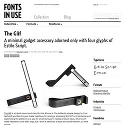
The brilliantly simple design by Tom Gerhardt and Dan Provost made headlines for raising a whopping $137,417 on Kickstarter and legitimizing the platform as a way for small startups to realize product ideas. What won’t make headlines is the Glif’s logo, but I think it deserves at least one small mention, so here we are. Online Font Converter. Téléchargez les typographies du Commodore, de l’Apple, de l’Atari 400, de Acorn BBC Micro, du Sinclair ZX Spectrum, du Commodore 64, de l’Amstrad CPC et MSX… :-)
Extract font from pdf - Online Font Converter. Braten. FontFonter. Type Tips Archive. Try Thousands of Webfonts From FontShop For Free with WebFonter FontShop is constantly at the forefront of font technology, developing innovative tools to facilitate and enhance the work of (web) designers.
Today the world’s leading retailer of digital type and publisher of the largest library of original contemporary typefaces launched its latest project. WebFonter aims to become an indispensable tool for anyone designing for the [...] Read more Using OpenType on the Web With Ampersand less than a week away, it’ll be no time before we begin to see type looking a little better on the web.
Read more Figuring Out Numerals In this first instalment of our examination of numerals we look at the different figure sets available in OpenType fonts. Type Tips—short, quick tips on all things web typography from Harry Roberts of CSS Wizardry. Typographica. Type Reviews, Books, Commentary. Delikat font family.
Kondolar. Rooney font family. Rooney is a serif typeface with a warm and friendly feel.
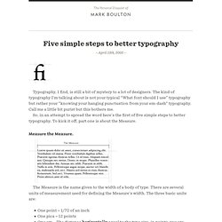
Rounded serifs and terminals create a strong impression in large headlines, while running text becomes soft and sympathetic when set in small sizes. Rooney includes six weights from Light to Black and Italics. More… The idea behind Rooney was to create a rounded typeface without getting a too playful and cheesy look. Rooney is based mainly on old-style serif construction principles, such as the angle of stress, the open letterforms and the medium contrast, which lends the typeface a serious feel. Ellen Lupton: Thinking w/Type. Free Fonts, Buy Fonts, Windows Fonts. The Big Book of Font Combinations. What is this book not?
It is not intended as a showcase of typography. It is a tool. A workbook. A sketchpad. Your favorite layout application document captured 350 times in the process of trying different typefaces on for size. Typetester – Compare fonts for the screen. Free Fonts, Buy Fonts, Windows Fonts. Thinking with Type. A List Apart: Topics: Design: Typography. Rod Graves – Design & Photography. Five simple steps to better typography. – April 13th, 2005 – Typography, I find, is still a bit of mystery to a lot of designers.
The kind of typography I’m talking about is not your typical “What font should I use” typography but rather your “knowing your hanging punctuation from your em-dash” typography. Call me a little bit purist but this bothers me. So, in an attempt to spread the word here’s the first of five simple steps to better typography. To kick it off, part one is about the Measure. Measure the Measure. The Measure is the name given to the width of a body of type. One point = 1/72 of an inchOne pica = 12 pointsOne em = The distance horizontally equal to the type size, in points, you are using.
But, with the advent of DTP packages and the website design the following are also now used: MillimetresPixels. Information Architects. Learn: Anatomy of a Typeface.