
Web Layout Tags Vector Pack. Deal mania on GraphicMania!

Check out our deals section for graphic designers and developers. The newest deal can be seen below! Photoshop Compositing Secrets: Extracting Hair. Home > Articles > Adobe Photoshop > Technique 📄 Contents If you've ever worked on compositing multiple graphical elements into one glorious image, you know how maddening it can be trying to make hair look as natural with a new background as it did in its original location. Matt Kloskowski, author of Photoshop Compositing Secrets, shares some great tricks he uses to get even the wispiest of baby-fine hair to cooperate in Photoshop (no matter how badly it behaves in real life).
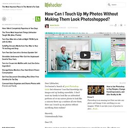
If you want to get into Photoshop compositing, one of the first features you'll have to conquer is selections. If you've ever tried selecting people (especially people with wispy hair) from one background and placing them onto another background, you know that it can be a huge pain in the neck. Refining the Edges Refining the Radius. How Can I Touch Up My Photos Without Making Them Look Photoshopped? Adding the gaussian blur layer is a cool idea.

Do you normally blur the layer only slightly, so that when you erase it over the focal point its a subtle draw of your eye to the focal point? Well it depends on the subject and size of the photo, but yep that's the basic idea. My camera doesn't always do focus very well, so I go and add it as a nice effect afterwards. Also works well for shots where someone managed to get a hand or leg into the background because they thought they could speed past when I took the photo :p Depending on your subject, I think this could make your photo very "Photoshopped.
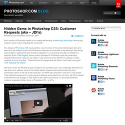
" I think you're objective should be to create what the eye sees as opposed to what the camera captures. Hidden Gems in Photoshop CS5: Customer Requests (aka – JDI’s) Every version of Photoshop needs to turn heads with exciting, breakthrough technology.

Aiming high, however, doesn’t mean forgetting the “small stuff.” The release of Photoshop CS5 incorporated a record number of innovative technologies that came direct from the brilliant minds of the Photoshop engineers and scientists in the Advanced Technology Labs at Adobe. Tackling this type of feature integration is no small feat and often prioritization is required. Bryan O’Neil Hughes, senior product manager for Photoshop, says they particularly targeted features that make you say, “Man, if only someone took a little time to change X, things would be so much smoother.”
They’re the kind of changes that are listed in John Nack’s blog post “CS4: Sweating the Details.” With this in mind, the Photoshop team decided to try something new. The Photoshop team always takes customer feedback into account when approaching each new product cycle. Here’s Just a Few of the JDI Timesavers: Editorial illustration. L.Bardsley Digital photo manipulation in Photoshop cs3.
DESIGN A EMPORTER. _lv0n23ETjc1qbj1sio1_500.jpg (494×700) Daily Desired: Typography Makes These Playing Cards Beautiful. Photoshop tutorial on dispersion effect.
HDR Panorama Planet. How to Use Photoshop to Pop Pimples, Change Facial Expressions, and Alter Reality As We Know It. How to Create Your Own Planets Using Your Panoramas. Scene opens to solar winds gently blowing intergalactic tumbleweeds past the open porch door.

An eerie quiet blankets the solar system. We don’t know about you, but ever since those astronomers kicked Pluto out of the party, we’ve been feeling mighty lonely over here on planet Earth. But wait! We’ve just the solution: Our pal Dirk wrote up a tutorial that shows you how to turn any panorama or landscape photograph into a full-fledged planet! Best of all, once you’ve selected an image to work with, the process takes only 5 minutes. There are special moments in the life of any photographer that suddenly change his view of his hobby (or profession).
Getting my first analog SLR (Nikon N2000/F301 in 1988)Getting my first digital camera (Kodak DC120 in 1997)Discovering a software that could stitch together photos into a seamless panorama (MGI PhotoVista 2.0 in 2002)Discovering the rather simple instructions to create my own planet. Doodles of Anj. Fuck Yeah Resources. Browsing deviantART. Old School Type – Line Gradients. One of our readers suggested we write a tutorial explaining how to do this cool text effect. On the Dragonforce logo above, the basis of my typography was sketched on paper first and then vectored in Illustrator using the Pen Tool. The process for creating the base logo is not included in this tutorial. Instead, we are going to take the base logo and add that cool “line gradient” effect that you see inside the actual letters. This gives the text an old-school or vintage feel to it. This look is prevalent in wood engraving and sign lettering. Here are some more examples: So in order to get this effect, we will need both Adobe Illustrator CS2 or higher and Adobe Photoshop.
You can see the kind of effect we are going to create. Creating a Light Leak Effect in Adobe Photoshop CS.