

Deconstruction. Deconstruction (French: déconstruction) is a form of philosophical and literary analysis derived principally from Jacques Derrida's 1967 work Of Grammatology.[1] In the 1980s it designated more loosely a range of theoretical enterprises in diverse areas of the humanities and social sciences, including—in addition to philosophy and literature—law,[2][3][4] anthropology,[5] historiography,[6] linguistics,[7] sociolinguistics,[8] psychoanalysis, political theory, feminism, and gay and lesbian studies.
Deconstruction still has a major influence in the academe of Continental Europe and South America where Continental philosophy is predominant, particularly in debates around ontology, epistemology, ethics, aesthetics, hermeneutics, and the philosophy of language. It also influenced architecture (in the form of deconstructivism), music,[9] art,[10] and art criticism.[11] Etymology[edit] On deconstruction[edit] Derrida's approach to literary criticism[edit] Basic philosophical concerns[edit] Postmodernism. Wayfinding and Social Platforms. Download this gallery (ZIP, null KB) Download full size (74 KB) “The heart of civilization throbs wherever people come together to work, play, shop, study, perform, worship, or just interact.
Crowded into bustling spaces, they share the richness and diversity of human experience as well as its challenges. In these spaces people may “find their way” in the existential sense, but they also become overwhelmed or disoriented if they physically lose their way. Wayfinding design provides guidance and the means to help people feel at ease in their surroundings Throughout history, people natural gravitate to city centers and the public places where all the action is. Download full size (215 KB) Question: How far can letterforms be taken forward or stripped back before they no longer are considered letters? The Digital Past: When Typefaces Were Experimental. Voice asked me to do a post-digital exploration of type to see if a new “experimental” stage was in the wings.
Typo-L : The Crystal Goblet. The Crystal Goblet, or Printing Should Be Invisible by Beatrice Warde (1900 -- 1969)
The optimism of modernity : what. Reduce to the max by Max Bruinsma. Reduce to the max.
Is not available. Social Media Newsfeed: Facebook Ads | Twitter Passwords Tim Sohn Facebook redesigns right-side ads to make them similar to News Feed ads.

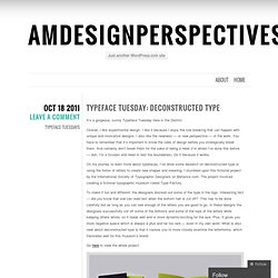
Twitter says users’ passwords were safe from attack. These stories, and more, in today’s Morning Social Media Newsfeed. Read more Social Media Newsfeed: Twitter Rolling Out Redesign | FarmVille Users Down Tim Sohn on April 9, 2014 8:00 AM. Speak Up Archive: Deconstructive Typography <em>Captches</em> up. Typeface Tuesday: Deconstructed type « amdesignperspectives. It’s a gorgeous, sunny Typeface Tuesday here in the District.
Deconstructive Typography on Typography Served. Johnston (typeface) Johnston printing blocks Johnston (or Johnston Sans) is a humanist sans-serif typeface designed by and named after Edward Johnston.
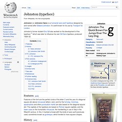
It is well known for its use by Transport for London. Johnston's former student Eric Gill also worked on the development of the typeface,[1] which was later to influence his own Gill Sans typeface, produced 1928–32. The font family was originally called Underground. It became known as Johnston's Railway Type, and later simply Johnston. A Typeface for the Underground. On Monday the 2nd January 1979, Eiichi Kono walked into the offices of Banks and Miles, one of London’s most renowned graphic design agencies.
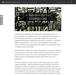
It was his first day at the firm as a typographer, and he was very excited. Admittedly Eiichi didn’t actually know what he’d be working on – they’d been slightly vague about that – but he was excited nonetheless. This would represent his first major typographical job, and that was something he’d been working towards for some time. Eiichi had been working in the optical printing industry in his native Japan for some years when, in the mid-seventies, he had experienced what he would later describe as a “mid-career crisis.”
The History of Visual Communication - The Computer. Postmodernity Postmodernity is a term used to describe the social and cultural implications of postmodernism.
The term is used by philosophers, social scientists, art critics and social critics to refer to aspects of contemporary art, culture, economics and social conditions that are the result of the unique features of late 20th century and early 21st century life. Deconstructive Typography on Typography Served. Transformed Dyslexic Typography - The Dyslexie Font Makes Learning and Living Easier for Many. The amazing Dyslexie font has the ability to make learning and living easier for thousands of people.
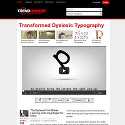
Dyslexie was designed for people who suffer from Dyslexia; Dyslexia makes it very difficult to read as letters are flipped and duplicated. Students and adults are faced with the challenge of reading letters that seem as if they are from another language. The Dyslexie font aims to change this, as each letter has been designed specially for dyslexics. Stefan sagmeister. Minimalist Typographic Subway Maps - Fadeout Design Creates Pared Down Public Transit Art. Weave Type on the Behance Network. I HATE 2D POSTERS on the Behance Network. Deconstruct on the Behance Network. Nuzzles™ - Wooden Typographic Puzzles on the Behance Network.