
RD: Week-Two Optional Assignment. Product Support. Learning to Wireframe: 10 Best Practices. At the wireframing phase of the design process, our ideas are young and unpolished.
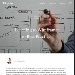
Wireframes, whether created on scraps of paper, a whiteboard, or in a software program, serve to establish relationships between elements in a project such as: navigation, imagery, and calls to action. But if we think of wireframing as a tool, it’s ultimate purpose is to create an ideal space for collaborative conversations about design solutions, while supporting iterations and driving rapid ideation. So how do you know if your wireframes are effectively driving the design conversation? The best way to tell if wireframes are hitting the mark is to take a step back and ask this question: When I share my wireframes, are the conversations about the execution OR about the experience I’m creating? If your creative brainstorms and discussions are getting stuck on “how your wireframes look”, you may be missing the mark.
Your wireframes are executed poorly. 10 Best Practices to Free Your Wireframes 1. 2. 3. 4. Wireframe Showcase. 50 Examples of Responsive Web Design (plus 1) Nowadays, it's not only important to develop your clients' websites to look good on all browsers, and on PC and MAC, it's also a must that websites are viewable on tablets and mobile devices.
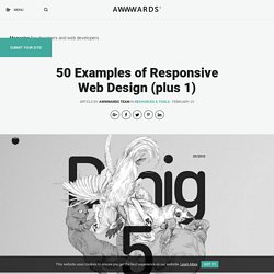
A lot of people opt for making one version of their site for desktop and another for mobile. Others choose Responsive Design, a mix of fluid grids and layouts, flexible images and an intelligent use of CSS media queries. There are quite a few sites dedicated to lending a hand with responsive grids, Gridpak, CSSGrid, Skeleton and SimpleGrid, just to name a few.
Here are 50 (plus 1) examples of responsive websites. Go to website. PXtoEM.com: PX to EM conversion made simple.
Am I Responsive? How it works Add your URL to the input field Click GO (reloads the preview) or press Enter (reloads the page) Admire your good work If you're interested there's now a post on the process of building Am I Responsive Features I'm always trying to improve the tool so please tweet me your feedback on bugs and suggestions.
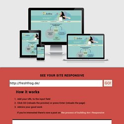
About Am I Responsive A time saving exercise by @justinavery for RWD Weekly Newsletter I take a lot of screen shots of the various device breakpoints for responsive design and it takes a while to prepare them. This is not a tool for testing, it is really important that you do that on real devices. Viewports Desktop 1600x992px scaled down to scale(0.3181) Laptop 1280x802px scaled down to scale(0.277) Tablet 768x1024px scaled down to scale(0.219) Mobile 320x480px scaled down to scale(0.219) A note on the viewports The viewports I have chosen are based on the devices that were a part of the responsive PSD layout I previously bought, and yes they are all Apple.
Updates. Media Queries. Responsive Design - Week Four - a Collection by Colleen van Lent on CodePen. Responsive Design - Week Three - a Collection by Colleen van Lent on CodePen. Responsive Design - Week Two - a Collection by Colleen van Lent on CodePen. Responsive Design - Week One - a Collection by Colleen van Lent on CodePen.