Afficher les articles en colonne avec WordPress. Traditionnellement la liste des articles d’un blog sont affichés les uns à la suite des autres, de haut en bas (comme sur ce blog).

Pour diverses raisons (design, optimisation de l’espace, utilisation spécifique de WordPress etc…) on pourrait souhaiter les afficher en colonne. Voici une méthode simple pour y arriver. Voici ce que l’on veut obtenir : afficher sur la page d’accueil la liste des articles (ou les extraits) dans 2 colonnes, avec les plus récents en haut. Pour y parvenir nous utiliserons l’opérateur modulo de PHP et de la fonction rewind_posts() de WordPress. Le problème On pourrait tout simplement utiliser la propriété float de CSS pour arriver à nos fins et ça fonctionnerai parfaitement dans le cas de figure où tous les blocs contenant les articles ont la même hauteur (comme dans l’image précédente).
Mais il est très probable que ça ne soit pas le cas : la hauteur de chaque bloc va varier en fonction de son contenu (l’extrait ou l’article). La solution Le template WordPress.
Base. The Foundation All modules in Pure build on top of Normalize.css.
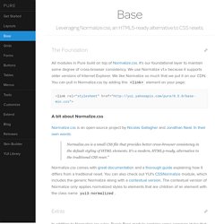
It's our foundational layer to maintain some degree of cross-browser consistency. We use Normalize v1.x because it supports older versions of Internet Explorer. We like Normalize so much that we put it on our CDN. You can pull in Normalize.css by adding this <link> element on your page: A bit about Normalize.css Normalize.css is an open-source project by Nicolas Gallagher and Jonathan Neal. Normalize.css is a small CSS file that provides better cross-browser consistency in the default styling of HTML elements. Normalize.css comes with great documentation and a thorough guide explaining how it differs from a traditional reset. Extras In addition to Normalize.css rules, Pure's Base module contains some common styles that are used by most websites. Hiding Elements Add the hidden attribute to an HTML element to hide it from the screen via display: none ! Responsive Images.
Responsive Retina-Friendly Menu. Ultimate CSS Gradient Generator - ColorZilla.com. Easy CSS3 Checkboxes and Radio Buttons. Ever wondered how to style checkboxes and radio buttons, but without JavaScript? Thanks to CSS3 you can! Step 1: Understanding the Process Recommended Reading: The 30 CSS Selectors you Must Memorize For those of you that feel confident in your CSS abilities already and just want a nudge in the right direction, here is the most important line of CSS in the entire tutorial: Now, for those of you who feel you may need more direction, fear not,read onward! Alright, so back on topic now. Step 2: Setting up our HTML Now, we start off by creating our HTML and CSS files (or however you prefer handling your styles) and get to work. For the purpose of getting you on your way, I will only demonstrate this technique on a checkbox, but the process for radio buttons is identical, and is included in the source.
Okay, let's actually begin then, shall we? I also will add a <span> inside of the label, which is more personal preference than anything else, but all will become clear in step 3. Our sprite sheet.
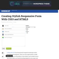
Morphing Devices. The last two devices may be rotated by hovering and clicking the rotate button. A slideshow concept where different screenshots are shown on morphing devices. One main element and two additional division are used for the parts of the devices, along with some pseudo-elements and the image anchor. Graphic design . Illustration . Photography. Creating Stylish Responsive Form With CSS3 and HTML5. #buttons #submitbtn { display: block; float: left; height: 3em; padding: 0 1em; border: 1px solid; outline: 0; font-weight: bold; font-size: 1.3em; color: #fff; text-shadow: 0px 1px 0px #222; white-space: nowrap; word-wrap: normal; vertical-align: middle; cursor: pointer; -moz-border-radius: 2px;