
What is Web Designing. The Internet has redefined the borders of our modern world.
Big or small companies now have customers all across the globe. Small or Big businesses houses, groups and non-profit organizations are providing an infinite array of information to a widespread audience. The possibilities are endless through effective and efficient Web Design. Web Design is an art of content presentation to an end user through World Wide Web. The efficient web design helps your company in bringing enquiries that generate sales and add asset to business.
In the digital world websites emerge as a significant tool that not only help the companies to find their target audience but also help in tapping desired customers while seating remotely. This information technology based communication design helps you to place your products to global customer with details of the placed products relatively at low cost.
Each of the websites planned in a precise manner to cater specific need. CSS Introduction. Introduction to HTML. Linguagens de programação. O que são e para que servem? O que é uma linguagem de programação?
Uma linguagem de programação é um método padronizado para expressar instruções para um computador, ou seja, é um conjunto de regras sintáticas e semânticas usadas para definir um programa de computador. Uma linguagem permite que um programador especifique precisamente sobre quais dados um computador vai atuar, como estes dados serão armazenados ou transmitidos e quais ações devem ser tomadas sob várias circunstâncias. Para que servem as linguagens de programação? Designing Culture. Want to hear a really pretentious definition of design?
Probably not, but I have to listen to this stuff almost constantly and misery loves company, so here it is: “Giving form to culture.” I hear people actually say those words from time to time, and it never puts me in a particularly good mood. My main beef with that definition is that after a year in a postgraduate design program and too many hours spent between stacks of anthropology textbooks, I still can’t figure out what “form” and “culture” even mean. My other beef is that the above definition is delusional. It seems to be gesturing toward the all-too-common notion that designers have some kind of sociocultural superpower: by shaping the physical objects that mediate and regulate people’s behaviors and interactions, they are shaping society itself!
But despite the limited influence that designers themselves are able to exert over culture at large, design as a practice plays a central role in cultural reproduction. Principais passos para o planejamento de um site. Um desafio para quem faz a gestão de projetos de web é visualizar desde o início o que a demanda representa em sua totalidade.
Digital Photography 101: The basics of color theory. Can you imagine a world without color?
It's such an intrinsic part of our lives that sometimes we don't even notice it. We only stop to think about color when we encounter a particularly jarring or particularly pleasing combination. But for a good photographer, color is a integral part of the constant image processing we do in our heads. We don't just see a composition in terms of lines and shapes; we see the colors in it and the way they work in harmony or opposition. Início do site. 10 Top Photography Composition Rules.
There are no fixed rules in photography, but there are guidelines which can often help you to enhance the impact of your photos.
It may sound clichéd, but the only rule in photography is that there are no rules. However, there are are number of established composition guidelines which can be applied in almost any situation, to enhance the impact of a scene. These guidelines will help you take more compelling photographs, lending them a natural balance, drawing attention to the important parts of the scene, or leading the viewer's eye through the image. Once you are familiar with these composition tips, you'll be surprised at just how universal most of them are. You'll spot them everywhere, and you'll find it easy to see why some photos "work" while others feel like simple snapshots. Rule of Thirds Imagine that your image is divided into 9 equal segments by 2 vertical and 2 horizontal lines.
Doing so will add balance and interest to your photo. Balancing Elements Leading Lines. Brightness, Contrast, Saturation, and Sharpness. Background At first glance, it might seem that doing an article on the four most common image controls would be a waste of time.
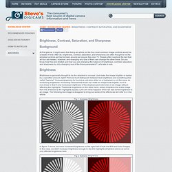
After all, brightness, contrast, saturation, and sharpness are often thought to be the simplest controls as they've been around as long as the color TV. People often overlook the fact that all four are related, however, and changing any one of them can change the other three. Do you know how they are related and how you are changing the balance of brightness, contrast, saturation, and sharpness by only changing one of the three parameters? Let's take a look. Brightness. Teach Yourself Graphic Design: A Self-Study Course Outline. Fortunately, it isn’t required to go to design school in order to be a graphic designer.
A good foundation in graphic design history, theory, and practical application will help you hit the ground running. There are plenty of resources available in which you can learn graphic design on your own. Don’t set your expectations to high at first, as it will take enthusiastic study for years to become great. You can do it though! If you would like to learn graphic design from the ground up, through self directed study, then this article lists some great resources that will get you started with your design education. 1.
There are a few graphic design principles that effect every project you’ll create. Principles of Design with Examples and Tutorials. Principles of Design: Color. Over the past five weeks I’ve written about simple principles you can employ to improve your designs, namely Contrast, Proximity, Balance and Value.

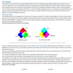
In this final part of the series we’re looking at color. Color in design is a huge topic in itself, and I will undoubtedly return to it in future blog posts, but for today let’s take a look at how you can use color schemes when creating a mood for your design. Color is an integral part of our lives. Nature uses color to warn off potential predators, to attract pollinators, to attract mates and to show fruit is ready for eating. Anyone who drives a car in a city follows traffic rules defined by red, green and amber, no text necessary. Something’s not quite right here. So how do you go about choosing the right colors for your design? Warm and Cool The three traditional primary colors are red, blue and yellow. Color Models. The purpose of a color model is to facilitate the specification of colors in some standard generally accepted way.
Plus Series - PMS Color Formula Guides, Color Bridge, Metallics and PANTONE Color Guides. What is the Pantone color system? How Pantone Works. What is Pantone and How Does it Work? What is Pantone? Pantone is a standardized color matching system, utilizing the Pantone numbering system for identifying colors. By standardizing the colors, different manufacturers in different locations can all reference a Pantone numbered color, making sure colors match without direct contact with one another. The most commonly referenced colors are in the Pantone solids palette.
What are primary colors? Cores Análogas - modaclara. Um pouco sobre cor. CMYK color model. Color printing typically uses ink of four colors: cyan, magenta, yellow, and key (black). When CMY “primaries” are combined at full strength, the resulting “secondary” mixtures are red, green, and blue. Mixing all three gives black. Color Models. RGB Color Codes Chart. RGB color picker | RGB color codes chart | RGB color space | RGB color format and calculation | RGB color table RGB color picker RGB color codes chart Hover with cursor on color to get the hex and decimal color codes below: RGB color space RGB color space or RGB color system, constructs all the colors from the combination of the Red, Green and Blue colors.
The red, green and blue use 8 bits each, which have integer values from 0 to 255. As cores no design gráfico. Dentre os meios de comunicação humana, o visual é o único que não possui um conjunto de critérios definidos. Diante do desafio do alfabetismo visual vem sendo mantida uma postura de ignorância do assunto. Color Scheme Designer 3. Color Theory for Designer, Part 3: Creating Your Own Color Palettes. Advertisement In the previous two parts of this series on color theory, we talked mostly about the meanings behind colors1 and color terminology2.
While this information is important, I’m sure a lot of people were wondering when we were going to get into the nitty-gritty of actually creating some color schemes. Well, that’s where Part 3 comes in. Color Theory For Designers, Part 2: Understanding Concepts And Terminology. Advertisement If you’re going to use color effectively in your designs, you’ll need to know some color concepts and color theory terminology. A thorough working knowledge of concepts like chroma, value and saturation is key to creating your own awesome color schemes. In Part 1: The Meaning of Color1 of our color theory series, we covered the meanings of different colors. Color Theory for Designers, Part 1: The Meaning of Color.
Color in design is very subjective. What evokes one reaction in one person may evoke a very different reaction in somone else. Sometimes this is due to personal preference, and other times due to cultural background. Color theory is a science in itself. Studying how colors affect different people, either individually or as a group, is something some people build their careers on. And there’s a lot to it. Color Theory 101. O que é Design Gráfico? O que um Designer Gráfico faz? Modena Design, Blumenau.
"Design Gráfico não é só um belo desenho. Design Gráfico é um belo desenho, com um sentido e uma tarefa a cumprir. " Chico Homem de Melo. The Principles of Graphic Design. The principles of design suggest how a designer can best arrange the various elements of a page layout in connection to the overall design and to each other. Generally, all the principles of design apply to any piece you may create. How you apply those principles determines how effective your design is in conveying the desired message and how attractive it appears. There is seldom only one correct way to apply each principle but check your documents to see how well you have applied each of these six principles of design. Balance Visual balance comes from arranging elements on the page so that no one section is heavier than the other. Gestalt – Grouping – Proximity, Similarity, and Closure « Lens, Light & Composition. Gestalt Principles: Similarity. Gestalt Principle: Similarity [1] The principle of similarity states that things which share visual characteristics such as shape, size, color, texture, value or orientation will be seen as belonging together.
In the example to the right, the two filled lines gives our eyes the impression of two horizontal lines, even though all the circles are equidistant from each other. About.com: Principles of Design: Proximity. Proximity in design simply means that objects near each other are seen as a unit. It really is that simple and it’s something you see every day. On your web page or your business card, related information is placed closely together and it forms a visual unit. Often when people are getting started with design, there is a temptation to throw everything on the page and fill up every square centimeter of space with type and images. However, it makes information difficult to digest and really doesn’t look good.
Using the principle of proximity, you’ll find as you group those items that have something in common, and separate those items that don’t, a clear visual hierarchy stands out on the page. White Space as Used in Page Layout. Lessons From Swiss Style Graphic Design. 9 Inspiring Graphic Designers and their Distinct Design Styles. Comparison Review: Graphic Design Theory. Graphic Design Theory: 50 Resources and Articles.