
Curated Personal Profile Pages. Tell It, Don't Sell It: Startup Storytelling. Bitstrips : l'application qui scénarise ta vie en BD. Donnez vie aux bonnes idées. Bruno TISON on Listorious. Blogs. This is the next blog in the continuing series of interviews with top-echelon and renowned professionals.
In this blog, I interview Sir John Daniel, President and CEO, Commonwealth of Learning, Globally Recognized Leader and Scholar in Education. Enjoy! Stephen Ibaraki Sir John joined the Commonwealth of Learning in 2004 after serving for three years as Assistant Director-General for Education at UNESCO. He began his career with an undergraduate degree from Oxford (First Class Honours) and a Doctorate in Science from the University of Paris, both in metallurgy. Brain & Behavior.
Neurophilosophy. Scientific Learning. The iPad® and Student Engagement: Is There a Connection?

April 1, 2014 by Carrie Gajowski When students at ACS Cobham International School (UK) got iPads, Richard Harrold saw an opportunity. Co-Nectar. Dipity - Find, Create, and Embed Interactive Timelines. MyCurator WordPress content curation Plugin. Beautiful web-based timeline software. 10 Astounding Infographics Comparing Money Matters Around the World. 47 Flares Google+ 2 Twitter 31 Facebook 4 Reddit 1 StumbleUpon 1 Pin It Share 0 LinkedIn 8 inShare8 47 Flares ×
20 Examples Of Infographs That You Don’t See Every Day. I think we all know what an infograph is, and nowadays they are increasingly popular.
The bad thing is that almost all of them are becoming boring and very similar. In this article I have collected 20 infographs that are very unique design and also interesting subjects. Twitter Dots: Mapping all Tweets for a specific Keyword Twitter Dots translates individual tweets as simple dots on a geographical world map. Infographic Tweets. The American identity according to social media #infographic. 10 Awesome Tools To Make Infographics. Advertisement Who can resist a colourful, thoughtful venn diagram anyway?

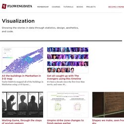
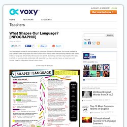
In terms of blogging success, infographics are far more likely to be shared than your average blog post. What Are The Hardest Languages To Learn? [INFOGRAPHIC] Learning a new language can be difficult, but some languages can be trickier than others.
![What Are The Hardest Languages To Learn? [INFOGRAPHIC]](http://cdn.pearltrees.com/s/pic/th/hardest-languages-infographic-18047888)
For native English speakers, the difficulty level of a new language depends on a variety of factors. So which are the most difficult to learn? And which languages would you be able to master in under a year? View the infographic below to learn more. (Click Image To Enlarge) How To Train Yourself to Speed Read. Infographic. Visualization. All the buildings in Manhattan in 3-D map Taylor Baldwin mapped all of the buildings in Manhattan using a 3-D layout.
. … Why America's Healthcare Sucks. You know it is true.

According to the CDC, over 40 million Americans did not have health insurance during 2009. Social Media Graphics. What Shapes Our Language? Our language is constantly being shaped by a number of different influences, from social media and pop culture to other languages and even human error.
Thanks to the ever-evolving Internet, new words enter our language almost daily. But beyond new words, technology has had a big impact on the ways in which we communicate, particularly with respect to how many words it takes us to get our point across. View the infographic below to learn more. 20 Examples Of Infographs That You Don’t See Every Day. 10 Astounding Infographics Comparing Money Matters Around the World. The Anatomy Of An Infographic. Women in Business. I’m sure you’ve been filling out a RFP, or some mundane company information form, when you see the section that asks if your company is a Women-Owned Business.
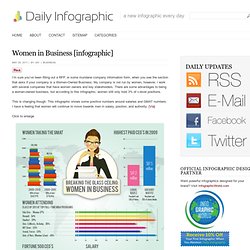
My company is not run by women, however, I work with several companies that have women owners and key stakeholders. There are some advantages to being a women-owned business, but according to this infographic, women still only hold 3% of c-level positions. This is changing though. This infographic shows some positive numbers around salaries and GMAT numbers. I have a feeling that women will continue to move towards men in salary, position, and authority. Click to enlarge. How To Create Outstanding Infographics. In this tutorial you will learn that data doesn't have to be boring, it can be beautiful!
Learn how to use various graph tools, illustration techniques and typography to make an accurate and inspiring infographic in Adobe Illustrator. Women in Business. InfoGraphic Designs: Overview, Examples and Best Practices. Information graphics or infographics are visual representations of information, data or knowledge. These graphics are used where complex information needs to be explained quickly and clearly, such as in signs, maps, journalism, technical writing, and education. They are also used extensively as tools by computer scientists, mathematicians, and statisticians to ease the process of developing and communicating conceptual information. They can present a rich amount of information without intimidating you.
Or sometimes they intimidate you, but make the digesting of the information much more bearable. Here in this article below, we are going to discuss best practices for designing infographics followed by some examples which might help you learn a thing or two. You may be interested in the following related articles as well. Cool Infographics - Blog. Are We Wired For Mobile Learning? Because of the proliferation of new technologies, the younger generation today is outgrowing traditional forms of education – remember pencils, chalkboards, textbooks and graphing calculators? Whether we are in the car, on the train, at work, or in a classroom, mobile technology in particular is giving us the ability to learn on-the-go. See the infographic below to learn why we are wired for mobile learning, and how we can use mobile technologies to educate ourselves. Note to teachers, bloggers and all those interested: Want to use this infographic in your class or share it on your blog?
No problem! Do You Know The Real Cost Of Social Media? Dipity Interactive Timeline App. Home. A free app that helps you remember. Springnote - your online notebook based on wiki. Remember everything with Evernote, Skitch and our other great apps. A free app that helps you remember. The Collaborative Online Notebook. WebList - The place to find the best web lists on the web. Personalise homepage. Ingredients for effective teaching. The 100 Best Web 2.0 Classroom Tools Chosen By You. EdShelf 2.0 Tools. Discover over 70,000+ databases and specially search engines. (Mapul) AOL Lifestream. Dashter. Memolane. Storybird. Co-ment. Digress.it. A.nnotate. NoodleTools. Commentpress. ¶ 1 CommentPress is an open source theme and plugin for the WordPress blogging engine that allows readers to comment paragraph-by-paragraph, line-by-line or block-by-block in the margins of a text.
Jarnal. List.it. Netvibes. Curation Tools. Dlvr.it : feed your blog to twitter and facebook.