
Reinterpreting Disney Princess Costumes Through a Historical Lens. If you grew up watching Disney movies, then you can probably picture the evening gown that Cinderella wore to Prince Charming’s ball or what Jasmine was wearing when she took that magic carpet ride with Aladdin.
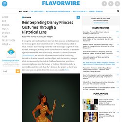
What you probably never considered was whether or not these signature ensembles were historically accurate. LA-based illustrator Claire Hummel, an artist for Microsoft Game Studios Publishing, decided to do some research on the subject, and the resulting images, while not necessarily the stuff of childhood memories, provide an interesting glimpse into the history of fashion. Click through for a narrated look at the work that she’s done on the project so far; if you like what you see, prints from the series are available here.
Claire Hummel, Pocahontas. All images via My Modern Met. “Oh, Pocahontas. Claire Hummel, Cinderella “I went with the mid-1860s for Cinderella’s dress, the transitory period where the cage crinoline takes on a more elliptical shape and moves towards the back. 24 Clever and Unique Logo Designs - Web Design Blog – DesignM.ag. 30 Simple But Clever Logo Designs. It takes a lot of work to make a logo, but when it should be as minimal as possible, the designer’s creativity is put to the test.
Below you can see 30 examples of simple but clever logo designs. Designed by: Wladimir Yeberza Designed by: Mihai Ragea Designed by: Dima Jelnov Designed by: Daniel Evans. 25 logos with hidden messages – Amazing Graphic Designing tricks. Clever Examples of Negative Space in Logo Design. We talk about negative space quite a bit here on WDL.

It can be a very important element in a design, especially in logos. Clever designers can create shapes around and inside the main elements to help reinforce the meaning or message of the logo. When done well, it’s a thing of beauty. I can’t get enough of logos like these. When I come across good ones, I have to share them. About the Author Henry Jones is a web developer, designer, and entrepreneur with over 14 years of experience. Related Posts 407 shares. 20 Very Clever Logo Designs. Clever Logo Designs That Speak For Themselves. Feb 21 2011 A creative logo design plays a vital role in portraying the brand identity of any company.
It is not only the name of the company, but also the brand’s message that communicates with the customers. Therefore, you should keep in mind that it is also the logo design that makes your business memorable and distinguishes it from the rest! It is for that reason that designers put a large amount of effort and time in designing creative and unique logo designs for their clients. In this post, we present to you some very cleverly designed logos that we hope will inspire you to try out something different! Collection of Fresh and Highly Clever Logo Designs. It is time for another logo design inspiration post.This time,all the logos are chosen from logopond and most of them are created in the last few months.There are very well-thought and clever logo designs in the collection.Hope you like them.
AskFox Logo Source Photo Carrier. 50 Fantastically Clever Logos. I know everybody and their brother does logo roundups so you’re probably sick of them, but I don’t believe I’ve ever done one and there is a particularly impressive brand of logo design that I wanted to point out.
Today we’ll look at 50 logos that are the result of going beyond the typical thought process and injecting a little wit and hidden symbolism into the design process. What Makes a Logo Clever? To explain what I mean by “clever” logo design, let’s take a look at a typical logo, (i.e. one that isn’t clever). The logo above is a nice piece of work. The colors are perfect, the lettering is masculine, the overall feel is athletic and the glossy effect works well. However, my favorite type of logo design is that which takes the assignment one step further. These types of logos make you smile at the brilliance of both the idea and the execution and have several layers of meaning that can hit you in waves. Visual Double Entendres Lion Bird Chad 2010 I love this one. Spartan DesignTent Ecotaste.
Caren Alpert Fine Art.
Bomboland. Crazy Illustrations By Chow Hon Lam. Chow Hon Lam is a t-shirt designer and a humorous illustrator from Malaysia.
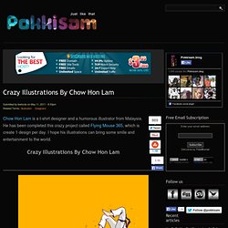
He has been completed this crazy project called Flying Mouse 365, which is create 1 design per day. I hope his illustrations can bring some smile and entertainment to the world. About the author. Clever Negative Space Illusions. Beware of Those Hands One of the toughest decisions one can make in their lives is to leave their steady job and follow their dreams.
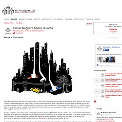
For Kuala Lumpur, Malaysia-based Yau Hoong Tang that hard decision came after a wonderful surprise. After graduating with an engineering degree, Tang could have easily pursued a more stable path. Design was just a hobby to him until, one day, he won an online t-shirt contest which gave him the confidence and courage to make a living at illustrating. He calls it "the biggest gamble" of his life so far. For the past four years, he's been creating illustrations that are filled with illusions, that have a surreal element to them and that often deal with negative space.
"I enjoy making illusion art because it has the ability to mislead us," Tang tells us.