
What a Hundred Million Calls to 311 Reveal About New York. New Yorkers are accustomed to strong odors, but several years ago a new aroma began wafting through the city’s streets, a smell that was more unnerving than the usual offenders (trash, sweat, urine) precisely because it was so delightful: the sweet, unmistakable scent of maple syrup.
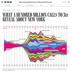
It was a fickle miasma, though, draping itself over Morningside Heights one afternoon, disappearing for weeks, reemerging in Chelsea for a few passing hours before vanishing again. Fearing a chemical warfare attack, perhaps from the Aunt Jemima wing of al Qaeda, hundreds of New Yorkers reported the smell to authorities. The New York Times first wrote about it in October 2005; local blogs covered each outbreak, augmented by firsthand reports in their comment threads. The city quickly determined that the odor was harmless, but the mystery of its origin persisted for four years. But then city officials had an idea. On January 29, 2009, another maple syrup event commenced in northern Manhattan. Ple.
Viz Exemplar. Viz IOns. Data visualization chart. 15 Stunning Examples of Data Visualization. Data Visualization is a method of presenting information in a graphical form.

Good data visualization should appear as if it is a work of art. This intrigues the viewer and draws them in so that they can further investigate the data and info that the graphic represents. In this post there are 15 stunning examples of Data Visualization that are true works of art. Click on the title or image for a larger view of each visualization. The top 20 data visualisation tools. Periodic Table of Visualization Methods. The Theory Underlying Concept Maps and How to Construct and Use Them. Mind Maps. Interactive Infographic - 13 Reasons Why Your Brain Craves Infographics. Infographic of the Day. How to create great infographics.
20+ Tools to Create Your Own Infographics. A picture is worth a thousand words – based on this, infographics would carry hundreds of thousands of words, yet if you let a reader choose between a full-length 1000-word article and an infographic that needs a few scroll-downs, they’d probably prefer absorbing information straight from the infographic. What’s not to like? Colored charts and illustrations deliver connections better than tables and figures and as users spend time looking back and forth the full infographic, they stay on the site longer. Exploratory Infographic Charts - This Infographic Explores Various Kinds of Info Charts. About Malofiej – Malofiej 21 · Infographic World Summit · Infographic awards.
Data Pointed. FlowingData. Profession d'origine des députés en Europe. L’histoire de la démocratie repose-t-elle sur la séparation progressive du pouvoir politique et du pouvoir économique ?
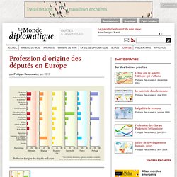
Longtemps, seuls les plus riches ont pu voter et être élus. Les luttes pour l’instauration du suffrage universel, puis d’une indemnité parlementaire (« Le salaire de la politique ») démontrent qu’il fallut des décennies pour (...) L’insolence des spéculateurs suscite une vive opposition populaire et contraint les gouvernements à prendre quelques distances avec la finance. Ceux qui signent les chèques vont-ils continuer à écrire les lois (...) Sur la liste des relations inavouables entretenues par l’argent et la politique, le clientélisme talonne la corruption.
Gapminder: Unveiling the beauty of statistics for a fact based world view. Junk Charts. Visualizing.org. Information visualization. Information mapping. Information Mapping is a technique that divides and labels information to facilitate comprehension, use, and recall.
It was originally developed by Robert E. Horn.[1] Overview[edit] Linked Data Linked Data - Connect Distributed Data across the Web. Graphic Organizers: Scientifically Based Research July 2003. Impure Blog. DATA. Data Sorta. Mike Kruzeniski – How Print Design is the Future of Interaction. This post describes “How Print Design is the Future of Interaction,” a talk I gave at SXSW Interactive on March 12, 2011.
The slides from the talk are available to view on Slideshare, and you can see some of the discussion that followed on Twitter here. Introduction. The Rise of Interactive Data Visualization. The visualization below highlights something only recently possible on the web: a dynamic, interactive canvas.

Titled “Disaster Strikes: A World In Sight”, it visualizes a century of floods, fires, droughts, and earthquakes around the globe. The Visual News. Visual News - The Cure For Eyeball Boredom. Four Easy Visualization Mistakes to Avoid. Mathematics as an artisti… Real-time Web Monitor. Weather Sealed. A Datablog Is Born – Weather Sealed. Beautiful Weather Graphs and Maps. The Color Strata – Color Names, Common And Less So, Compared.
I’m an incorrigible data hound.
So, once the tempting aroma of XKCD’s color name survey results tickled my nose, I had no choice – but to run to the dining room, stand up on my hind legs, and yank that statistical top sirloin off the table. Color Me A Dinosaur – The History Of Crayola Crayons, Charted. First, Pluto got a demotion.
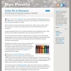
Then, surfing the FM dial, I heard a Styx song on the oldies station. And just yesterday, park-side, a nanny chided me: “Star fish? No, kids call those sea stars nowadays.” Why Is Facebook Blue? The Science Behind Colors In Marketing. Editor's Note: This is one of the most-read leadership articles of 2013.
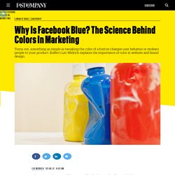
Click here to see the full list. Why is Facebook blue? According to The New Yorker, the reason is simple. It’s because Mark Zuckerberg is red-green color blind; blue is the color Mark can see the best. New Artsy. What is a Visual Practitioner? - IFVP Community. Welcome to our site and welcome to the world of "visual practitioning".

If you've managed to find us, chances are you have some inkling about who we are and what we do. Visual learning and outlining in the classroom. Visual thinking is a learning style where the learner better understands and retains information when ideas, words and concepts are associated with images.
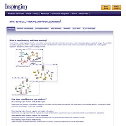
Research tells us that the majority of students in a regular classroom need to see information in order to learn it. Some common visual learning strategies include creating graphic organizers, diagramming, mind mapping, outlining and more. Visual learning helps students clarify their thoughts. NeWeb Design. NeWeb Modules. Web Development. Presentation. Practicum.
Copyright Patent. Education Resources. Educational Programs. INTERNET. ENGAGING SITES. QR Y. Curate Content Research. New Practicum. Data Aesthetics. Statistics Compile. Information. ORGANIZATION. Data Aesthetics. Bookmarx Quest.