
Framework for Designing for Multiple Devices. Nowadays, content must be developed to be viewed and interacted with across a range of screen sizes, from smartphones to the widest flat-screens.
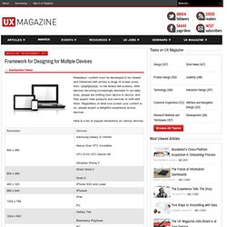
With devices becoming increasingly abundant in our daily lives, people are shifting from device to device, and they expect their products and services to shift with them. Regardless of what size screen your content is on, people expect a delightful experience across devices. Here is a list of popular resolutions on various devices: Not Your Parent's Mobile Phone: UX Design Guidelines For Smartphones - Smashing UX Design. Advertisement In your pocket right now is the most powerful “remote control” (as Drew Diskin put it1) that has ever existed.
It is no ordinary remote control. It can harness everything that all of the previous mass media2 (television, radio, Internet, etc.) can do. Ergonomie : les règles d'or d'une appli mobile réussie.