
Building Websites and Browser Apps with jQuery Mobile: A Beginner’s Guide. Over the past 2-3 years we’ve seen a tremendous growth in browser and OS support for mobile websites.

Most notably Apple’s iOS and Google’s Android platforms come to mind. But others such as PalmOS and Blackberry are still in the mix. Up until recently it was very difficult to match a single mobile theme into all of these platforms. Pin it JavaScript was a start, but there hasn’t been any truly unified library until now. jQuery Mobile takes all the best features of jQuery and ports them over to a mobile-based web source. Recommended Reading: Mobile App: Custom Themes with jQuery Mobile Features & OS Support The reason I suggest learning jQuery Mobile over any other frameworks is simplicity.
Support is varying between phones and is broken into a chart of 3 categories from A-C. Apple iOS 3-5Android 2.1, 2.2, 2.3Windows Phone 7Blackberry 6.0, Blackberry 7Palm WebOS 1.4-2.0, 3.0 If you want to learn more try reading up on their official docs page. The Standard HTML Template Top Bar Buttons. Framework - Page 2. Mobiletuts+ jQuery Mobile Book: Master Mobile Web Apps with jQuery Mobile. 8 Popular online apps to test the mobile version of your site. The mobile revolution has inspired major and minor websites alike to have a mobile version.

Mobile versions can be created using themes, extensions, and other modifications. While developing mobile version, you may want to test it on two, three, or even five different mobile handsets. After development, you are not aware how it will appear in each mobile present on this Earth as you have to buy each of them to test it manually. Let us make this work simple for you by collecting some tools in this article to test the mobile version of your website. You can test your mobile website on these tools, analyze it for the mistakes/errors, and then optimize it according to the recommendations. 1. W3C tops the list every time you come to the field of website testing. 2. Ready.Mobi is a service of dotMobi and an extension of W3C MobileOk Checker Service. 3.
Google also has tools for testing your website for mobile. 4. iPad Peek Currently, Apple iPad is the highest selling tablet. Mobile 2.0: Design & Develop for the iPhone and Beyond. Mockups and more for the mobile web. Common mobile web design mistakes. Mobile Internet usage is on the rise, and the world of Web design continues to evolve—so designers must learn to accomodate mobile devices.
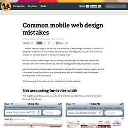
Thinking “Oh, my users won’t visit my website on a mobile device” is the worst mistake of all. No one can stop mobile usage from increasing, and the odds are that every website will receive visitors on mobile devices. So, the best strategy is to be as prepared as possible. Just thinking about mobile users isn’t enough to address the situation. Many mistakes are still committed during the process, and knowing what they are is the first step in effectively avoiding them in future projects. The following are the most common mistakes on mobile websites. Not accounting for device width This might sound obvious, but an awful lot of websites look like this on a mobile device (in this case, the iPhone): In the screenshot above on the left, the website is formatted for variable device widths, but its elements are not.
Making users fill out long forms.