
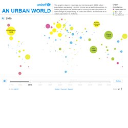
You Start the Girl Effect - Girl Effect. The Art of Complex Problem Solving. _happy data. Maral Pourkazemi. Visual Thinking. Urban Population Map. Close Source United Nations, Department of Economic and Social Affairs (UNDESA), Population Division special updated estimates of urban population as of October 2011, consistent with World Population Prospects: The 2010 revision and World Urbanization Prospects: The 2009 revision.
Graphic presentation of data based on The Guardian, 27 July 2007. This map is stylized and based on an approximate scale. It does not reflect a position by UNICEF on the legal status of any country or territory or the delimitation of any frontiers. Notes Because of the cession in July 2011 of the Republic of South Sudan by the Republic of the Sudan, and its subsequent admission to the United Nations on 14 July 2011, data for the Sudan and South Sudan as separate States are not yet available. Data for China do not include Hong Kong and Macao, Special Administrative Regions of China. The Economist - Women's Economic Opportunity Index. In hopes of going beyond the traditionally static, and oftentimes boring, PowerPoint presentation, The Economist tapped JESS3 to help bring an important data set to life through a powerful graphic animation.
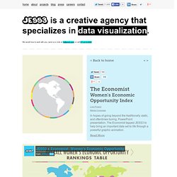
Working closing with the Economist Intelligence Unit, which compiled a 150-page report called the Women’s Economic Opportunity Index, our team explored creative direction through multiple styleframes in order to achieve a look that would illuminate crucial information about women’s opportunity across the world. In combing through data and creating detailed storyboards, this six-minute animation tells the story through data visualization of where women stand in the business world from issues ranging from maternity leave to property rights. The Economist Intelligence Unit presented the data at the World In 2011 Festival, an event that coincided with the 25th Anniversary of The Economist’s World In… publication. The Gamification of Education Infographic #gamification #edtech. Is mobile Africa's future? African economies are among the fastest-growing in the world. Today, the continent is poised to transform the global economic landscape.
Sub-Saharan Africa’s annual GDP growth averaged 5.7% between 2000 and 2010. Annual growth is expected to average 7% over the next 20 years. Africa accounts for 14% of the world’s population. A new middle class is emerging in Africa, signaling new growth opportunities for several key industries. Nearly 90% of all phones in Africa are mobile phones.
By the end of 2012, there will be 735 million mobile subscribers in Africa. Across Africa, mobile technology is becoming a cornerstone for industries like healthcare and agriculture. Close to 18 million Kenyans use mobile phones as a bank account, depositing and transferring money remotely to avoid excessive travel and wait times. Total African mobile money transfers are expected to exceed $200 billion in 2015, accounting for approximately 18% of the continent’s GDP. A visual exploration on mapping complex networks. A Comprehensive List of Top Resources on Instructional Design. Instructional design is one of the most important and hottest topics in education today.

With the diversity of technologies, audiences, and modes of teaching continuing to grow, it’s essential to stay up-to-date. We’ve compiled a list of our 37 favorite resources on instructional design. We chose these resources because they offered detailed and accurate information, and were written by professors, administrators, designers, and other authoritative sources. Check them out to find ways to improve your learning environment. University & Academic Resources 7 Things You Should Know About: Educause is an educational non-profit. Multimedia & Interactive Resources. A Peek Into Netflix Queues - Interactive Graphic. Social Media Infographics.
Graffiti Analysis. KASHIWA SATO. Co.Design - Infographic Articles. Worldmapper: The world as you've never seen it before. Social Media Graphics - collecting all kinds of social media related charts, graphs and infographics. Data Visualization and Infographics Resources.
Advertisement Data visualizations and infographics can make complex datasets easier to understand and comprehend.
By creating a graphical represenatation of data and statistics, complicated concepts and information can make more sense in less time. Many visualizations focus on representing a specific set of data or statistical information. Others focus on less-concrete topics, providing a visual representation of abstract concepts. Many Eyes : Browsing Visualizations. Fantastic Information Architecture and Data Visualization Resour. Jan 15 2010 Information architecture can be a daunting subject for designers who’ve never tried it before.
Also, creating successful infographics and visualizations takes skill and practice, along with some advance planning. Maps In Modern Web Design: Showcase and Examples - Smashing Magazine. Advertisement Geo-location was a hot topic in 2009.

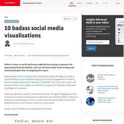
With so many applications on GPS-enabled smartphones, more maps than ever were accessible to the average person. Year in Reviews 2010. A Periodic Table of Visualization Methods. 10 badass social media visualisations. When it comes to social media you might be busy trying to separate the opportunity from the bullshit, such are the interstellar levels of hype and associated jargon that are plaguing this space.
Nevertheless, I for one believe that a solid social media strategy can make a real difference to your business, helping you to drive engagement in order to boost customer satisfaction, retention, and profits. Tracking Taxi Flow Across the City - Interactive. Ideas, issues, knowledge, data - visualized!