
Installing Power Query in Excel 2010 – Excel Blog – MyExcelOnline Blog. Power Query is a new add-in that was introduced in Excel 2013 by Microsoft and was that popular that they made it backward compatible with Excel 2010.

Well you know when you get data from a file, a data dump/import or an external data source and it comes into Excel in an ugly, unworkable format? I can hear you say YEEEES! Well Power Query accesses, cleans and transforms all that messy data and displays it in a way that Excel loves and can work with. The best thing is that the next time you receive the same ugly file, all you need to do is press the Refresh button and your data will automatically be cleaned up and displayed the correct way! So no more formulas, text to columns, trim spaces, vlookup, find & replace etc. MyExcelOnline.com. View The Online Course Here: Course description: This is the Ultimate Excel Pivot Table course which has 217 short and precise tutorials.

Excel Pivot Tables, Charts & Dashboards - Excel 2016, 2013 & 2010. Create a waterfall chart in Office 2016. A waterfall chart shows a running total as values are added or subtracted.
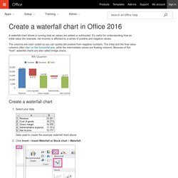
It's useful for understanding how an initial value (for example, net income) is affected by a series of positive and negative values. The columns are color coded so you can quickly tell positive from negative numbers. The initial and the final value columns often start on the horizontal axis, while the intermediate values are floating columns. Because of this "look", waterfall charts are also called bridge charts. What's new in Excel 2016 for Windows - Excel. January 2016 Updates Note: The following features are only available to Office 365 subscribers.
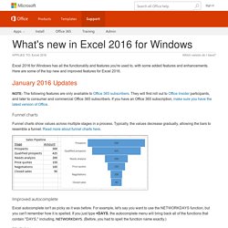
They will first roll out to Office Insider participants, and later to consumer and commercial Office 365 subscribers. If you have an Office 365 subscription, make sure you have the latest version of Office. Funnel charts Funnel charts show values across multiple stages in a process. Improved autocomplete Excel autocomplete isn't as picky as it was before. This function combines text from multiple ranges, and each item is separated by a delimiter that you specify. This new function is like CONCATENATE, but better. Tired of typing complicated, nested IF functions? This function evaluates an expression against a list of values in order, and returns the first matching result. This function returns the largest number in a range, that meets a single or multiple criteria. This function is similar to MAXIFS, but it returns the smallest number in a range, that meets a single or multiple criteria. 3D Maps. Introducing new and modern chart types now available in Office 2016 Preview.
Editor’s Note 7/7/2015: We added the sample workbook used to create the charts, which you can download here.
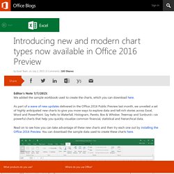
As part of a wave of new updates delivered in the Office 2016 Public Preview last month, we unveiled a set of highly anticipated new charts to give you more ways to explore data and tell rich stories across Excel, Word and PowerPoint. Say hello to Waterfall, Histogram, Pareto, Box & Whisker, Treemap and Sunburst—six powerful charts that help you quickly visualize common financial, statistical and hierarchical data. Read on to see how you can take advantage of these new charts and then try each one out by installing the Office 2016 Preview. You can download the sample data used to create these charts here. Waterfall—visualizing financial statements with ease Most business owners seek to better understand their finances in order to ensure their success. Learn more about the Waterfall chart. Histogram—exploring and analyzing a distribution Learn more about the Histogram chart. Security Check Required. Text To Columns: Dates – Excel Blog – MyExcelOnline Blog.
Whenever you download data from an external ERP system like Oracle, SAP, etc, you can have data that is not formatted the way you and Excel likes.
Sometimes “Date” values are downloaded as “Text”, so you cannot sort in the periodic date format. No worries! Text to Columns to the rescue! Below I show you how to convert this “Text” data into “Excel friendly” data. Download the workbook to practice this cool trick! NB: If the dates are not converting properly after you do the Text to Columns, it may be that your computer’s Region formats need changing. VLOOKUP Function: Introduction – Excel Blog – MyExcelOnline Blog. What does it do?

Searches for a value in the first column of a table array and returns a value in the same row from another column (to the right) in the table array. Formula breakdown: =VLOOKUP(lookup_value, table_array, col_index_num, [range_lookup]) What it means: =VLOOKUP(this value, in this list, and get me value in this column, Exact Match/FALSE/0]) Excel`s VLOOKUP function is arguably the most used function in Excel but can also be the most tricky one to understand. VLOOKUP Function: Introduction – Excel Blog – MyExcelOnline Blog. Introducing new and modern chart types now available in Office 2016 Preview.
Use sparklines to show data trends - Excel. New in Microsoft Excel 2010, a sparkline is a tiny chart in a worksheet cell that provides a visual representation of data.
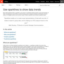
Use sparklines to show trends in a series of values, such as seasonal increases or decreases, economic cycles, or to highlight maximum and minimum values. Position a sparkline near its data for greatest impact. "Sparklines enable us to create visual representations of data with one click. It makes it easier to grasp data, and it’s helping our CFO analyze trends on the spot. "Matt Stuckey, IT Director of Levick Strategic Communications.