
The 1140px CSS Grid System · Fluid down to mobile. Linear Gradients.
Creating Liquid Layouts with Negative Margins. I was recently confronted with the task of creating a two-column liquid layout with a header and footer in which the content needed to come before the sidebar in the source code.

I took opportunity to demonstrate an under-used aspect of CSS: negative margins. Negative margins allow us to push the content area away from the sides of the browser, leaving room for the sidebar. Starting out simple#section1 To show how negative margins can be helpful in creating liquid layouts, let’s start by creating a liquid two-column layout with a header and footer.
The main content area will be on the left, with the sidebar on the right. Given the way that floats work, it would be easiest to put the sidebar before the content area, allowing it to float to the right of the rest of the content. The source code we want#section2. Make a Footer Stick to the Bottom of the Page. This CSS footer stylesheet will make a footer stick to the bottom of the page.
CSS Sticky Footer This CSS sticky footer code pushes a website's footer to the bottom of a browser window. It is valid CSS and HTML with no unsavory hacks, so it works in all of the major browsers (even the now defunct IE5 and IE6). View the example CSS Sticky Footer or the HTML5 Sticky Footer. How to use the CSS Sticky Footer on your website Add the following lines of CSS to your stylesheet. Follow this HTML structure. <html> <head> <link rel="stylesheet" href="layout.css" ...
/> </head> <body> <div class="wrapper"> <p>Your website content here. Multicolumn layout with Sticky Footer Add clear to the .push div Adding margins to elements is messing up the footer. Simply use padding instead, and all your worries will go away. I put this on my site and it doesn't work right in browser X. A CSS Sticky Footer. A CSS Sticky Footer that just works We've all tried to use a CSS Sticky Footer one time or another, but they never seem to come out right, do they?
Well, the days of a hard to understand CSS Sticky Footer are thankfully over. With just a few simple CSS classes with minimal extra HTML markup, I've fashioned a CSS Sticky Footer that even beginners can get a handle on. It's been tested in IE 5 and up, Chrome, Firefox, Safari and Opera. Ultimate CSS Gradient Generator - ColorZilla.com. CSS3 Gradient Generator. Learn CSS Positioning in Ten Steps: position static relative absolute float.
1. position:static The default positioning for all elements is position:static, which means the element is not positioned and occurs where it normally would in the document.
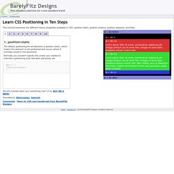
Normally you wouldn't specify this unless you needed to override a positioning that had been previously set. 2. position:relative If you specify position:relative, then you can use top or bottom, and left or right to move the element relative to where it would normally occur in the document. Let's move div-1 down 20 pixels, and to the left 40 pixels: Notice the space where div-1 normally would have been if we had not moved it: now it is an empty space.
It appears that position:relative is not very useful, but it will perform an important task later in this tutorial. 3. position:absolute When you specify position:absolute, the element is removed from the document and placed exactly where you tell it to go. CSS Layout Generator. Generateur de multi-colonnes en CSS3 - Design et programmation web2 - Dji. Développement CSS animation, transition, font, playground, ...
Développement Javascript jQuery, Javascript, performance, ... Développement PHP test unitaire, librairies, ... Développement HTML5 HTML5 Api, localStorage, geolocalisation, ... Développement jQuery jQuery, plugins, performance, ... CSSeasy.com - Learn CSS the modern way. Ie.microsoft.com/testdrive/graphics/svggradientbackgroundmaker/default.html. CSS3 Media Queries - Adapter un site à plusieurs résolutions d'écran. Les Medias Queries sont des propriétés CSS permettant d'adapter une page HTML à différents types d'écrans et résolutions.
Imaginons que vous ayez développé un site web adapté aux résolutions classiques: 1024px / 1280px de largeur, qu'avec la démocratisation des smartphones et tablettes, vous souhaitiez rendre votre site compatible sur ces écrans, sans toucher au HTML... Grâce aux CSS3 medias queries, extensions des types media en CSS2 (print, screen), c'est possible ! Voici quelques exemples de medias queries pratiques que vous pourriez utiliser sur vos prochaines réalisations web: Adapter le style de la page web en fonction des dimensions du navigateur via les medias queries Il peut être intéressant de connaître les dimensions de la zone d'affichage du navigateur de notre visiteur pour adapter au mieux la taille des listes, colonnes etc.
Voici comment c'est possible en quelques lignes d'assigner un style particulier pour les navigateurs ayant pour largeur mini 400px et maxi 700px 1. 1. 2. 6. 1.