
How to create an Excel dashboard. Excel dashboards and executive reports are powerful, fairly easy to design and a great way to improve your Excel and data visualization skills.
Because of its flexibility, you can virtually design any dashboard in Excel exactly the way you, or the users, imagined. And, best of all, you may want to implement it yourself or consider it a prototype and ask IT to implement it. Erlandsen Data Consulting. Stock Chart with Scroll and Zoom. Stock charts come in various shapes.
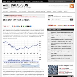
There are candlestick stock charts, line and bar stock charts, “Kagi” stock charts, moving average stock charts and everything in between. For a financial service provider how to present financial information pertaining to a specific stock can a critical question. On one hand, if you give too many options, you loose out on user comfort and increase API complexity. On the other, give too few options and you end up losing more demanding customers. Interesting to note is that both Yahoo and Google tend to use the same type of stock chart displays though personally I tend to use the former.