
Our 11 Favorite Branding Projects Of 2011. A great logo has staying power, eventually becoming synonymous with a brand’s identity and a stand-in for its name.
Just have a look at Saul Bass’s enduring designs for AT&T, Quaker Oats, and United Airlines (which made our list last year for worst rebranding campaign for dropping the Bass’s “U” in favor of Continental’s Wiffle ball). So while it was fun to compile our best branding coverage, the truly interesting part will be watching how they age over time. In an effort to stack the deck in their favor, some designers created morphing logos with many possible iterations (see, for example, E Roon Kang and Richard The’s work for MIT’s Media Lab and Bruce Mau Design’s campaign for OCAD University). Others borrowed from the past, conjuring an aura of nostalgia and timelessness for new and established enterprises alike. We’ll check in on them in a few years to see how they’ve held up.
For last year’s roundup, go here. Canada's Bold, Leafy Rebranding Of Its Olympic Team. On the Team USA Web site, you'll find this explanation of our uninspired Olympic logo: "[It] is made up of the letters 'USA,' the common abbreviation for the United States of America, and the Olympic Rings logo.
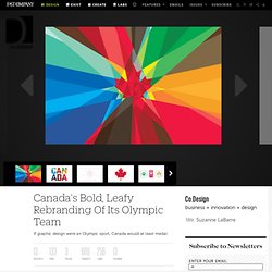
" (If that made your chest fill with patriotic pride, read no further.) We could stand to learn a thing or two from Canada, which recently rolled out its Olympic rebranding campaign, centered not on "CANADA" (you know, what the country's called) but the beloved maple leaf. "The aesthetic needed to be bold but humble. " Canada began competing in the Olympics in the early 1900s, and, in overhauling the team's branding, Ben Hulse drew from more than a century of stories and iconography.
The maple leaf stood out as the unifying element, both for its meaningful history (it appeared on Olympic athletes 60 years before becoming the symbol of the nation's flag) and for its versatility (it appears clean and classic on marks and intense and vibrant on mosaic graphics). 33 Creative Negative Space Logos. Written by Inspiral On Friday, May 27th, 2011 with 6 Comments so far in Inspiration, Logo Design Negative space logos strategically use whitespace to create the illusion of an object in that space.
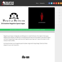
Negative space designs are effective in branding because they force the viewer to look twice to figure out what’s happening, though a well-executed negative space logo won’t require the viewer to look closely to have its effect. As of late the clever use of negative space has been a big trend in logo design. Check out these designs for your own inspiration.
Conclusion These logos don’t have 3D effects or shiny lens flares: they’re about as simple as you can get stylistically and in many cases would fit right into a minimalist logo round-up. Need a creative logo design? Then try using ‘Inspiral’, a freelance graphic designer from the United Kingdom. Looking for freelance design work?