
15 Examples of Brilliant Homepage Design. 15 Must-Know Facts on How People View Websites. Do you know what is the first thing that your eye is drawn to on a website?

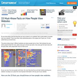
And in what pattern do people scan your website? There have been many eyetracking tests on this subject and I’ll give you 15 most useful facts you should know. The picture below shows 3 different websites and where people look on them. Red indicates the area, where people looked the most, yellow areas got a bit less eye-action, blue areas got the least views and the gray areas, well, people didn’t focus on them at all. As you can see, the more people scroll down, the more they lose focus and start mainly scanning your website. Here are the 15 facts you should know on how people view websites.
Text attracts more attention than pictures. There you go. Sources: Using Targeted Content Marketing to Improve User Experience. UX or user experience has been emerging as a very vital channel for digital and inbound marketing, given the fact how users’ behavior and demands toward web-based content are continuously growing over the past years.

This constant evolution in web usage is clearly defining the changes in the online marketing space as well, because users have to come expect continually better experiences. This means marketing professionals must now work to delight as well as inform to efficiently get the attention of their target users/audience. Evaluating the significance of UX in today’s marketing age will simply take a longer list, but here are several reasons that exemplify its impact to marketing and revenue generation processes: These reasons simply imply how great marketing/advertising experiences can result in customer loyalty (by serving as an extension of the brand).
Effective Content Marketing can improve User Experience. 14 Real-Life Examples of CTA Copy YOU Should Copy. When marketers think about call-to-action (CTA) creation, the first thing many of them tend to focus on is design. And while CTA design is critical to initially drawing the attention of your visitors, it's the copy of your calls-to-action that has to be compelling enough to get them clicking.
If the copy you craft doesn’t keep your visitors' attention, it can hurt your click-through rate, lead conversions, and ultimately, sales. “People looking for information are looking for text, not pictures,” writes copywriter Dean Rieck, analyzing the results of an Eyetrack III study. Because visitors focus on the words in ads more than on the graphics, marketers need to first make sure their wording is clear, specific, and action-oriented. 13 Little Landing Page Tweaks That Can Make a BIG Difference.
It's no news flash that inbound marketers have to produce a lot of content and offers.

After all, without these valuable assets -- and plenty of 'em -- inbound lead generation would be quite a challenge. Website Optimization Basics. 10 best practices for your mobile website. Examples of Mobile Awesomeness How to bring awesomeness to your mobile presence Target audience: Small, mid-size and large businesses, social enterprises, mobile developers, social marketers, educators — and anyone with a mobile website.

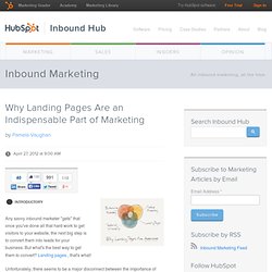
Yesterday we discussed some of the choices you have when it comes to creating your mobile website. Regardless of the solution you choose, there are some best practices that should be applied to all mobile websites. Why Landing Pages Are an Indispensable Part of Marketing. Any savvy inbound marketer "gets" that once you've done all that hard work to get visitors to your website, the next big step is to convert them into leads for your business.

But what's the best way to get them to convert? Landing pages , that's what! Unfortunately, there seems to be a major disconnect between the importance of landing pages and their use by marketers. Website Testing: Move Beyond the Landing Page. Smart marketers understand the value of testing.

In a relatively short period of time, website testing has evolved from changing the color of a “submit” button on one web page, to building intricate, multi-page testing campaigns with the ultimate goal of delivering an engaging online experience to customers. Our latest infographic, Website Testing: Move Beyond the Landing Page, provides ideas for testing other pages as well as tips for what you should consider when choosing a testing solution.
10 Foolproof Ways to Earn Your Landing Page Visitors' Trust. Landing pages are a critical tool for meeting your ever-increasing lead generation goals.

Actually, only 8% of marketers reported that dedicated landing pages were ineffective, according to MarketingSherpa's 2011 Landing Page Optimization Benchmark Report. I'm not sure what those 8% are doing, but the effectiveness of landing pages for the other 92% of marketers hinges on one component that isn't often discussed -- visitors have to trust you enough to give away their personal information on your landing page forms to obtain your offers. The thing is, we've all been burned too many times by companies that don't deliver on their offers' promises, sell our personal information, and SPAM us with irrelevant emails. As such, we've all accrued some keen Spidey senses that kick in when we visit landing pages that tell us whether a company is trustworthy, or whether we should cut and run. 10 Ways to Instantly Amplify the Social Proof of Your Marketing. An individual's purchasing decision can be influenced by a large number of factors.

Are you considering how influential social proof can be in that mix? According to Goog le , 70% of Americans now say they look at product reviews before making a purchase. Furthermore, a CompUSA and iPerceptions study revealed that 63% of consumers indicate they are more likely to purchase from a site if it has product ratings and reviews. Optimizing the 2012 Presidential Donation Forms. InShare30 A website optimization review for five U.S. presidential campaigns' online donation forms. Election season gets longer and longer every term, forcing presidential candidates to acquire more money than ever to run a successful campaign.
While big donors are the primary focus for candidates, donations by the mass public play a vital role in the election and are not overlooked. To maximize the contributions made by the everyday voter, candidates and their election teams need to optimize the donation forms on the presidential hopeful's website to ensure they are capturing the interest and pocketbook of all prospects. The Product Page 2012: 7 Must-Test Elements. Bryan Eisenberg | February 24, 2012 | 1 Comment.

Before & After: The Optimization of a Flawed Landing Page. Marketers talk a lot about advanced techniques for working with their leads: lead flow, lead management, lead nurturing.

7 Ways to Lower Your Website's Bounce Rate. 12 Critical Elements Every Homepage Must Have [Infographic] If you’re considering a website redesign or are wondering how to generate more leads from your website, it's a good idea to start with your homepage. Serving as your company's virtual front door, this page is generally responsible for drawing in a majority of your website's traffic. And despite its prominence, many businesses struggle to optimize it properly. You see, your homepage needs to wear a lot of hats. Rather than treating it like a dedicated landing page built around one particular action, it should be designed to serve different audiences, from different origins. And in order to do so effectively, it needs to be built with purpose.
So to improve the performance of your homepage, check out the following infographic detailing 12 critical elements every homepage must have. 4 Tips to Keep Your Website Ahead of the Curve. This post originally appeared on the American Express OPEN Forum, where Mashable regularly contributes articles about leveraging social media and technology in small business. Sure, having a website for your business serves a practical need: to draw net-surfing users to your product or service. However, it's also much more than slapping on a run of the mill two-column template and calling it a day. Nothing kills an online buzz like a poorly designed or drastically outdated website.
Dry and boring default templates, broken assets, confusing pages and invasive widgets do nothing but harm a page's style, which in turn reflects poorly on the company. 2012 is heralding a new wave of innovative web technologies and design, and a page that stays in step with these trends is bound to pique interest and lower your bounce rate. 1. Mail Chimp. A bold design can be obtained with very little money, especially for those who aren't necessarily experienced in coding. 2. 3. 4. How to Design an Ecommerce Site to Maximize Sales.
Daniel Alves is the design director for the small business web design division at the digital marketing and web design company 352 Media Group. If you read the business news that followed Black Friday and Cyber Monday, you would remember that this year's online holiday shopping season was predicted to be the biggest in history.