
The Lettering Work of Ricardo Gonzalez. The Vinyls Alphabet – Fubiz Media. Behance. Weitzer Paper – Publishing on Behance. Saint - Louis : un Didot de prestige. La société de postproduction Saint-Louis s'offre une police de caractères sur mesure pour sa nouvelle identité visuelle.
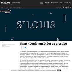
Réalisé par Élise Gay et Kévin Donnot deux designers graphiques, fondateurs du studio E+K, le Saint-Louis est une réinterprétation du Didot. Le choix de ce caractère n'est pas anodin : il permet de convoquer non seulement le classicisme à la française mais aussi les champs du luxe et de la mode, domaines d'application fondateurs de la société. En travaillant les contours du Didot, tout se passe comme si les graphistes nous révélaient l'ourlet et les finitions de ce grand classique de la typographie française. Monolinéaire, le Saint-Louis joue sur l'accentuation des contrastes entre les empattements filiformes, les pleins et les déliés. Le jeu entre raffinement et rondeur, les courbes toute en délicatesse aboutissent à une version élégante et contemporaine du Didot.
Alphabet Typography in GIF Inspired by Animals Appendages. L’artiste et designer américain Ari Weinkle a conçu l’alphabet Feelers fait de lettres colorées en GIF animés qui imitent le mouvement des appendices et intestins d’animaux.
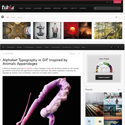
Des lettres organiques composées de dégradés de couleurs vives et brillantes, à découvrir en images dans la galerie. TYPO & LETTERINGS on Behance. We love Typography & Lettering and We use to play with it creating typefaces in our projects, so this is a small selection of typo stuff created for several clients.
We are Showing this Typefaces in order: · LINEAL FLOW ™ (project header) / COMPLETE TYPE· NIGHTTYPE ™ (SPREAD VICE-LOVE-NYC)/ COMPLETE TYPE· HOTNIGHTS REGULAR ™ / COMPLETE TYPE· HIDDEN FONT ™ / COMPLETE TYPE· Detroit Modular™ / COMPLETE TYPE. New 3D Calligraphy Experiments by Tolga Girgin. Turkish graphic designer and electrical engineer Tolga Girgin continues to experiment with calligraphy that seems to jump off the page.
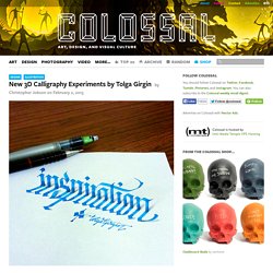
Girgin uses shading, shadows, and different forms of perspective to create three-dimensional letters that float, stand, drip, and slant. You can see more on Instagram and over on Behance. (via Lustik) Le grand retour du racket aux fichiers verrouillés. Le Monde.fr | • Mis à jour le | Par Olivier Dumons et Yves Eudes « Your files are encrypted !
Jolly Roger on Behance. Food Typography by Becca Clason. Voici une série de typographies réalisées à la main par l’artiste Becca Clason à partir d’aliments et condiments tels que des graines, du sucre ou des feuilles de salades.
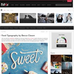
Entre précision, créativité et humour, Becca Clason joue avec les formes des lettres et la mise en scène autour de ses messages gourmands. Hand Lettering on Behance. Boundless Space Typography. YOROKOBU Numbers on Behance. Louis Mallart - Animated letters. Ana Gomez Bernaus - Textappeal II. M W M 2 O 1 5 on Behance. Custom Typography Collection by Moshik Nadav Typography on Behance. Shop - Typodarium 2014. Your daily dose of Typography!
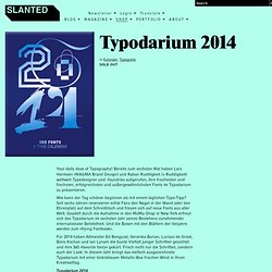
Bereits zum sechsten Mal haben Lars Harmsen (MAGMA Brand Design) und Raban Ruddigkeit (+ Ruddigkeit) weltweit Typedesigner und -foundries aufgerufen, ihre frischesten und frechsten, erfolgreichsten und außergewöhnlichsten Fonts im Typodarium zu präsentieren. Wie kann der Tag schöner beginnen als mit einem täglichen Typo-Tipp? Seit sechs Jahren reservieren echte Fans den Nagel in der Wand oder den Ehrenplatz auf dem Schreibtisch und freuen sich auf neue Fonts aus aller Welt. Geadelt durch die Aufnahme in den MoMa-Shop in New York erfreut sich das Typodarium im sechsten Jahr seines Bestehens zunehmender internationaler Beliebtheit. Und die Boxen mit den Blättern der Vorjahre werden zum »flying Fontbook«. Für 2014 haben Altmeister Ed Benguiat, Veronika Burian, Luc(as) de Groot, Boris Kochan und Ian Lynam die bunte Vielfalt junger Schriften gesichtet und ihre 365 »favorite fonts« gekürt.
~Paradise~ — Love hops and live the dream. Ennemm - MS Milk. Casser les codes visuels pour mettre en évidence les qualités d'un produit, c'est le choix opéré par l'agence islandaise Ennemm pour la marque de lait Mjólkursamsalan Dairy.
Les packagings sont pour le moins singuliers. Ils remplacent l'esthétique minimale et illustrative sur fond blanc, par des écritures à la craie sur fond noir. Un concept inédit qui puise sa source dans les bienfaits du produit. 36 Days of Type by Adrian Lorga. Graphic designer by day and typographer by night.
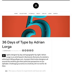
Adrian Lorga is an artist based in Bucharest, Romania, he started a while back 36Daysoftype.com. A project that invites designers all around the world to give their particular perspective on our alphabet. Challenging ourselves to creativity wih no rest for 36 days. “Type Safari” with Designer James Victore. Beautiful Hand Lettering & Calligraphy Designs. Joseph & Joseph on Behance. Poster / Sans-serif_rgb_a4. RAWZ. Chinese Typography on Behance. Friday Fresh Free Fonts - Hanken Round, Brig, Rabiola. Neon Sign Installations. Basée à Berlin, Olivia Steele est une artiste qui utilise la lumière et les néons pour ajouter du sens et de l’ironie à un endroit.
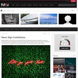
Elle imagine ainsi des phrases spirituelles à interpréter selon notre humeur, en travaillant énormément sur la typographie et le style de ses lettres. Sublime Lettering Works by Luke Lucas. By AoiroStudio Thu, 07/03/2014 - 08:59 Luke Lucas is a freelance creative art director, illustrator, designer and typographer currently based in Melbourne, Australia. Since 2011, living the happy life as a Dad; Luke has also worked with Nike, Target USA, Esquire, the New York Times and more. Atypical on Behance. Typography For Advertising on Behance. RAWZ. Share what inspires you or what you have done. We will select the best images for the Daily Inspiration on Abduzeedo. Powered by Fusion March 31, 2014 View Original ryogotoyoda Ryogo Embed Code <h3>ryogotoyoda</h3><p class="imgC" ><a href=" src=" /></a></p> RAWZ. Share what inspires you or what you have done.
We will select the best images for the Daily Inspiration on Abduzeedo. Powered by Fusion March 31, 2014. Www.handmadefont.com. RAW - NOTEGRAPHY on Behance. Alek Typeface on Behance. La Grosse Sélection Typographique. Pkd | On Faire une grosse sélection typographique est un magnifique petit défi. Typography Mania #208. Tremendo - Lapsus on Behance. Calligraphie et SMS pendant une semaine !
Hello. Atype - Craft Typography. Les 10 meilleures polices de caractères, d'après Domenic Lippa de Pentagram. Des choix très classiques (ce qui ne veut pas dire mauvais, au contraire) et seulement deux typos contemporaines : le Knockout et le Gotham, deux créations d'Hoefler and Frere-Jones. À lire ici. Des lettres à s'arracher les cheveux. Interview with Gwer aka. Rutger Paulusse. Today we present this interview with the typography dutch master Gwer also known as Rutger Paulusse.
We had a great talk about subjects as carrer, expectations, influences and life, hope you appreciate it. Vector Paper Graphic Alphabet Set - 145008769. All Images Refine Your Search Save to a Lightbox ▼ Please Login... To organize photos in lightboxes you must first register or login. Great Lettering & Typography Designs. Shanghai Ranking Book on Behance. Vector Paper Graphic Alphabet Set - 139581401. Signs for the Homeless. Les 2 artistes Kenji Nakayama and Christopher Hope investissent les rues de différentes villes comme Cambridge ou Boston en créant de superbes pancartes typographiées avec le même texte que celles que possédaient les sans-abris.
Un projet très touchant à découvrir en images. Beautiful web type — the best typefaces from the Google web fonts directory. Lucius Annaeus Seneca60 AD Among the numerous faults of those who pass their lives recklessly and without due reflexion, my good friend Liberalis, I should say that there is hardly any one so hurtful to society as this, that we neither know how to bestow or how to receive a benefit. It follows from this that benefits are badly invested, and become bad debts: in these cases it is too late to complain of their not being returned, for they were thrown away when we bestowed them. Nor need we wonder that while the greatest vices are common, none is more common than ingratitude: for this I see is brought about by various causes. The first of these is, that we do not choose worthy persons upon whom to bestow our bounty, but although when we are about to lend money we first make a careful enquiry into the means and habits of life of our debtor, and avoid sowing seed in a worn-out or unfruitful soil, yet without any discrimination we scatter our benefits at random rather than bestow them.