
Why use WordPress responsive Themes, an infographic. iCloud LogIn. "What Font Should I Use?": Five Principles for Choosing and Using Typefaces. Advertisement For many beginners, the task of picking fonts is a mystifying process.

There seem to be endless choices — from normal, conventional-looking fonts to novelty candy cane fonts and bunny fonts — with no way of understanding the options, only never-ending lists of categories and recommendations. Selecting the right typeface is a mixture of firm rules and loose intuition, and takes years of experience to develop a feeling for. Here are five guidelines for picking and using fonts that I’ve developed in the course of using and teaching typography. 1. Many of my beginning students go about picking a font as though they were searching for new music to listen to: they assess the personality of each face and look for something unique and distinctive that expresses their particular aesthetic taste, perspective and personal history.
The most appropriate analogy for picking type. For better or for worse, picking a typeface is more like getting dressed in the morning. 2. 1. 2. 3. Genius Custom Web Design and Copywriting Services for Business. MeetCheap - Video Conference Software for Webinars, Online Meetings, Desktop Sharing & Web Conferencing. Lyndsay Rees-Jones (lyndsay2020. Supporting your online networker. Website Design Rugby. Susan Farrell Consulting Ltd. Educational Benefit of Ugly Fonts.
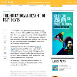
A few months ago, I wrote a speculative blog post about e-readers.

Although I love my Kindle, I worried that these new gadgets made the act of reading a little bit too easy, and that this visual ease might lead, one day, to a shallower engagement with our texts. It was a rather tortured argument, an awkward mash-up of McLuhan and fMRI research. I’m happy to report that a brand-new paper in Cognition by a team of Princeton psychologists (Connor Diemand-Yauman, Daniel M.
Oppenheimer and Erikka B. Vaughan) makes the same point I was trying to make, only much, much better. Interestingly, they frame the issue in terms of classroom technique, as they take aim at a core assumption of educators: Many education researchers and practitioners believe that reducing extraneous cognitive load is always beneficial for the learner. That sounds reasonable, right? There is strong theoretical justification to believe that disfluency could lead to improved retention and classroom performance.
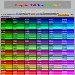
Phil Bradley:Internet search, Librarians, search engines, web search. Complete HTML True Color Chart; Table of color codes for html documents. The background color in each cell is produced by the color code shown.

Black, grays and white are shown in bold red. Primary colors and complements are in BOLD ITALIC. This site was created by Photius Coutsoukis and it is hosted by ITA. Contact the Webmaster with your comments and suggestions. . . . USAGE EXAMPLES: <body bgcolor="#003300"> <font color="#330066"> Thank you for making this an award winning site TelefoneintrageAll Language Translations. Webs support. Creative personal organisation and transitioning. How To Get More Blog Subscribers. Creative personal organisation and transitioning.