
Infographics old and new: top data visualisations, in pictures. There is an infographic boom going on out there - with the internet flooded with data visualisations of the way we fight war, how we use Twitter, what music we like and how we use the, er, internet. But new as these are, there's a long tradition of telling stories using graphics. Guardian definitive atlas of UK government spending Information Graphics from Taschen, which includes work from the Guardian such as our public spending chart, tells the story of how information graphics came to rule our world.
We've selected some of those from the past - to contrast with some key infographics from the past few years - albeit missing out hundreds of examples we could have chosen from the years inbetween. These are some of the images. Information Graphics from the Guardian bookstore at a discount price of £35.99 1858 Histoire Universelle Fold-out print depicting all of human history This Table of Universal History was published in Paris. 1926 Kahn Fritz Kahn 1940 Geis Geis 1940 2006 Esquire Body Parts.
Storia disegnata della mappa della metro di New York - Il Post. È uscito The Great New York Subway Map, un libro illustrato da Emiliano Ponzi, uno dei più importanti illustratori italiani contemporanei, e commissionato dal MoMA di New York insieme al New York Transit Museum.
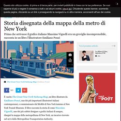
Il libro racconta la storia di come Massimo Vignelli, uno dei più celebri designer e grafici italiani di sempre, disegnò la mappa della metropolitana di New York, un incarico ricevuto nel 1972 dalla Metropolitan Transportation Authority. INFOGRAPHIC: Analyzing Shakespeare’s Characters. La nuova campagna IKEA sfrutta il potere visivo dell’infografica. Forse è giunto il momento di avviare una rubrica espressamente dedicata a IKEA.
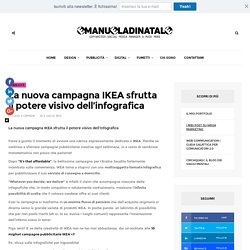
Perché se continua a sfornare campagne pubblicitarie creative ogni settimana, io a costo di sembrare monotematica non posso che parlarne! Dopo “It’s that affordable”, la bellissima campagna per l’Arabia Saudita fortemente incentrata sulla convenienza, IKEA torna a stupirci con una multisoggetto formato infografica per pubblicizzare il suo servizio di consegna a domicilio. “Whetever you decide, we deliver” è infatti il claim che accompagna ciascuna delle infografiche che, in modo simpatico e volutamente confusionario, mostrano l’infinita possibilità di scelta che il colosso svedese offre ai suoi clienti. Each UEFA Euro 2016 country is given an animal in these fun, illustrated cards. Delle infografiche minimaliste per riassumere le serie TV.
Dipendenti dalle serie TV?
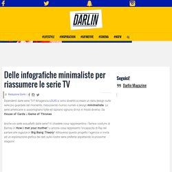
All’agenzia LOUIS si sono divertiti a creare un data design sulle serie più guardate del momento, mescolando humor, numeri e design minimalista. Le serie americane si assomigliano tutte ed ispirano ognuno di noi in modo diverso. Da House of Cards a Game of Thrones. The 83 best infographics. Every picture tells a story, as they say, but sometimes it takes a clever combination of words and pictures to tell a story quickly, concisely and in an entertaining fashion. The best infographics may look like they were simple to create in Photoshop, but designing an effective piece of data visualization is usually anything but. There are several great tools to create infographics, but these examples of infographics from around the web will show you how you can take it a step further and add a bit of style and personality to your data. Some are older than others, but they can still provide some inspiration for those of you looking to create an infographic from scratch.
Some are funny, some more serious, and all are inspiring examples of the art. If Star Wars: The Last Jedi has put you in the mood to immediately watch the original movie, hold your horses just one second. 02. 03. Are you reading this slumped at your desk? 04. AutoCAD Drinks DWG Files. This AutoCAD drawing has long roots back to the day of the pen plotters when it was a sample drawing for Calcomp I believe.
I posted the DWF file awhile back and a link to my Autodesk 360 but several emailed or called me to tell me they had an error in their browser when trying to load it. Below is link to download the related Whisky Drinks DWG format drawing file that has been modified by several people over the years.If you update the drawing please share it back with me. Infografica: James Bond ha bevuto un sacco di cocktails dal 1962 - DARLIN Magazine. Ma quant’è figo James Bond?
Le sue pistolette nascoste, le macchine super eleganti, le tipe che si porta a letto in ogni film… e le sue classiche frasi tipo: “Un martini cocktail per favore. Agitato, non mescolato”. A proposito di cocktail, va detto che James beve parecchio. 30 Useful Infographics for Designers & Developers. There aren't many better ways to gain information these days than infographics.
Infographics allow designers and non-designers to compile interesting, important and funny information all into one creative package. An infographic is meant to tell a story and provide information in a visually striking way. You can use an infographic to visually display statistics, facts, data, and anything else. Today, we've compiled a list of useful and funny infographics for both designers and develoeprs. You'll see things that will make you laugh, and infographics that you can use as a reference sheet on a daily basis. The infographic that explains how to make a killer infographic.