
Fano si è fatta il Brand, eccolo. Brand Design on Behance. Bellagio - City Branding on Behance. Comunicare un territorio: branding, identità e immagine - agenzia di comunicazione visiva e grafica pubblicitaria. OPUS B - Brand design. Partire dal cuore di una città. UK Parliament gets new logo and visual identity to make it more digital. The Houses of Parliament has been given a rebrand in a bid to make it better suited to digital platforms, as well as make it “simpler” and “clearer” to understand.
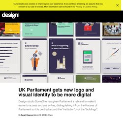
The Houses of Parliament – now known in brand terms as UK Parliament – is made up of the House of Commons and House of Lords. Its role is to examine and scrutinise Government, make new laws, hold debates about political issues and approve Government spending in the form of budgets and taxes. The new visual identity has been designed by studio SomeOne, and includes a name change from Houses of Parliament to UK Parliament. This aims to “highlight the role of the institution in the UK’s constitution, and distinguish it from the building it occupies”, says a parliamentary spokesperson.
SomeOne was appointed to the project as part of a tender process in late 2016. The logo is also now digitally optimised so it scales depending on screen size, such as moving from mobile to tablet or computer screen. Analysis. New Logo and Identity for Russia Tourism. New Russia, the largest country in the world by area, is better summed up by Fodor’s than me: “The grandeur of the Czars, the brutality of Soviet regime, the literary masterpieces baring the Russian soul, and the onion domes of the cathedrals all have captivated the imagination of generations of travellers.
Now Russia is shedding its Soviet past and creating itself anew. Rebranding the city of Melbourne. What goes on behind the scenes of a brand identity program?
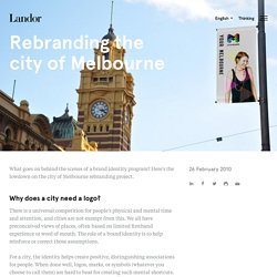
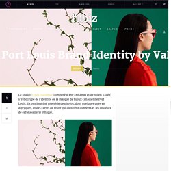
Here’s the lowdown on the city of Melbourne rebranding project. Why does a city need a logo? There is a universal competition for people’s physical and mental time and attention, and cities are not exempt from this. We all have preconceived views of places, often based on limited firsthand experience or word of mouth. Région Auvergne-Rhône-Alpes - Architecture de marque. Oltrepò Pavese - Glifo Associati. Port Louis Brand Identity by Vallée Duhamel. Fr en Categories More Fubiz.
Snøhetta: National Park. Il comprensorio è di 44 parchi e la strategia del design mira a creare un’identità riconoscibile per visitatori e utenti, con lo scopo di dare informazioni riguardo il luogo e la protezione dello stesso.
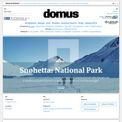
Snøhetta’s design per Norway’s National Park La natura ha un posto molto importante in tutte per anime norvegesi – la gioia di salire una montagna, vivendo il silenzio della natura, o sentire il potere dei luoghi incontaminati. I parchi nazionali rappresentano alcune delle parti più belle della nostra natura. Devono essere sperimentate, ma allo stesso tempo protette. Behance. New Logo and Identity for Saint-Gobain by Terre de Sienne.
About (Est. 1665 ‹ not a typo) “Saint-Gobain S.A. is a French multinational corporation, founded in 1665 in Paris and headquartered on the outskirts of Paris, at La Défense and in Courbevoie.
Originally a mirror manufacturer, it now also produces a variety of construction and high-performance materials.” (Wikipedia) L'Europe et ses identités visuelles régionales - Graphéine - Agence de communication Paris Lyon. L'Europe et ses identités visuelles régionales Depuis 2014, le découpage administratif français est passé de 22 à 13 régions.
New Logo and Identity for Hammerson by Pentagram. Established in 1942, Hammerson is an owner, manager, and developer of retail destinations in Europe.
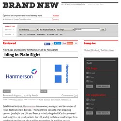
Their portfolio consists of 21 shopping centers (malls) in the UK and France — including the UK’s first covered mall in 1976 — 19 retail parks in the UK, and 15 outlets across Europe, for a combined retail space of 7.2 million square feet (2.2 million square meters). Long operating behind the scenes and as B2B brand, Hammerson is making a concerted effort to make its name better known amongst consumers and gain more brand recognition, starting with a new identity designed by London-based Pentagram partner Harry Pearce. The masterbrand is centred on the logotype’s hidden H, that gives Hammerson a strong presence, whilst still giving individual centres and surrounding communities a sense of ownership. The invisible H makes clear Hammerson’s quiet personality but essential role.The new identity is purposefully European, reflecting Hammerson’s presence in the UK and France.
Behance. Le nouveau logo de la ville la plus haute de France - Graphéine - Agence de communication Paris Lyon. Travail & réflexion sur l'identité visuelle des régions et départements. Partages sur les réseaux sociaux Comment représenter visuellement une collectivité territoriale ?
Comment éviter que le politique prenne le pas sur l'intérêt général ? Behance. Brand Identity Magazine. È un grafico fiorentino – Fabio Chiantini – ad aggiudicarsi il concorso per il nuovo marchio del capoluogo toscano che, come dichiara l'assessore al turismo Sara Biagiotti "non sostituisce lo storico simbolo di Firenze, il giglio, ma verrà utilizzato a fini di marketing, promozione e cultura: a tale scopo la commissione ha scelto questo logo perché rappresenta Firenze come città dei popoli e nella sua unicità".
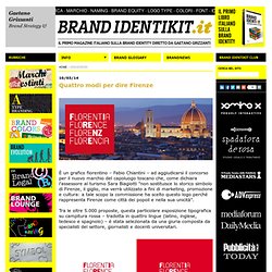
Tra le oltre 5.000 proposte, questa particolare esposizione tipografica su campitura rossa – tradotta in quattro lingue (latino, inglese, tedesco e spagnolo) – è stata selezionata da una giuria composta da specialisti del settore, giornalisti e docenti universitari. The Logos of Budapest's Transportation Services. Nouvelle identité visuelle de Bordeaux Métropole. On sait que les enjeux liés au design d’une identité visuelle sont nombreux. L’identité visuelle doit simultanément identifier et marquer une différence, se faire reconnaître du plus grand nombre et instaurer une singularité. Dès lors, la question de sa visibilité et sa singularité dans un espace public rempli de milliers de logos se pose. Traditionnellement, une identité visuelle, qu’elle soit celle d’un produit, d’une marque ou d'une organisation, est conçue sur la base d’un certain nombre de paramètres, généralement liés aux contraintes de son contexte d’utilisation, mais surtout de production.
Dès lors l'arrivée de l'écran a considérablement élargi le champ des possibles.
Parigi. Porto.