
Rule of Thirds. Framing and Composition - Rule of Thirds.mp4. 10 rules of photo composition (and why they work) In photography, it’s not just what you shoot that counts – the way that you shoot it is crucial, too.
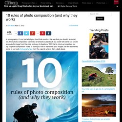
Poor photo composition can make a fantastic subject dull, but a well-set scene can create a wonderful image from the most ordinary of situations. With that in mind, we’ve picked our top 10 photo composition ‘rules’ to show you how to transform your images, as well as offered some of our best photography tips from the experts who do it on a daily basis. Don’t feel that you’ve got to remember every one of these laws and apply them to each photo you take. Instead, spend a little time practising each one in turn and they’ll become second nature. You’ll soon learn to spot situations where the different rules can be applied to best effect. Photo composition doesn’t have to be complicated. In the real world, you’ll be working with a wide range of subjects and scenes, and this requires a more open-minded approach. How to Choose a Typeface. Advertisement.
Type Design. Introduction Design History Family Classifications An Introduction to Type Type Design Since the first recordings of letterforms the concept of the typographic form has evolved into a seemingly endless variety of designs.

Type design variations fall within specific categories. Typeface The basic category of type design is the typeface: the specific letterform design of an alphabet , including the serif shape, x-height, length of ascenders and descenders, variation of stroke weight, and any other characteristics that differentiate it from any other design. Typestyle A typeface usually includes several design variations called styles . Character angle . Character weight. Character width . Font. Thinking with Type. Vocabulary. The%20Language%20of%20Art. Design Elements & Principles. Principles-of-Design. Fully Understanding Contrast in Design. Usually the subject of contrast is reserved for beginners.
Books will say “black and white have contrast, red and orange do not” – but there’s so much more to it. Beginners books usually only touch on color contrast, but what about size and shape contrast? Often the easiest way to tell an amateur designer from a professional one is to look at their use of contrast. Creating a structure of importance using size, shape and color is what gives a page impact and legibility to the reader. In this post, we’re going to look at contrast in detail, examining big typography, funky shapes, clear divides, imagery, and how they properly fit together using contrast for a good user experience. Visual Design. Some foundational ideas are so thoroughly ingrained in modern life that we hardly see them for their ubiquity and familiarity.
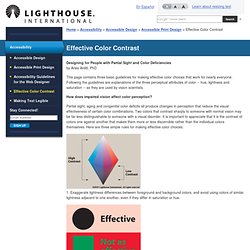
The concept of “module and program”—regular building blocks of repeating patterns that when joined together produce an organized whole—permeates our information-age lives even more thoroughly than it did the lives of our ancestors in the industrial revolution launched by manufacturing innovators like Eli Whitney. As the industrial world grew more complex, document designers in the mid-1800s began to adapt modular programs to newspaper, catalog, financial, and other publications, and modern page layout was born. International - Effective Color Contrast. Home > Accessibility > Accessible Design > Accessible Print Design > Effective Color Contrast Designing for People with Partial Sight and Color Deficiencies by Aries Arditi, PhD This page contains three basic guidelines for making effective color choices that work for nearly everyone.
Visual09. Using Visual Aids. Visual aids can powerfully help the effectiveness of a speech.
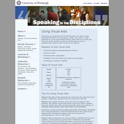
Many speeches benefit from having objects, images, key quotes, or data presented in a clear and dramatic fashion. Different types of visual aids. There are many different types of visual aids.
The following advice will help you make the most of those most commonly used. PowerPoint (or equivalent) Microsoft PowerPoint is probably now the most commonly used form of visual aid. Used well, it can really help you in your presentation; used badly, however, it can have the opposite effect. The general principles are: Overhead projector slides/transparencies Overhead projector slides/transparencies are displayed on the overhead projector (OHP) - a very useful tool found in most lecture and seminar rooms. Pre-prepared slides : these can be words or images either hand written/drawn or produced on a computer;spontaneously produced slides: these can be written as you speak to illustrate your points or to record comments from the audience;a mixture of each: try adding to pre-prepared slides when making your presentation to show movement, highlight change or signal detailed interrelationships.
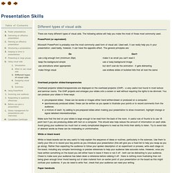
White or black board Paper handouts Flip chart. ACRL Visual Literacy Competency Standards for Higher Education. Approved by the ACRL Board of Directors, October 2011 Introduction The importance of images and visual media in contemporary culture is changing what it means to be literate in the 21st century.
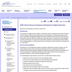
Today's society is highly visual, and visual imagery is no longer supplemental to other forms of information. New digital technologies have made it possible for almost anyone to create and share visual media. Yet the pervasiveness of images and visual media does not necessarily mean that individuals are able to critically view, use, and produce visual content. Visual%20Literacy.