

Toyota Icons Case Study – SoftFacade. The Visual Direction We strived for a photorealistic appearance, keeping a symbolic and consistent look across the entire set. The Process Before proceeding with rendering, we collaborated with the Saatchi LA team to get the metaphors just right. Maintenance Check the Manual Add a Vehicle Add Toyota Avensis Step by Step Starting with rough sketches, we painstakingly crafted each icon in 3D before rendering the final versions in Photoshop.
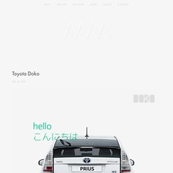
Icon options for 404 Page. The Next Microsoft - journal - minimally minimal. Toyota Doko - journal - minimally minimal. *Sponsored by Fujitsu, designed in partnership with Jaewon Hwang.
Broadway.com iPad App Case Study. Mentaway Logo Design Case Study. A few weeks ago my brother Eduardo Sasso showed me an idea he had for a web service that would be perfect for those who travel a lot or simply want to keep track of their adventures when they are away from their places.
I loved the concept and I joined him along side with Gisele Muller and Fabiano Meneghetti to make that app become real. The name was already chosen, Mentaway. Talking to my brother and Gisele, the creators of the whole idea, they gave me some insights on how they see the service, the goals and philosophy behind it. My role would be come up with the design. The first thing I did was list some keywords: Traveling Map Route Compass Direction Away Pinpoint I started looking for compass, map and direction images. First concept: Lettering and Arrow. The first concept I explored was using an arrow in the lettering. After sketching I went to the computer and tried to come up with something based on those ideas.
Second concept: Compass and direction sign. Website & Blog Logo Design - Process & Tips. Posted on 09'09 Sep Posted on September 9, 2009 along with 43 JUST™ Creative Comments I’ve recently had the pleasure of designing the A-List Blogging Bootcamps logo for Mary Jaksch of Write To Done and Leo Babauta of Zen Habits and in this article I will guide you through my design process of creating the logo as seen above.
This article was originally written for those enrolled in the A-List Blogging Bootcamp and has been edited for display on Just Creative Design. A Brief Introduction A-List Blogging Bootcamp is a website that offers series of short, live, online training courses for bloggers. For more information, please check out the A-List Blogging Bootcamps website. Logo Design Process for Just Creative Design’s Award Winning Logo. Posted on 24'08 Apr Posted on April 24, 2008 along with 169 JUST™ Creative Comments In this article I will talk about how I came to the name for my freelancing business ‘Just Creative Design’ and also the logo design process that I used to design the award winning logo that you see above.
This logo has won 3 major awards: This logo also appears in these publications: The process I used was somewhat disjointed and a very long one at that, mainly because I was designing for myself and I had no idea what ‘brand’ I was after, but this is it. Enjoy. What will be my business name? Believe it or not but this was one of the hardest parts of the process. I actually got very mixed feedback about this name ‘JackCass Productions’. Ok, so now I had the problem of choosing whether to brand myself as my name ‘Jacob Cass’ or another name.
Sketches From these sketches I had the idea of trying to make the initials JCD into a pencil and after a bit of experimenting I got it to work. Illustrator Font Change Colour. Henri Ehrhart. Operating for more than 50 years, Henri Ehrhart is a French wine producer in the Alsace region.
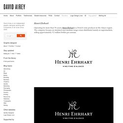
The company focuses on standard and medium range wines distributed mainly in supermarkets, selling approximately 3.2 million bottles per annum. Logo Design Process and Walkthrough for Vivid Ways. This post was originally published in 2009 The tips and techniques explained may be outdated.

I recently finished up a project with Scott McIntyre of Vivid Ways and Jon Phillip of Spyre Studios. My part in the project was to work on a new logo design for the Vivid Ways website and brand. Here’s my design process and a walkthrough of how the final logo is created in Adobe Illustrator. Vivid Ways is a new blog focusing on the topic of personal development and colourful living, it aims to inspire and encourage readers through ideas and tips on how to live an amazing life. Broadway.com iPad App Case Study.
FITC Logo Redesign Process by James White. At FITC Toronto in May of this year, Shawn Pucknell , FITC’s director approached James White to develop the creative for the following year's event, FITC Toronto 2012. “I've spoken at FITC twice so far and being a huge fan of the event and the entire crew behind it, I jumped at the opportunity to work with my friends,” said White. With creative freedom to develop the bits and pieces needed to promote and showcase at the event next year, James started looking at everything including the FITC identity which, at the time, he had no idea would be used. Here we go... Creative Brief “Those bums didn't even give me one.
Getting Started.