
Establishing geek cred since 1305712800. Listen to bootstrap checkbox being checked. Use CSS background:rbga to Darken Background Photos For Improved UX - Ryan Hayes. If you’ve been to any new websites lately, you’ll know that parallax scrolling and large background images are incredibly popular right now.
They’re great because they are able to help better tell stories, with big, gorgeous photos on the background and relevant text in the foreground overlaying those images as you scroll. In addition, responsive design means that the text overlaying these photos can move around. One of the challenges in this is that you’re likely to run into an issue where you have the text the same color as the image behind it.
Multiple Columns Layout (Magazine-alike) With CSS3. In general, people will lose track when reading extremely long content.
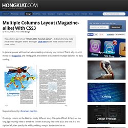
That is why, in print media like magazines and newspapers, the content is divided into multiple columns for easy reading. Magazine layout by: Ronel van Heerden. Multiple Columns Layout (Magazine-alike) With CSS3. Adding a Background Image to Your Joomla Articles. Here's how you can achieve this In this tutorial we are going to show you how to add a background image to an article on your website with some CSS code.
How to show Page Loading image/div/text until the page has finished loading/rendering.
Php - How can I speed up image load time in my web site? Prevent Long URL's From Breaking Out of Container. Or any long bit of text, really.
Css - How to automatically crop and center an image. CSS media queries - Web developer guide. Media queries are useful when you want to apply CSS styles depending on a device's general type (such as print vs. screen), specific characteristics (such as the width of the browser viewport), or environment (such as ambient light conditions).
With the huge variety of internet-connected devices available today, media queries are a vital tool for building websites and apps that are robust enough to work on whatever hardware your users have. Media types describe the general category of a given device. CSS Tools: Reset CSS. The goal of a reset stylesheet is to reduce browser inconsistencies in things like default line heights, margins and font sizes of headings, and so on.
The general reasoning behind this was discussed in a May 2007 post, if you're interested. Reset styles quite often appear in CSS frameworks, and the original "meyerweb reset" found its way into Blueprint, among others. The reset styles given here are intentionally very generic. How to create an adaptive layout with CSS Grid. It goes without saying that web developers have a lot of choices when it comes to laying out their webpages.
Ensuring your layout can adapt to different devices, orientations, and screen sizes an important consideration as you decide which methods to use. Grid layout is a new layout method that enables you to divide space for major regions of a webpage based on either a fixed amount, the available space within the browser window, or a combination of both. Because Grid layout enables you to align elements into columns and rows but has no content structure, it also enables scenarios—like the one described in this article—that are either not possible or are very difficult to achieve with HTML or Cascading Style Sheets (CSS) tables.
How to Create a Modal Popup in Foundation 5. 11 Steps to a Perfect Logo. Spanish industrial designer Borja Acosta de Vizcaino has created a simple guide that teaches readers how to create the perfect logo in 11 steps.
65 Beautiful Fonts You Can Download For Free. Freebie 65 Beautiful Fonts You Can Download For Free by Alex on Aug 9, 2012 • 9:43 am 17 Comments There are so many free fonts all around the web these days and sometimes it makes me think is their any really point purchasing fonts.
Easily Remove Image Backgrounds Online - ClippingMagic.
In Search of the Holy Grail. I’m sorry.
Really. I didn’t name it. I don’t mean to overstate its importance or trivialize the other and rather weightier Holy Grails. Article Continues Below. Strong Layout Systems by Eric Meyer. Eric is at An Event Apart in Atlanta talking about Strong Layout Systems. Following on from Brother Jeffrey’s presentation, he begins with a reading… In the beginning Sir Tim created the server and the browser. And the web was without form. And the face of Tim moved over the web. Generate High Quality Favicon.ico - ConsultSarath.com. A favicon (short for favorites icon), also known as a website icon, shortcut icon, url icon, or bookmark icon is a 16×16, 32×32 or 64×64 pixel square icon associated with a particular website or webpage. A web designer can create such an icon and install it into a website (or webpage) by several means, and most graphical web browsers will then make use of it. Browsers that provide favicon support typically display a page's favicon in the browser's address bar and next to the page's name in a list of bookmarks.
Browsers that support a tabbed document interface typically show a page's favicon next to the page's title on the tab. Some programs allow the user to select an icon of his own from the hard drive and associate it with a website. HTML5 header Element. The HTML5 header element is used to semantically mark the header section of a page, or of individual parts of the page. An Introduction to Meta Viewport and @viewport. Introduction Support for the viewport meta tag in Opera’s mobile products has been around for quite some time, and from Opera Mobile 11 onward, we have made our viewport implementation more robust, added support for new mechanisms to deal with different screen densities, and included an implementation of our own CSS @viewport rule proposal.
In addition, Opera Mini 6 and later now also comes with basic support for the viewport meta tag. So, what better time than now to give you an introduction to the various viewport-related mechanisms you can use to optimize your site for mobile? Let’s get started! Web page handling by mobile browsers Recent generations of mobile browsers can render full web pages without a problem and scale them so they fit nicely inside the phone browser’s visible screen area or viewport — the user then can zoom in on areas of interest and pan around on the page using touch, keypad, trackball or other input, depending on the phone model.
Viewport syntax Specific width. CSS - media queries. "Responsive Design" is the strategy of making a site that "responds" to the browser and device that it is being shown on... by looking awesome no matter what. Media queries are the most powerful tool for doing this. Let's take our layout that uses percent widths and have it display in one column when the browser is too small to fit the menu in the sidebar: Learn CSS Layout. CSS media queries - Web developer guide.
Improve Website Load Times Using Progressive JPEGS. Changing the viewport meta tag with JavaScript. 07 March, 2014 by Tom Elliott Responsive Web Design, let’s face it, can be tricky. There are essentially two basic elements to make responsive websites work: CSS media queries, that change the styling of your site at different browser sizes using breakpoints and the viewport meta tag. Without the viewport meta tag and even if your site uses CSS media queries, most devices will resize a website to the page to a standardish size of 900-1000 pixels, a common resolution for many fixed width websites.
Most responsive sites usually use the below standard viewport meta tag, with width=device-width. This tells the device that the page is as wide as the devices ‘logical resolution’, at a scale of 100%. The Return of the Progressive JPEG. Make a Footer Stick to the Bottom of the Page. Retina Favicons. Thomas Fuchs needs no introduction. I've looked up to Thomas' animation artistry since his Prototype/script.aculo.us days. He's more recently created Zepto.js, a micro multipurpose library for desktop and mobile devices.
How to Add Favicon.Ico to Your Website: 7 Steps. WebKit HTML5 Search Inputs. One of the new types of inputs in HTML5 is search. It does absolutely nothing in most browsers. It just behaves like a text input. Change the color of an icon with Gimp. Fairly often, I run across the perfect icon that I need for a website, but it’s just the wrong color. I want to keep the nice blending to the background of the icon around the edges, the shape and everything that makes the icon look spiffy. 10 Footer Design Tutorials. December 22nd, 2011. 10 Great Single Long-Page Website Designs - Apt Design. Designing Search: Results Pages.