
Negative space logos. It’s hard to beat a clever use of negative space.
Here are 35 or so logos that use white space well, along with the designers/agencies responsible. A.G. Low Construction logo By Rebecca Low Martin Newcombe Property Maintenance logo By buddy Nexcite logo By AmoreVia Blair Thomson American Institute of Architects Center logo By Pentagram Ogden Plumbing logo By Astuteo WWF By Sir Peter Scott, modified by Landor FreemanWhite logo By Malcolm Grear Designers The Brand Union logo By The Brand Union Egg n Spoon logo (same day couriers) By Thoughtful Human logo By Social UK Dolphin House logo By Ico Design Eaton logo By Lippincott (thanks, Brendan) Elefont logo By Logo Motive Designs USA Network logo By Sean Serio CultureBus logo By Pentagram Carrefour logo Original design examined by Miles Newlyn (thanks Rianna) Henri Ehrhart monogram (shameless) View the design process on David Airey dot com Sinkit logo By smashLAB Guild of Food Writers logo By 300million ED logo By Gianni Bortolotti Conception logo By The Chase.
Iconmonstr. Blog – Golden Ratio in logo designs. Golden Ratio in logo designs.
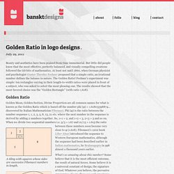
Beauty and aesthetics have been praised from time immemorial. But little did people know that the most effective, perfectly balanced, and visually compelling creations followed the tid-bits of mathematics. At least not until 1860, when German physicist and psychologist Gustav Theodor Fechner proposed that a simple ratio, an irrational number defines the balance in nature. The Golden Ratio! Fechner’s experiment was simple: ten rectangles varying in their length-to-width ratios were placed in front of a subject, who was asked to select the most pleasing one. Golden Ratio Golden Mean, Golden Section, Divine Proportion are all common names for what is known as the Golden Ratio which is based off the number phi (φ) = 1.61803398874… discovered by Italian Mathematician Fibonacci.
The ratio between these numbers soon become very close to φ (1.618). What’s so amazing about this number? Logos with golden ratio National Geographic Pepsi Apple iCloud Toyota Grupo Boticário. 23 Brilliant Logos With Hidden Messages. Big Ten Big Ten is an academic union which was founded in the year 1896.

Until 1990, this union consisted of 10 universities, but in June 1990 Pennsylvania State University was added. They didn’t want to change their name, so they added the number 11 to the logo. Amazon.com This logo doesn’t seem to hide much at first sight, but it gives you a little insight in the philosophy behind the brand. Eighty-20 Eighty-20 is a small consulting firm. Fedex This is probably one of the best known logos with a hidden meaning. Continental Continental is a manufacturer of tyres. Toblerone Toblerone is a chocolate-company from Bern, Switzerland. Baskin Robins The old logo of Baskin Robbins had the number 31 with an arc above it. Sony Vaio Sony Vaio is a well known brand of laptops. Eight I really love this logo: every letter is made of the number 8.
Carrefour Carrefour is one of the biggest European retailers, and it’s also French for “crossroads”. Roxy Unilever Northwest Airlines Milwaukee Brewers. Design Daily: Are Minimalist Brands the Future? - Design. When these "minimalist brands" started popping up on the A2591 blog a few weeks ago, they seemed like a fun design exercise.
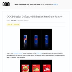
The designers simply reduced familiar packaging to its bare essentials, taking colors and graphics away in a dramatic, three-step reveal. Some of the brands look especially sharp when reduced to a bare-bones execution; others are reduced to an almost unrecognizable state without their cascading milk falls or sides of sliced fruit. These seem like products stocked in some fantasyland grocery store patronized exclusively by anal-retentive designers, but as I started to look at some recent rebranding stories, I'd argue that the minimal trend is actually infiltrating the market faster than we think. Remember the outcry over the new Pepsi branding?
Compared to a few years ago, heck, even compared to the other brands in its flock, that's about as streamlined of a design as you could get. Disclaimer: GOOD partners with PepsiCo on the Refresh Project.