
Deux siècles de Propagande en 160 affiches. Petit dossier du jour, plein de poussières parce que retro au possible.

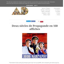
Vous connaissez mon amour pour les pubs vintage et autres vieilleries publicitaires, présentes dans de nombreux articles, elles ont aujourd'hui le droit à un article entier. Après moultes réflexions, l'article d'aujourd'hui concerne tout un pan de l'histoire mondiale en deux siècles. Je cite : la propagande. En soit, ce n'est pas de la publicité pure et dure, mais ce fut de loin le modèle de communication leplus utilisé au XIXème siècle que ce soit en période de guerre comme de stabilité politique. Voici donc une petite rétrospective de la propagande comme vous ne l'avez jamais vu, pays par pays.La Corée du Nord : Bastion de la propagande actuelle Dernière dictature communiste asiatique, la Corée du Nord est de loin le pays qui maîtrise le plus la propagande.
La Paysanne, heureuse dans ses champs Les verts pâturages de la Corée du Nord (Actuellement en État de Famine) Le sourire na-tu-rel Lenine mystifié L'URSS Juive. Design - Architecture - Blog / Magazine / Webzine - Inspiration / Tendance. Voici un extrait du travail personnel de Jan Kriwol, photographe et artiste numérique polonais. Article précédent Article suivant. Design - Architecture - Blog / Magazine / Webzine - Inspiration / Tendance. Carte Pantone silver 877c (christmas) Unveiling the process. How awesome is that long shot of a studio desk?

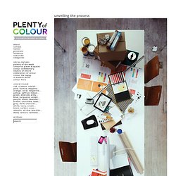
Thin slices of Mac computers, handwritten notes, strange snacks and Pantone guides – it’s design studio heaven. Oneighty Creative, a design studio in the UK, directed a series of shots in the hopes of “unveiling the process” of creativity and brand creation to their clients (as well as a piece of self-promotion). Photographed beautifully by Adrian Ray, I think that fantastic long photograph and the additional images more than capture the process, tools, steps and overall beauty of studio life. There is no design key on computers!
Oh and Oneighty had a great description of the shot and goal: “[a] visualised physical timeline of our brand process which creates a sort of mad hatter’s tea party feel”. Sprucing up gift certificates {colour commentary} This is probably the longest I have gone without posting since I started plenty of colour 10 months ago!

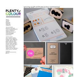
Some decidedly uncolourful things have sprung up but have no fear, I will be posting an avalanche of hue-filled items soon. There are few seasons as colour-inspiring as Christmas. In the meantime and if you are interested in retail branding, take a peek at a post I wrote for Rena Tom’s website on the topic of gift certificates. So many shops and makers use boring plastic swipe cards or fill-in templates which is a missed creative and branding opportunity in my mind. There are a million small but impactful details that can make the buyer feel like their purchase is important to the seller and make the recipient feel like they got a really special gift.
Design - Architecture - Blog / Magazine / Webzine - Inspiration / Tendance. Le studio créatif britannique Six a conçu l’identité visuelle globale pour dropyx, un réseau allemand pour créatifs. A Showcase of Minimal Workstations to Inspire You. The basic idea of minimalism that less is more can also be applied to your workstation, and the result is really inspiring.

Clean, minimal and beautiful stations with exactly those things you need to work, nothing more, nothing less. The spaces are simple: desks, a nice chair, your computer and something to give the space a nice personality, it’s all about keeping the space clean, really inspiring. About the Author Gisele Muller loves communication, technology, web, design, movies, gastronomy and creativity. Web writer, portuguese/english translator and co founder of @refilmagem & @mentaway Twitter: @gismullr Related Posts 244 shares 11 Inspiring Examples of Textures and Patterns in Web Design Here at WDL we like to browse the web to find inspiring websites to show our readers.
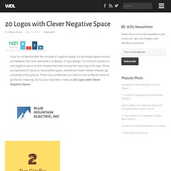
Read More 427 shares Colorful Logos for Your Inspiration We’ve rounded up some examples of logo designs that make excellent use of color. 20 Logos with Clever Negative Space. If you’re not familiar with the concept of negative space, it’s the empty space around and between the main elements in a design.

In logo design, it’s common practice to use negative space to form shapes that help convey the meaning of the logo. Since our eyes tend to focus on the positive space, sometimes these “hidden shapes” go unnoticed at first glance. That’s why sometimes you have to look a little bit closer to get the full meaning. So for your inspiration, here are 20 Logos with Clever Negative Space. About the Author Henry Jones is a web developer, designer, and entrepreneur with over 14 years of experience. Related Posts 476 shares Colorful Logos for Your Inspiration We’ve rounded up some examples of logo designs that make excellent use of color.
Visual Idntity of ADC Young Guns 8 on the Behance Network. Symbiosis on the Behance Network. Analogiques Laboratoire de recherche. Facebook Ben Barry sur comment pirater votre travail.