
Html - Make div 100% height of browser window. Get down! How to keep footers at the bottom of the page. By Matthew James Taylor on 10 November 2007 When an HTML page contains a small amount of content, the footer can sometimes sit halfway up the page leaving a blank space underneath.
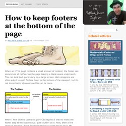
This can look bad, particularly on a large screen. Web designers are often asked to push footers down to the bottom of the viewport, but it's not immediately obvious how this can be done. When I first ditched tables for pure CSS layouts I tried to make the footer stay at the bottom but I just couldn't do it. Now, after a few years of practice I have finally figured out a neat way to do it. See it in action: View my demo with the footer at the bottom The main features Works in all modern, standards compliant browsersCompatible browsers: Firefox (Mac & PC), Safari (Mac & PC), Internet Explorer 7, 6 & 5.5, Opera and Netscape 8Fails gracefully on older browsersOlder non-standards compliant browsers position the footer under the content as per normal. CSS3 Conditional Statements.
In times gone by a web designer had only the properties and values in his head to style a website.
Nowadays however, things are a little more complex, and they’re about to get even more so with the CSS Working Group’s conditional CSS statements. This article is about new CSS which may not be supported in every browser! Be careful. I say almost introductory because you might have heard of these new things called media queries. 25 CSS best practices we follow at Innofied.
Dilbert is probably right – if everyone follows the best practices then it may become mediocre.
But the fact is: it rarely happens. Only a small number of developers follow good practices while others either aren’t aware of such rules at all or they don’t feel like applying them.
The Adjacent-Sibling Selector. Web Review July 2000 As previous articles in this series have shown, CSS has some interesting new selectors.
Between the universal selector and the child selector, it's possible to construct selectors which would be next to impossible using traditional CSS1-style selectors. Let's Talk About CSS Preprocessors. October 5, 2014 4:49 am Callie Kavourgias You might be just getting in to web design and hearing the words “CSS Preprocessor” an awful lot.
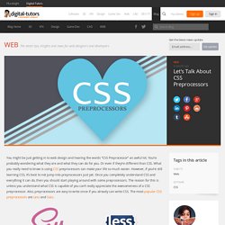
You’re probably wondering what they are and what they can do for you. Or even if they’re different than CSS. What you really need to know is using CSS preprocessors can make […] Csstyle Clean, Simple Styling for the Web. CSS display:table-cell child width bug in Firefox and IE. While working with a grid of product images that could vary in height, I wanted to vertically align them in their respective containers.
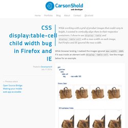
I chose to use display: table and display: table-cell with a max-width on each image, but Firefox and IE ignored the max-width. While browser testing, I realized the images ignored max-width: 100% if it was inside an element with display: table-cell. See the image below for an example. View the problem code in this JSFiddle. Try it in Chrome/Safari or Firefox/IE to see the differences. Since I develop in Chrome and was testing in IE9 at the time, I assumed it was a classic IE bug. 10.2 Content width: the ‘width’ property Percentage: Specifies a percentage width. Table cells, and CSS-defined table-cells, fit into the category of an element that lets its content determine the width. Good thing there is an easy fix. View the fix live in this JSFiddle. How Well Do You Understand CSS Positioning? When people are new to css layouts there’s a tendency to gravitate toward positioning.
Positioning seems like an easy concept to grasp. Quantity Queries for CSS. Don’t you just hate documentaries that don’t deliver?
They have enticing names like In Search of the Giant Squid, and tease you with shots of murky underwater shapes and excited scientists pointing far out to sea. Font Size Idea: px at the Root, rem for Components, em for Text Elements. Me, for the last year or so: "rem's are so cool!
I'm gonna size everything with them, that way I can adjust the font-size on the root element and everything will scale with it! " It was a nice dream. And it wasn't a disaster. 3D hover plane effect. Simple CSS-Only Row and Column Highlighting. It was a few years old, so I thought I'd just clean it up and post it here.
The trick is using huge pseudo elements on the <td>s, hidden by the table overflow You don't really know how big the table is from CSS, so just make the pseudo elements super tall with a negative top value of half of that. The negative z-index keeps it below the content. Switch Button #2. Responsive Table.
Media Queries: A Look at Different Media Features. If you have worked with responsive design, you have probably used media queries. Media queries are a clean and simple way to create responsive websites using CSS. They work by allowing you to change the style of the page when the user’s screen is a certain size. Media Queries: A Look at Different Media Features. Pure CSS Off-screen Navigation Menu. Hamburger menu, drawer menu, off-canvas menu: Whatever you call it, hiding a website’s primary navigation just off screen is becoming a ubiquitous pattern in responsive web design. More and more sites feature a fixed-position icon that, when tapped, pushes the entire site to the side to reveal a hidden navigation menu.
While there are plenty of jQuery plugins that will create this effect for you, it’s actually pretty easy to achieve without using any JavaScript at all. This article will show you how to make a simple version of the off-canvas menu and sliding effect using only CSS. Before we get started, I’d like to make a note that using this method for creating the drawer menu means your site’s navigation will always be in a drawer, regardless of viewport size. If you only want the drawer menu on smaller screens, you’ll have to use some JavaScript to manipulate the DOM order or use some funky CSS to make the menu look right on larger screens. You Can Do That With CSS? Awhile back, I published an article on how to mimic CoDrops’ Morphing Menu Button demo. I then wrote a quick follow-up showing how to expand on the original demo to provide some additional JavaScript-like overlay functionality. That was kind of the start of it all…
Media Queries: A Look at Different Media Features. Pure CSS Off-screen Navigation Menu. Fluid Width Video. IN A WORLD of responsive and fluid layouts on the web ONE MEDIA TYPE stands in the way of perfect harmony: video. There are lots of ways in which video can be displayed on your site. You might be self hosting the video and presenting it via the HTML5 <video> tag. You might be using YouTube or Vimeo which provides <iframe> code to display videos.
You might be using Viddler or Blip.tv which provide nested object/embed tags to display a Flash player. In each of these scenarios, it is very common for a static width and height to be declared. CSS: Elastic Videos. While I was coding the Elemin Theme (a responsive WordPress theme that I recently designed), one of the challenges that I faced was to make the embedded videos elastic. Using the max-width:100% and height:auto trick works with native HTML5 video tag, but it doesn't work with embed code using iframe or object tag. After hours of experimenting and Googling, I finally found a trick on how to achieve this. If you are creating a responsive design, this simple CSS trick will come in handy. View the final demo and resize your browser window to see it in action. View Demo Elastic Videos. CSS Gradients with Internet Explorer (IE6-10) Robby Leonardi. CSS3 rem units. Scout - Compass and Sass without all the hassle.
The Current Generation of CSS3 Selectors. After CSS 2.1, the W3C added a whole slew of new selectors to help us target elements in unique ways.