
Breakdowns. Open Access We believe in Open Access and the democratization of knowledge.
Unfortunately, world class educational materials are normally hidden behind payment systems or in expensive textbooks. UX Methods & Deliverables — Hints from the lazy bear. Side Drawer Navigation Could Cost Half Your User Engagement. Anthony Rose is co-founder and CTO of zeebox, the social network for TV.
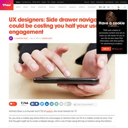
So, you have a mobile app where there are more pages or sections than can fit on a mobile screen at once. Your first thought might be to create a tabbed design, with a row of tabs along the top or buttons along the bottom. But wait… that extra row of tabs or buttons wastes a lot of valuable real estate on a small mobile display, so let’s not do that. Instead, let’s move the options into a side menu, or side drawer, as our Android team keep reminding me it’s called. If your mobile app has multiple views then I would be surprised if this subject has not been vigorously debated by your team: Persist all the navigation options on screen at all times so your users have clear visibility of all the main app views and single-click access to them.Or, free up screen real estate by moving the options into a side menu.
I thought it worth sharing our experience. Side navigation or Top navigation drawer: Usability vs. clean design. 10 Useful Techniques To Improve Your User Interface Designs. Advertisement Web design consists, for the most part, of interface design.
There are many techniques involved in crafting beautiful and functional interfaces. Here’s my collection of 10 that I think you’ll find useful in your work. They’re not related to any particular theme, but are rather a collection of techniques I use in my own projects. Without further ado, let’s get started. 1. Links (or anchors) are inline elements by default, which means that their clickable area spans only the height and width of the text. Obviously, the larger the clickable area is, the easier it is to click on the link because there is less of a chance of missing it. Make sure to also add a healthy dose of padding to the links, because converting a link into a block only affects its behavior and width; adding padding ensures that the link is high enough and has some room to breathe.
Novice vs. Expert Users. User interface design for beginners, intermediates or experts? Dear visitor: Please keep in mind that this post is originally from Vibor Cipan's personal blog, the name of which we eventually adopted as our company name together with its conveniently-named URL.

We're keeping the posts on our official company blog for all the subscribers to Vibor's blog who have read and commented on his previous posts. Please be aware that this post represents Vibor's personal thinking few years ago and doesn't necessarily represent the opinions of the UX Passion as a company today.
As user experience designers we are regularly in situations where our design decisions will have a significant effect on the end users of the web sites, applications or other user interfaces or services we design. Apart from the need to understand the business case and idea, probably the most important thing is to understand who are the users of our interfaces? Introduction One of the biggest challenges is: how to address the needs and requirements of all those users? Further reading. UI-Patterns.com. 15 Tips for Designing Terrific Tables.
Tables of information are boring.
In a sense, they’re meant to be that way. Les méthodes d’inspection des interfaces. J’ai rédigé initialement cette définition pour le petit dictionnaire du design numérique. Design, communication, nouvelles technologies et toutes ces sortes de choses. 15 Free Ebooks about User Experience and Interface Design » paul olyslager.
Designing UX for apps. User Interface Design Libraries for Keynote, PowerPoint and OpenOffice. Save 10 hours on your next app design project, GUARANTEED!
When you buy a bundle, you get all 9 templates for 50% off the total price, and you receive all future updates for free. Each template includes both Keynote and PowerPoint files. 100% Money Back Guarantee Try Keynotopia ABSOLUTELY RISK FREE. UX, Startups et Cie. So you wanna be a user experience designer — Step 1: Resources. Want to pursue a career in UX, but don’t know where to start?
When you Learn the Ropes with Whitney Hess, you get in-depth training on principles, process, methods and techniques you need to excel in User Experience. Learn more > Pretty much every single day I get a tweet, email, or in person request for information on how to get started in the field of user experience. I’ve recently had a few people reach out to me even asking me to mentor them throughout the process. Given that I often find myself repeating the same answers over and over again, I decided to put all of my resources in a single blog post so that folks could easily access a consolidated version of my advice. Interaction Design Foundation.
IHM, Ergonomie & expérience utilisateur. 10 blogs et sites sur l’ergonomie pour vous remettre à l’anglais. Free UX Sketching And Wireframing Templates For Mobile Projects. Today we are happy to release two printable UX sketching and wireframing templates, designed by Pixle81 for Smashing Magazine’s readers.
This article presents Outline, a set of sketching and wireframing papers for mobile platforms and Tapsize, a set of templates for checking optimal tap areas without a mobile device. Outline Outline is a set of 28 printable sketching and wireframing papers (in PDF) for seven mobile platforms: Android, BlackBerry, iOS (iPad and iPhone), Meego, Symbian, webOS, Windows Phone 7. The set consists of a few combinations, such as actual size, 10 devices fit to a page, and landscape layout. Note: Print the sheets at actual size (i.e. do not resize). As a bonus, Outline includes an Illustrator file displaying the mobile devices. Selling Usability to Your Manager. You're enthusiastic about usability and want to make it happen within your organisation. L'ergonomie dans la conception d'un formulaire. Introduction Le formulaire est l'un des moyens pour l'utilisateur d'envoyer des données, alors que son comportement classique sur le web consiste plutôt à recevoir des informations.
Cette notion entraîne des problématiques d'ergonomie autres que celles liées à la simple consultation de contenus. Cet article présente les standards d'ergonomie web pour la conception de formulaires et quelques recommandations à adapter à la spécificité de chaque situation. Les thématiques concernant les formulaires couvrent un large champ d'application, dans les domaines du logiciel et du web, pour le grand public ou les applications métiers, pour les novices ou les utilisateurs expérimentés. User Experience Deliverables. January 27, 2009 It's an exhilarating time for the user experience community.
Rising awareness of our value plus emerging technologies and transmedia trends have created conditions for a step change in our practice. As an information architect, I'm enjoying the new challenges immensely, even as they sweep me outside my comfort zone.