
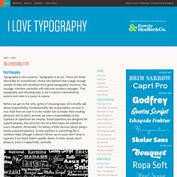
On Choosing Type. First Principles.
A Guide to Web Typography. The Basics: contrast, size, hierarchy, space. The Basics Typography for the Web has come a long way since Tim Berners-Lee flipped the switch in 1991.
Back in the days of IE 1.0, good web typography was something of an oxymoron. Today things are different. Not only do we have browsers that support images (gasp!) , but we have the opportunity to make our web pages come to life through great typography. First, it’s worth noting that Typography is not just about choosing a font, or even distinguishing one typeface from another. Terminology. Typography tips for graphic design students. Publishing Glossary. Choose a basic leading that suits the typeface, text and measure. “Vertical space is metered in a different way [to horizontal space].
You must choose not only the overall measure – the depth of the column or page – but also a basic rhythmical unit. This unit is the leading, which is the distance from one baseline to the next.” Leading (pronounced “ledding”) is so called because, in mechanical presses, strips of lead are placed between lines of type to space the lines apart. Leading is achieved in CSS through the line-height property. For example 12 point text can be given 3 points of lead in the following manner: However that example is bad as line-height should never be applied using absolute units such as points or pixels.
Five simple steps to better typography. – April 13th, 2005 – Typography, I find, is still a bit of mystery to a lot of designers.
The kind of typography I’m talking about is not your typical “What font should I use” typography but rather your “knowing your hanging punctuation from your em-dash” typography. Call me a little bit purist but this bothers me. So, in an attempt to spread the word here’s the first of five simple steps to better typography. To kick it off, part one is about the Measure. Five simple steps to better typography - Part 5.
– May 18th, 2005 – The final part in this series, I’m glad to say is a little more cut and dry than the last in the series.
It’s more about historical typographic theory but with a simple, practical guide to ensuring a balanced use of typeface weights. Typeface weight, and the choice of weight, is perhaps one area of typography that to most designers is simply a matter of choice. That choice is dictated by answering a design problem which is aesthetically, or content, motivated. What many designers do not realise is that there are rules which should govern the choice of weight - a typographic pecking order - which when followed, aids the designer’s typesetting and can produce stunning results.
Solving the design problem Let’s start by addressing the root of the decision to set type in different weights - solving a design problem. An aesthetic problem. There may be other reasons as well, but I believe these are the main cause. Five simple steps to better typography - Part 2. – April 18th, 2005 – Hanging punctuation is an area of typographic design which has suffered at the hands of certain software products.
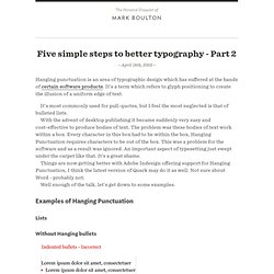
It’s a term which refers to glyph positioning to create the illusion of a uniform edge of text. It’s most commonly used for pull-quotes, but I feel the most neglected is that of bulleted lists. With the advent of desktop publishing it became suddenly very easy and cost-effective to produce bodies of text. The problem was these bodies of text work within a box. Things are now getting better with Adobe Indesign offering support for Hanging Punctuation, I think the latest version of Quark may do it as well. Well enough of the talk, let’s get down to some examples. Lists Without Hanging bullets A ranged left body of type is pretty much destroyed, aesthetically, when punctuation isn’t hung. With Hanging bullets With hanging punctuation the flow of text on the left hand side is uninterrupted.
Five simple steps to better typography - Part 3. – April 25th, 2005 – I’m pleased this series is turning out to be so popular and it’s somewhat confirmed what I suspected.
A bit of a thirst for simple typographic design theory. As I’ve been writing this series i’ve deluged by email and comments from people agreeing, disagreeing, asking for more information etc. What’s great is designers are thinking and talking about typography again. Designers are questioning typography and not just letting the font and the software do the work. Five simple steps to better typography - Part 4. – May 9th, 2005 – I’ve struggled a bit with the latest addition to this ‘simple steps’ typography series.
Mostly because it’s not so simple and it’s a bit more of a grey area than the previous three articles. Typographic hierarchy, put simply, is how different faces, weights and sizes of typefaces structure a document. Some of these hierarchical devices are well-established conventions, such as cross heads and folios, so I’m not going to touch on them in this post.