
Some CSS tricks; or what we do at our Naked Fridays — Frontend Babel. Our development department has a very nice tradition.
Every 2 weeks we hold Naked Friday; this is a little conference where we share interesting knowledge gotten during our work. As a result, we have a lot of such information by now and so we decided to publish it. Thus, let me introduce a set of fascinating CSS and HTML tricks, which we hope are not yet well-known.
We will be happy if everyone learn something new! The often solution to this problem is to put a block into 50% position horizontally and vertically with top and left properties and then shift it back with negative margins. 7 Things You Didn't Know You Could Do with CSS. CSS and JavaScript, believe it or not, are starting to overlap as CSS adds more functionality.
When I wrote 5 Ways that CSS and JavaScript Interact That You May Not Know About, people were surprised at how CSS and JavaScript have come to overlap. Beautiful coloured gradients. Box Sizing. The "box model" in CSS works like this: width + padding + border = actual visible/rendered width of box height + padding + border = actual visible/rendered height of box It's a little weird, but you get used to it.
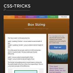
* { box-sizing: border-box } FTW - Paul Irish. One of my least favorite parts about layout with CSS is the relationship of width and padding.
You’re busy defining widths to match your grid or general column proportions, then down the line you start to add in text, which necessitates defining padding for those boxes. And ‘lo and behold, you now are subtracting pixels from your original width so the box doesn’t expand. Ugh. If I say the width is 200px, gosh darn it, it’s gonna be a 200px wide box even if I have 20px of padding. So as you know, this is NOT how the box model has worked for the past ten years. CSS Selector Performance has changed! (For the better) Great articles, like Dave Hyatt’s Writing Efficient CSS, helped developers adapt to a rudimentary selector matching landscape. We learned from Steve Souders (and others) that selectors match from right to left, and that certain selectors were particularly arduous to match and should best be avoided.
For example, we were told that descendant selectors were slow, especially when the right-most selector matched many elements on the page. All this was fantastic information when we had none, but as it turns out, times have changed. Thanks to some amazing work by Antti Koivisto there are many selectors we don’t need to worry about anymore. 10 Useful CSS Snippets For Web Developers. CSS is the underlying language that gives websites its look.
Although CSS is a straightforward language and easy to learn, it can be difficult to harness in some cases. Nothing to fear, there are workarounds that you can find online, and here are but just 10 handy ones that you can use. If you want to wrap long text, autoadjust the width of your table columns, or create a simple loading state without the use of Gifs, we have the snippets that will deliver, and more. Recommended Reading: 50 Useful CSS Snippets Every Designer Should Have 1. Topcoat. No más problemas con los "em", puedes utilizar "rem" Blueprints. Flexible Google-style loader with CSS. So, for a while I had noticed the nice sutble loader Google apps use and I was wondering if it would be easy to make with CSS and CSS animations: Yesterday, I realised that you can get this effect by increasing border size until about the middle of the element, as long as the total width stays the same (by using box-sizing: border-box): However, as you can see above, after the midpoint, the border is not curved any more, so does not produce the desired effect.
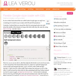
However, what if we split the background colour in half, and animated border-left until 50% of the width and then border-right from 50% of the width? That worked, but only gave us 25% of the effect. This is the finished result: Golden Forms - Responsive CSS3 Form Framework Preview. Susy: Responsive grids for Compass. All Susy3 API functions draw on the same shorthand syntax, which consists of two parts, seperated by the word of.
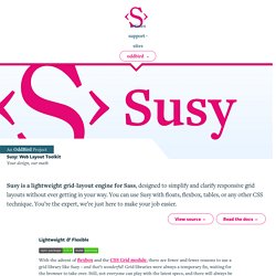
The first part describes a grid-spanwidth, location (if needed), and spread (in any order): Selectivizr - CSS3 pseudo-class and attribute selectors for IE 6-8. Discover the power of CSS3 selectors. UIkit. Absolute Horizontal And Vertical Centering In CSS. Rethinking Mobile Tutorials: Which Patterns Really Work?
Pattern libraries are a great source of inspiration and education for designers. But common practice doesn’t always equal best practice. In this post, we’ll look at why many common tutorial patterns are ineffective and how you can leverage game design principles to increase user engagement. After the release of the first edition of Mobile Design Pattern Gallery, Intuit asked me to speak with its mobile team.
I spoke at a high level about the value of patterns across industries (fashion, architecture, software and others) and how they are a useful teaching tool. Creative CSS3 Animation Menus. Being in the mood for experimenting with CSS3, I'd like to show you some creative menu hover effects in today's tutorial.

The idea is to have a simple composition of elements, an icon, a main title and a secondary title, that will be animated on hover using only CSS transitions and animations. A Collection of Page Transitions. A showcase collection of various page transition effects using CSS animations.
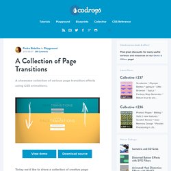
View demo Download source Today we’d like to share a collection of creative page transitions with you. We’ve put together a couple of animations that could be applied to “pages” for creating interesting navigation effects when revealing a new page. While some effects are very simplistic, i.e. a simple slide movement, others make use of perspective and 3d transforms to create some depth and dynamics. Nifty Modal Window Effects. A set of experimental modal window appearance effects with CSS transitions and animations. View demo Download source Today we want to share some ideas for modal window effects with you. There are infinite possibilities for transitioning the appearance of a dialog box and we wanted to provide some ideas of how to show dialog boxes and provide some inspiration. The idea is to have a trigger button (or any element) which will make a modal window appear on click using a simple transition (or animation). Please note: this only works as intended in browsers that support the respective CSS properties.
Caption Hover Effects. A tutorial on how to create some subtle and modern caption hover effects. View demo Download source Today we want to show you how to create some simple, yet stylish hover effects for image captions. The idea is to have a grid of figures and apply a hover effect to the items which will reveal a caption with the title, author and a link button. For some of the effects we will use 3D transforms. The aim is to keep the effects subtle and provide inspiration for many different variations. Caption Hover Effects - Demo 7. Previous Demo Back to the Codrops Article.
Simple Icon Hover Effects. Going Nuts with CSS Transitions. I’m going to show you how CSS 3 transforms and WebKit transitions can add zing to the way you present images on your site. Laying the foundations First we are going to make our images look like mini polaroids with captions. Here’s the markup: Creating Content Tabs with Pure CSS. As CSS3 has started gaining more popularity and more browsers are starting to support it, many common interactions that you would expect from a website that were created using JavaScript are now being replaced by pure CSS solutions.
Today I’ll show you how to create an animated content tab using only CSS. Disclaimer: The purpose of this post is to show you the possibilities of CSS3. The content may or may not be practical to use in real life. Creating Content Tabs with Pure CSS First off, in order to replicate the functionality of JavaScript, we need to find a way to let the CSS know that the user has clicked the button.
10 Simple and Effective CSS Tricks for Web Designers. Creative Button Styles. Topcoat. Designing CSS Layouts With Flexbox Is As Easy As Pie. Advertisement This article is an updated excerpt of the chapter “Restyle, Recode, Reimagine With CSS3″ from our Smashing Book #3, written by Lea Verou and David Storey. — Ed. Ultimate CSS Gradient Generator - ColorZilla.com.
2008 vs. 2013: Reverse-Engineering the Redesign of kadavy.net. Transiciones - Utilidades [Xitrus - Pedro Gutiérrez] Animaciones - Utilidades [Xitrus - Pedro Gutiérrez] Esta documentación explica el uso de las animaciones de CSS3 Las animaciones de son la herramienta perfecta para animar cualquier elemento, para crear un efecto puntual o para crear un movimiento continuo de algún elemento (es decir, se pueden mover varias elementos de forma continuada pudiendo crear animaciones que antes solo se veían en o con ). Las animaciones usan el parámetro en , para su uso estándar, por lo que es más correcto (por cuestiones de compatibilidad) también incluir el parámetro de cada navegador. La mayoría de los navegadores son compatible, pero no (en su versión 9). Nunca uses texto en mayúsculas en tu código en Duopixel. Entre los maquetadores novatos, un error muy común hacer cosas como esto: Si decides cambiar el formato, tendrás que cambiar cada uno de tus textos manualmente.
CSS3 Tools and Snippets. On/Off Flipswitch HTML5/CSS3 Generator - Proto.io. Cómo hacer CSS3 compatible con Internet Explorer 6, 7 y 8. Quienes se niegan al avance de HTML5 y CSS3 dicen "no es compatible". Pero este es el año 2011 y gracias a los hackers de la web, es 100% posible hacer CSS3 compatible con IE6 y otros navegadores viejos.CSS3 es genial. En nuestro curso de CSS3 en linea aprendes, con 1 linea de código, a hacer bordes redondeados, sombras en cajas y textos, degradados, reflecciones, animaciones, transiciones, rotaciones, perspectivas, fondos multiples, selectores avanzados, entre muchas otras cosas. Con CSS3 haces el 20% del código que con CSS2, en la mitad del tiempo. CSS3 PIE: CSS3 decorations for IE. How to use RGBA() in IE. CSS Frame Generator. Sticky Footer, mantener el footer siempre abajo — Guiabreve.
Vertical Centering in CSS. La nueva guerra de navegadores del 2012 y los prefijos de CSS3. Less+ Framework. Aprende a Utilizar LESS, un Potente Preprocesador de CSS. Less CSS Compiler for Windows (lessc.exe) Sass Color Variables That Don’t Suck. CSS Preprocessors. Comparing SASS, LESS and Stylus. Stylus — expressive, robust, feature-rich CSS preprocessor.