
MarketWatch.com. Interactive News Graphics from the Guardian and the New York Times. Sciences Po - Accueil. Journaliste de données : data as storytelling. Par Hubert Guillaud le 09/07/10 | 8 commentaires | 4,135 lectures | Impression En préfiguration de Lift France, l’un des ateliers était consacré au Journalisme de données, cette “nouvelle” façon de faire du journalisme, en utilisant les données comme matériel pour construire de l’information.
Qu’est-ce que le data journalisme ? Quels sont les enjeux ? Décryptage, pour mieux comprendre la richesse du croisement entre données publiques et journalisme. Le journalisme de données, c’est l’exploitation de données sous des formats plus ou moins structurés, explique Lideth Rodriguez Solorzano, animatrice de l’atelier. Une narration visuelle Pour Caroline Goulard, qui vient de lancer le site ActuVisu (blog), un laboratoire étudiant de la visualisation de données, ce qui définit cette nouvelle profession ce sont les données. C’est un usage qui vient s’ajouter aux autres formes de journalisme, pour conceptualiser et visualiser l’information.
Les chiffres sont aussi subjectifs que les mots. Actuvisu Blog. Data journalism at the Guardian: what is it and how do we do it? Data journalism.
What is it and how is it changing? Photograph: Alamy Here's an interesting thing: data journalism is becoming part of the establishment. Not in an Oxbridge elite kind of way (although here's some data on that) but in the way it is becoming the industry standard. Two years ago, when we launched the Datablog, all this was new. Meanwhile every day brings newer and more innovative journalists into the field, and with them new skills and techniques. These are some of the threads from my recent talks I thought it would be good to put in one place - especially now we've got an honourable mention in the Knight Batten award for journalistic innovation. 1.
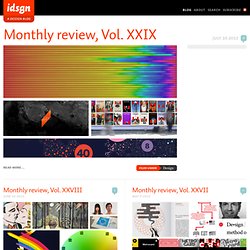
Florence Nightingale's 'coxcomb' diagram on mortality in the army Data journalism has been around as long as there's been data - certainly at least since Florence Nightingale's famous graphics and report into the conditions faced by British soldiers of 1858. The big difference? 2. 3. Sometimes. 4. Journalism in the Age of Data: A Video Report on Data Visualization by Geoff McGhee. [nytlabs] Project Cascade.
DataArt on BBC Backstage - Visualisations. OWNI, News, Augmented. ActuVisu. Visualisation de l'information. Faites parler les donn?es. Sense Networks. Ideas, issues, knowledge, data - visualized! Design and branding news. The creative community loses a multi-talented inspiration.
Designer, author, and filmmaker Hillman Curtis sadly passed away on April 18th after a three year battle with cancer. At only 51, Curtis leaves behind an impressive body of work which includes numerous award-winning short films and the feature-length film Ride, Rise, Road about David Byrne and Brian Eno. Curtis is perhaps best known for his popular Artist Series, which was ongoing from 2005 and featured designers like Milton Glaser, Paula Scher, and David Carson. His latest project, The Happy Film, is a feature-length film loosely based on designer Stefan Sagmeister’s book Things I Have Learned in My Life So Far. It was in production at the time of his death. Are unpaid internships evil, or is education payment enough?
Editor’s note: idsgn spans different points of view, and what follows is an opinion not neccesarily shared among our editorial team. SEAN FREEMAN: Thanks! DANA TANAMACHI: Thank you! Steve Jobs, 1955-2011 Webfonts! Election Forecasts - FiveThirtyEight Blog. Data Visualization. Journalisme de DONNEES. A visual exploration on mapping complex networks. Many Eyes. Data Visualization, Infographics, and Statistics.