
Elements of Learning Experience Design. The process of designing any sort of human experience, regardless of purpose or platform, is centered around reaching a desired outcome, ideally with as little fuss and as much joy as possible.

The purpose of an experience and the platform on which the experience takes place will vary: purchasing a plane ticket on a tablet to vacation, enjoying a musical performance in a theater, or learning to code in a classroom. Although each of these experiences require their own unique methods and frameworks, the elements that should be taken into consideration during the design process remain mostly the same. The best representation of those elements comes from Jesse James Garrett’s Elements of User Experience. While Garrett’s “elements” are most relevant to digital product design, I’ve been able to use them as a roadmap for developing learning experiences for adults. Strategy plane What are the needs and goals of your learners and your organization? Requirements plane Start with your objectives. The Lean UX Manifesto: Principle-Driven Design.
Advertisement My colleague Ajay and I have been working at incorporating lean UX at the enterprise level for over two years.

In studying it, I find that there’s a temptation to lay down rules, and if the rules aren’t followed… well, then, you can’t call it lean UX. At the end of the day, though, some lean UX is better than none. If you were told to finish off the following sentence, how would you do it? “You’re not practicing lean UX if…” I asked that very same question on Twitter, LinkedIn and email to some lean UX thinkers1 out there.
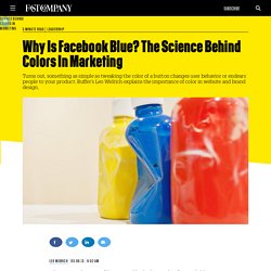
Let me give you a real-world example. The value of co-location is obvious. “Nothing is more effective than walking over to a colleague, showing some work, discussing, sketching, exchanging ideas, understanding facial expressions and body language, and reaching a resolution on a thorny topic.” I couldn’t agree more, but in one of my projects, it’s not a reality. From Ha Phan7: From Jeff Gothelf8: From Melissa Hui9: The Lean UX Manifesto I didn’t do it alone. Why Is Facebook Blue? The Science Behind Colors In Marketing. Editor's Note: This is one of the most-read leadership articles of 2013.

Click here to see the full list. Why is Facebook blue? According to The New Yorker, the reason is simple. It’s because Mark Zuckerberg is red-green color blind; blue is the color Mark can see the best. Not highly scientific, right? So how do colors really affect us, and what is the science of colors in marketing, really?
First: Can you recognize the online brands just based on color? Before we dive into the research, here are some awesome experiments that show you how powerful color alone really is. Example 1 (easy): Example 2 (easy): Example 3 (medium): Example 4 (hard): These awesome examples from YouTube designer Marc Hemeon, I think, show the real power of color more than any study could. How many were you able to guess? Which colors trigger which feeling for us? Being completely conscious about what color triggers us to think in which way isn’t always obvious.
Black: Green: Blue: So how did that experiment turn out? 5 big brands with brilliant ecommerce websites. In 2012, 53 per cent of Americans shopped on the web.

With more than half of the American population choosing to buy online, Forrester Research predicts that by 2016, more than $320 billion will be spent on online shopping. Online sales are becoming a norm and now, more than ever, ecommerce websites are facing tough competition. So what should you keep in mind when creating an ecommerce website that drives sales?
Read through our list of the best examples as we break down five ecommerce websites to tell you what they're doing right: 01. The best thing about Philips' ecommerce website is that there are added benefits for consumers shopping online - and these benefits are clearly visible. The site enables you to choose a product by category (which the sleek navigation makes very easy) and then customise the listings according to price or, interestingly, what is most environment-friendly. 02. 03. The design is sleek and smart and extremely user-friendly. 04. 05. Useful takeaways. FLUPA UX-Day 2012 - Luxe et e-commerce : quelle expérience utilisat...