
Color schemes - Adobe Color CC. FontShop. LEEC is a set of languages supported by Linotype’s Com fonts.
The languages included in this set are: Afrikaans, Albanian, Basque, Bosnian, Breton, Catalan, Cornish, Croatian, Czech, Dutch, English, Estonian, Faroese, Finnish, French, Frisian/Eastern, Frisian/Western, Friulian, Gaelic/Irish, Gaelic/Manx, Gaelic/Scots, Gagauz (Latin), Galician, German, Hungarian, Icelandic, Italian, Karelian, Ladin, Latvian, Lithuanian, Maltese, Modavian (Latin), Norwegian, Polish, Portuguese, Rheto-Romance, Romanian, Saami/Lule, Saami/Southern, Slovak, Slovenian, Sorbian/Lower, Sorbian/Upper, Spanish, Swedish, Turkish, Turkmen/Latin.
Free Stock Photos: 74 Best Sites To Find Awesome Free Images. Looking for the perfect stock photo for your blog or website?
Better Posters. All time favorite Color Palettes to improve design. The past couple weeks we’ve talked a lot about using colors!
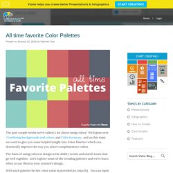
We’d gone over Combining backgrounds and colors, and Color harmony, and on this topic we want to give you some helpful insight into Color Palettes which can drastically improve the way you select complimentary colors. The basis of using colors in design is the ability to mix and match tones that go well together.
Let’s explore some of the trending palettes and we’re learn when to use them in your content’s design. With each palette the hex color value is provided (ex. b4ac01). You can input these values into any popular design tool’s color picker including Visme. This colorful palette brings up Mediterranean colors for a sober and elegant feel. An interview with information designer Martin Oberhäuser. Infographics post #5 : an interview with German designer Martin Oberhäuser, who lives and breathes infographics.
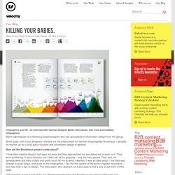
Martin Oberhäuser is a Hamburg-based designer who has specialised in information design from the get-go. When Jude, one of our designers, showed me his brilliant work for German encyclopedia Brockhaus, I decided to ring him up for a chat about his work and information design in general. How did the Brockhaus project come about? I think their creative director had seen my work and they approached me and asked me to work on it. They were publishing 11 print volumes, but I didn’t do all the graphics – only the hero pieces. Unfortunately, it was a one-off for me. How do you deal with data that’s not so easy to visualize? Visualising Data » Resources. Weekly Roundup of Web Design and Development Resources: August 1, 2014. Welcome to the weekly roundup of resources for web design and development.
Each week I gather some of my favorite resources I’ve learned about from Twitter and the blogs I read, and compile them in my weekly resource post. In this week’s roundup, you’ll learn eight tips for presenting your work to executives, find out how to reverse the circle of mistrust from users, discover how to make your responsive website load faster, and more. I’m at WordCamp Columbus this weekend, learning more about working with WordPress.
I’ll also be sharing what I know tomorrow when I speak about how to improve accessibility in your WordPress sites. Favorite Tweet User Experience Presenting Your Work to Executives: 8 Tips for UX Designers: I think every designer has war stories to share about presenting design ideas to executives. 7 Experts Reveal Their Secrets: How to Use Visual Content to Attract More Readers (Part I) Donna MoritzSocial media strategist, visual marketing specialist, blogger and speaker.

Www.amstat.org/sections/srms/proceedings/y2011/files/300784_64164.pdf. 14 Tools to Create Images for Your Blog Posts in Less than 5 Minutes. 14 Tools to Create Images for Your Blog Posts in Less than 5 Minutes A stock photo is worth a thousand words, but a custom image is worth a thousand page views.
I’m pretty sure that almost every blogger knows on some level they should kick their addiction to stock photos and curated visual content. It’s enough to help you scrape by, but does it help you visually communicate your brand’s goals or voice? Do any of your audience members stop and say “wow, that’s a really cool picture!” Probably not, and this is why you should be investing in custom images. Free Photos - Free Images - Free Stock Photos - FreeDigitalPhotos.net. Www.writing.engr.psu.edu/speaking/imece2004-61889.pdf. Speaking Guidelines. How well scientists and engineers present their work affects how well their ideas and designs are accepted.

Sadly, most scientists and engineers follow the weak defaults of Microsoft PowerPoint and build their presentations on topic-phrase headlines supported by bulleted lists—an approach that has no research basis. This website advocates an assertion-evidence approach (AE approach), which is an approach grounded in principles of cognitive psychology. The AE approach builds presentations on key messages, rather than topics, and supports those key messages with visual evidence, rather than bulleted lists.
Color Hex - ColorHexa.com. The Spreadsheet Page - By John Walkenbach. Daguardian.tumblr.com. Color Scheme Designer 3. 100 Legal Sources for Free Stock Images. Thank you to Laura Milligan from virtualhosting.com for this great list of free stock images.

I firmly believe the church above every other entity in this world should adhere to strict ethical guidelines when dealing with digital content. Many churches use images without even thinking that they are someone else’s intellectual property. This list is for those who can’t spend money on images, but need good quality images for their presentations and promotions. Please check the license agreements first before using any of these photos. Hci.usask.ca/uploads/173-pap0297-bateman.pdf.
Color Use in Data Representation. Color Use Guidelines for Data Representation [ASA presentation]Cynthia A.
Brewer Department of Geography, Penn State, cbrewer@psu.edu Paper prepared for invited presentation in Theme Session titled “Using results from perception and cognition to design statistical graphics” organized by Dan Carr for the Section on Statistical Graphics at the 1999 ASA Joint Statistical Meetings in Baltimore. This paper synthesizes my previous research papers which each include literature reviews (see bibliography), but references are not included in the body of this text. Colorbrewer: Color Advice for Maps. The Data Visualization Beginner’s Toolkit #2: Visualization Tools.
(Note: if you are new to this series, the DVBTK doesn’t teach you how to do visualization. Rather it is meant to help people find a less chaotic and more effective path towards the acquisition of the necessary skills to become a data visualization pro. To know more, make sure to read the introduction to the series first.) The DVBTK #1 introduced books and study material to make sure you acquire the right knowledge in the right order. Studying is the first step and there’s no level of practice that can substitute for it. That said, it is extremely important to realize that good visualization cannot happen without practice. But if you want to do visualization you need some tools right? Task-Centered User Interface Design : Main page and Shareware Notice. The suggested shareware fee for this book is $5.00, payable to Clayton Lewis and John Rieman. Send it to: Clayton Lewis and John Rieman P.O.Box 1543 Boulder, CO 80306 USA. 533-09: Information Visualization. More Business Insights with Better Excel Charts and Dashboards The Excel Charts Blog.
Jon's Excel Charts and Tutorials - Index. Www.cs.ubc.ca/labs/imager/tr/2009/VisChapter/akp-vischapter.pdf. Visualising Data » Resources. Piktochart- Stories from Data. Your presentation/data visualization tool. Amazon launches Storyteller to turn scripts into storyboards — automagically. NOTE: GrowthBeat -- VentureBeat's provocative new marketing-tech event -- is a week away! We've gathered the best and brightest to explore the data, apps, and science of successful marketing. Get the full scoop here, and grab your tickets while they last. Upload your script, choose some backgrounds, and magically create a professional-looking storyboard of your movie. Or the graphic novel version of your text-based anything.
20 Best Websites For Finding Free Vector Art. Interactive Design. Fantastic Information Architecture and Data Visualization Resources. Jan 15 2010 Information architecture can be a daunting subject for designers who’ve never tried it before. Also, creating successful infographics and visualizations takes skill and practice, along with some advance planning. But anyone with graphic design skills can learn to create infographics that are effective and get data across in a user-friendly manner. Visual thinking basics. Milestones in the History of Thematic Cartography, Statistical Graphics, and Data Visualization. ACCENT Principles for effective graphical display.
22 Useful Online Chart & Graph Generators. Have you ever encounter situations where you need to create a simple yet good-looking chart, graphs or diagrams and all you have is your browser? Charts are good and effective way to show relationship between entities but sometimes creating one can be pretty challenging especially when your favorite word processing software is not around. In today’s post, we want to highlight some of the best web services that allow you to create various charts and graphs online on-the-fly. Most of them are easy to use and don’t you even worry about the design. Your output will be as good as what you see in the screen shots below. Full list after jump. Rich Chart LiveCreate enjoyable and captivating Flash Charts from your web browser. DIY ChartDIY (Do it yourself) Chart is a Web-based, simple and powerful online tool to create interactive charts and graphs from static or dynamic data which may be generated using any scripting language.
Hohli ChartsHohli Charts lets you dynamically generate charts. A guide to using diagrams. Periodic Table of Typefaces. Large original English version HERESpanish version HEREPortuguese version HERE PRINTS, SOURCE FILES, and other Periodic Table of Typeface related goodies are available HERE The Periodic Table of Typefaces is obviously in the style of all the thousands of over-sized Periodic Table of Elements posters hanging in schools and homes around the world. This particular table lists 100 of the most popular, influential and notorious typefaces today.
As with traditional periodic tables, this table presents the subject matter grouped categorically. Rhetological Fallacies. Visual Literacy resources. Glossory of information design. Information aesthetics - Data Visualization & Information Design. Elements of Design Quick Reference Sheet. Last year, we created a Color Theory Quick Reference Poster - a cheat sheet designed to give you a quick overview of color theory at a glance. It proved fairly popular with the design community, as we received our biggest bump in traffic yet from it, and it remains one of our most popular posts. I know I still reference it quite often. One thing that quite a few readers have asked for is a similar quick reference poster, or cheat sheet, for the Elements of Design. Visual Info references. Color Theory Quick Reference Poster. Data Stories. I have a goal in life: To rid the world of bad PowerPoint slides.
We’ve all sat through meetings, struggling to stay awake during presentations filled with cheesy stock images, confusing bar graphs, and pie chart after pie chart. Excel Charts. Fell in Love with Data — Data Visualization Evangelism.