
10 Most Common Misconceptions About User Experience Design. The UX Book — Process and Guidelines for Ensuring a Quality User Experience. Amazon. Functional Beauty and User Experience. Beauty is one of the oldest and most powerful concepts in human history—inspiring artists and lighting up cultural movements, philosophical debates, and, in modern times, curious scientific interest.
Beauty is a desirable feature of the products we buy, with the power to shape consumer choices and preferences. While the nature of beauty is still a mystery, the nature of design is unquestionably linked to the beautification of crafts throughout human history. Designers purposely create beautiful solutions so people can enjoy solving problems, working, or pursuing goals.
In recent years, concepts like visual design, aesthetics, information architecture, and usability have helped designers create more ways for people to enjoy using technology. However, when it comes to interaction design, functional beauty outweighs aesthetics—here’s why: Understanding Functional Beauty "You've got to start with the customer experience and work back toward the technology," Steve Jobs said. Usability Ingenuity. Putting Your Content to Work: A user-centric approach to evaluation. Too often, we view digital content from the perspective of the organization or business, rather than the user.
No matter how beautiful your site design, how elegant your user interface, or how appropriate your information architecture, if your content is not what your users are looking for, their entire experience can be compromised. For most organizations, digital content is a critical element in establishing the company’s credentials, reinforcing the brand, supporting sales, and delivering value through thought leadership. But excessive content can dilute the value of your message and it can be difficult for a company to be objective about what works and what doesn’t. Typically, Siteworx finds that a majority of the content views on a website (up to 80%) are concentrated around a small number of pages (as few as 10%). Do things that will help people. Create opportunities & earn respect. Stop Explaining UX and Start Doing UX. Both design communities I’ve been involved in (graphic design and user experience design) spend an inordinate amount of energy bemoaning the lack of respect designers get and how misunderstood our value is.
Perhaps you’ve heard or even uttered statements like this: I always include user research in my proposals, but clients never want to pay for it. Nobody in our company understands what we do. They think we’re just here to build wireframes and make things look pretty. If I could convince management how important design is, they’d involve us earlier in the process and we could have more influence on the direction of the product. Not surprisingly, there is no shortage of articles and blog posts about how to communicate the value of UX.
Many of us have been drawn into the “define the damn thing” debate. If only people understood us, we’d get the respect we deserve, right? The External Validation Model If we model this strategy, it looks something like this: The Internal Validation Model 1. 2. Review: UX Archive. Buttons, scrollbars, drop-down menus, borders, windows, rollers, cursors, and all sorts of other widgets are the playthings of UI designers.
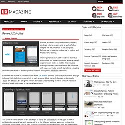
Buttons are for pushing, rollers are for rolling, and knobs are for turning. User experience deals with how these individual actions feel, but more importantly, a user’s overall experience on web or mobile. This includes making sure users can understand text, navigate with ease, and make smooth transitions—creating seamless user flows so that the product elicits an appropriate emotional response. Essentially an archive of successful user flows, UX Archive shows a cycle of specific events through individual high-definition screen shots of each process.
While currently focused on top-quality apps for iPhone, the site gives viewers a broader understanding of the UI for each individual step and how it contributes to the overall experience. Realism in UI Design. The history of the visual design of user interfaces can be described as a gradual change towards more realism.
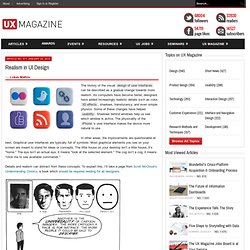
As computers have become faster, designers have added increasingly realistic details such as color, 3D effects, shadows, translucency, and even simple physics. Some of these changes have helped usability. Shadows behind windows help us see which window is active. The physicality of the iPhone’s user interface makes the device more natural to use. In other areas, the improvements are questionable at best. Details and realism can distract from these concepts. The image on the left is a face of a specific person.
At the same time, it’s obvious that some details are required. The circle on the left clearly shows a face. Let’s look at a symbol we actually see in user interfaces, the home button. The thing on the left is a house. The thing on the left is a home button. Let me explain this concept using an entirely unscientific graph: The button on the left is too realistic. Conclusion. Introduction to Web and eCommerce User eXperience Design. The Psychologist’s View of UX Design.