
Atomic Design. Hey there!
I wrote a book called Atomic Design that dives into this topic in more detail, which you can buy in paperback and/or ebook formats. We’re not designing pages, we’re designing systems of components. —Stephen Hay As the craft of Web design continues to evolve, we’re recognizing the need to develop thoughtful design systems, rather than creating simple collections of web pages. A lot has been said about creating design systems, and much of it focuses on establishing foundations for color, typography, grids, texture and the like. In searching for inspiration and parallels, I kept coming back to chemistry.
Similarly, interfaces are made up of smaller components. What is Atomic Design Atomic design is methodology for creating design systems. Let’s explore each stage in more detail. Atoms Atoms are the basic building blocks of matter. Atoms can also include more abstract elements like color palettes, fonts and even more invisible aspects of an interface like animations. Molecules Organisms. Build Atomic Design Systems. Style Guide. Buffer Sign Up The Buffer Style Guide A collection of reusable styles and components for faster product development.
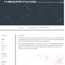
Dark Background Light Background Introduction Atoms Grid Colors Typography Buttons Inputs Molecules Notifications Forms Organisms Modals Introduction As the Buffer team grows, it will become increasingly important to maintain a consistent style and visual language across all areas of the product. This style guide is based largely on the principles of atomic design.
Atom Molecule Organism Grid At the moment we only utilize the grid system on static (non-app) pages. Each grid row must contain parts that add up to one whole. Example: Grids <div class="grid-row"> <div class="one-third"></div> <div class="one-third"></div> <div class="one-third"></div> </div> <div class="grid-row"> <div class="one-fourth"></div> <div class="one-half"></div> <div class="one-fourth"></div> </div> Colors Using colors consistently brings a sense of familiarty and unity to a product. Typography Buttons. Epic List of 41 Web Design Tools That Will Help You Build Websites Faster. The Grid. Web Starter Kit. Download Web Starter Kit (beta) What is Web Starter Kit?
Web Starter Kit is an opinionated boilerplate for web development. Tools for building a great experience across many devices and performance oriented. Helping you to stay productive following the best practices outlined in Google's Web Fundamentals. A solid starting point for both professionals and newcomers to the industry. Features Quickstart Download the kit or clone the repository and build on what is included in the app directory. There are two HTML starting points, from which you can choose: index.html - the default starting point, containing Material Design layout.basic.html - no layout, but still includes our minimal mobile best-practices Be sure to look over the installation docs to verify your environment is prepared to run WSK.
Web Performance Web Starter Kit strives to give you a high performance starting point out of the box. Browser Support ChromeEdgeFirefoxSafariOperaInternet Explorer 9+ Troubleshooting. Multi-Screen Resources – Google. Multi-Screen Resources Skip to content Make Your Website Work Across Multiple Devices Build a website that showcases your business on every screen from smartphones and tablets to computers and TVs.
Your customers expect a great browsing experience regardless of what device they use. Whitepaper Building websites for the multi-screen consumer Learn about the most typical structures for multi-screen websites, with tips on how to create a great user experience and avoid some of the more common mistakes. Learn more. Case Study American Cancer Society mobilizes 7,000 web pages in one quarter The Society increased mobile visits by 250% and trippled mobile donations with a smart content strategy and deep understanding of visitor needs. Read more. Case Study Baines & Ernst’s new site increase mobile conversions Baines & Ernst launched a Responsively Designed Site. Read more. Case Study Beyond the Rack’s mobile conversion rate doubles Read more.
Case Study Plusnet sees traffic grow 2x and sales 10x.
Training & Tutorials, Web Development.