
Responsive Webfont Icons. One of the major problems we face in responsive design is how to create icons that scale to the interface, not just for physical dimensions, but based on screen size and number of pixels per inch.
Generally, images are used to add the icon inline using the img tag. Another common technique relies on a grid of the different icons and states — a CSS sprite — saved in a bitmap format, typically GIF or PNG. However, the more you scale these images up or down to respond to the context, the more the icon will appear distorted as the bitmap image’s anti-aliasing becomes increasingly apparent. Even worse, sprite-based icons can not be reliably or easily scaled. I think this why many designers and developers often avoid icons in their design, despite the fact that icons can be amazingly effective at communicating complex ideas in a limited space. To create responsive designs with scalable icons, I recommend replacing bitmap image icons with vector-based webfonts. Why Webfonts.
Blueprint: Slide and Push Menus. Css-only Lavalamp-like Fancy Menu Effect. This time let’s get inspired by the sliding menu effect, also known as the Lavalamp effect (ex. here).
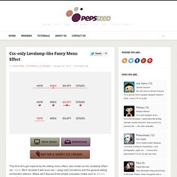
We’ll recreate it with pure css – using css3 transitions and the general sibling combinator selector. Below we’ll discuss three simple examples (make sure to see the demo first). Step 1 – Prerequisites We use a Unica One google web font. In the “heart & arrow” example we use three images combined into a sprite image as below : Step 2 – HTML. Html - Sliding An Entire Web Page. Building a Circular Navigation with CSS Transforms. A tutorial on how to create a circular navigation using CSS transforms.
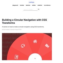
View demo Download source In this tutorial I’m going to show you how to create circular navigations using CSS transforms. I’m going to take you through the steps for creating these styles one by one, and explain the math (yikes!) And simple logic behind them so you get a clear understanding of the technique. Like I mentioned, there’s going to be some basic math involved, along with CSS transforms to create these styles. I also want to mention that credit for the original technique goes to Ana Tudor. So, without further ado, let’s get started! How to Create a Contact Form using HTML5, CSS3 and PHP.
Personally, I feel it is important to be aware of the [positive] impact HTML5 will have on forms and the way they will function in years to come.
Realistically, we can’t implement all of the new features today, but you don’t want to be lagging behind the rest of the industry when these features finally become widely supported. Having said that, this tutorial will be focusing on the new HTML5 features that are already supported by all the major browsers, or that at least employ graceful degradation for the browsers that are still trying to play catch up. 1. The Design First of all, this is not a Photoshop tutorial. 2. Menus. Menus are vertical by default.
Minimal default styling and low-specificity selectors make them easy to customize. By default, menu items take up 100% of the width of their container, so you may want to limit the menu width or set the menu to display:inline-block. Responsive Column Layouts. Typically, to create a column layout, you would need to add the first or last classes to reset the margin space and clear the float.
Today I’m going to share a very simple CSS trick to create a responsive column layout using nth-of-type pseudo class. I use this trick to code the WordPress themes at Themify. It doesn’t require any first or last class and the number of columns can be adjusted base on the viewport. In other words, it can be toggled from 4-column to 3-column or 2-column, etc. View Demo Responsive Column/Grid The Inconvenience of Using The First & Last Classes Normally we would add a .first or .last class to clear the margin space and float in the grid. Using nth-of-type. 3 Column Responsive Layout.
Layout. Responsive Web Design: What It Is and How To Use It. Advertisement Almost every new client these days wants a mobile version of their website.
It’s practically essential after all: one design for the BlackBerry, another for the iPhone, the iPad, netbook, Kindle — and all screen resolutions must be compatible, too. In the next five years, we’ll likely need to design for a number of additional inventions. When will the madness stop? It won’t, of course. In the field of Web design and development, we’re quickly getting to the point of being unable to keep up with the endless new resolutions and devices. Responsive Web design is the approach that suggests that design and development should respond to the user’s behavior and environment based on screen size, platform and orientation. The Concept Of Responsive Web Design Ethan Marcotte1 wrote an introductory article about the approach, “Responsive Web Design992,” for A List Apart. Transplant this discipline onto Web design, and we have a similar yet whole new idea.
Adjusting Screen Resolution. 31 CSS Code Snippets To Make You A Better Coder.
Tricks and Hacks.