
RSA Animate. Chaîne de TheCognitiveMedia. Mapping complex networks. 50 Great Examples of Data Visualization. Wrapping your brain around data online can be challenging, especially when dealing with huge volumes of information.

And trying to find related content can also be difficult, depending on what data you’re looking for. But data visualizations can make all of that much easier, allowing you to see the concepts that you’re learning about in a more interesting, and often more useful manner. Below are 50 of the best data visualizations and tools for creating your own visualizations out there, covering everything from Digg activity to network connectivity to what’s currently happening on Twitter.
Music, Movies and Other Media Narratives 2.0 visualizes music. Liveplasma is a music and movie visualization app that aims to help you discover other musicians or movies you might enjoy. Tuneglue is another music visualization service. MusicMap is similar to TuneGlue in its interface, but seems slightly more intuitive. Digg, Twitter, Delicious, and Flickr Internet Visualizations.
Sexual Network Of High School. Mapping God's Bloodline. Follow the genealogy of Jesus from the creation of Adam and Eve through Noah, the tribes of Israel, King David, and finally Joseph and Mary.
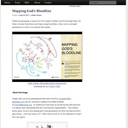
Zoom out for a broader perspective or zoom in to examine finer details. I began with some key genealogical information found on complete-bible-genealogy.com and am working on adding more detail available at marshallgenalogy.org. I’m seeking out new ways of visualizing this data because I’ve always been dissatisfied with the usual tree-like representation. That method works great if you’re only dealing with a few generations at a time, but beyond that it gets messy.
Just how messy is it? First attempt at visualization I made this using a tool called Gephi which is great for deep analysis of complex networks, especially social connections. Floaters – families which can’t be connected back to Adam and Eve None of this is to say that spouses, mothers, and “floater” families are unimportant.
Straight Layout. Paris: Visualizing Urban Transportation. Update: If you are interested in isochronic maps, I have more detailed explaination of the process in my graduate thesis Seeing Differently: Cartography for Subjective Maps Based on Dynamic Urban Data, and the source code (Processing) is on GitHub.
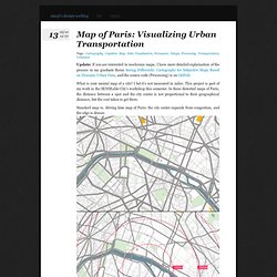
What is your mental map of a city? I bet it’s not measured in miles. This project is part of my work in the SENSEable City’s workshop this semester. In these distorted maps of Paris, the distance between a spot and the city center is not proportional to their geographical distance, but the cost taken to get there. Standard map vs. driving time map of Paris: the city center expands from congestion, and the edge is denser. Comparing the isochronic map of Paris under different transportation modes: (unit: minutes, click to zoom in) Think driving is better? In the workshop I proposed an alternative to Google Maps on smartphone map services. Made with Processing. A demo video that shows how the transformation works: Loaded: 0% Progress: 0% Map your moves. Data This map distills more than 4000 moves from over 1700 people, collected in an informal survey by WNYC, a New York based public radio station.

For generating the geo–coordinates from the entered ZIP codes, I used the free bulk geocoder at gpsvisualizer.com. I did not check every single data row in detail, so a few of the moves might be misrepresented. Mapping As most moves occurred from, to or within the New York area, this area displayed enlarged in the white circle at the center of the graphic. Visual markers Each circle corresponds to one zip code area. Actually, it is consists of two overlaid circles: a red one for people moving out of the area, and a blue one for people moving to the area. Interaction Click one of the circles to inspect only moves to or from this area. Details On the right, you can find some statistics on why and when people moved to the selected areas.