
The Joy of XUL. Intended audience: Application developers and development managers who seek to better understand XUL and why the Mozilla platform is built with it.
Introduction XUL (pronounced "zool") is Mozilla's XML-based user interface language that lets you build feature rich cross-platform applications that can run connected to or disconnected from the Internet. These applications are easily customized with alternative text, graphics, and layout so they can be readily branded or localized for various markets.
Web developers already familiar with Dynamic HTML (DHTML) will learn XUL quickly and can start building applications right away. This document will describe the compelling reasons for application developers to leverage XUL and Mozilla technology for building cross-platform applications. Key Features and Benefits Supporting Technologies There are number of other technologies introduced by Mozilla that complement XUL for building cross platform web applications. Conclusion Reference material. Video for Everybody! Video for Everybody is simply a chunk of HTML code that embeds a video into a website using the HTML5 <video> element, falling back to Flash automatically without the use of JavaScript or browser-sniffing.
It therefore works in RSS readers (no JavaScript), on the iPhone / iPad (don’t support Flash) and on many browsers and platforms. Thanks to the rapid adoption of HTML5 video happening right now, Video for Everybody isn’t the only solution around. It is not a neatly packaged, fully-featured solution for those unfamiliar with HTML. VfE is for developers who either want something really simple they can quickly use on their blog or websites, or as a good starting point to develop their own custom solution. It does not use JavaScript. How It Works If your browser supports it, HTML5 video is used. If HTML5 video is not supported, Adobe Flash is used. Finally, if all else fails, a placeholder image is shown and the user can download the video using the links provided. Designing Web Apps for the iPad.
What’s stopping you from creating a functional app/website for the iPad?
My answer was the Objective-C coding language, time constraints and having to deal with the infamous Apple App Store. But if you’re a web designer, like me, and you think that designing for the iPad is outside the realm of possibility — think again. Love it or hate it, the iPad is an incredible medium. There is no denying that the touch form factor will have an incredible impact on how designers approach user interaction. So get ahead of the game and start experimenting with iPad web apps now. In this article, I will guide you through my creative process in which I developed a simple but useful iPad web app in just one weekend: BracketSlash.com. I do not consider myself a professional iPad app developer, so if you feel a little apprehensive, let my experience be an inspiration to you. Why Did I Create a Web App for the iPad? I created a web-based iPad app mainly for my own personal use. Reset Reloaded. After a bit of time to bake and a few more suggestions from readers, I have what I’m willing to call the final version of my take on the topic of reset styles.
To wit: So what changed from the last iteration? I added background: transparent; to the first rule. HTML5 & CSS3 Support, Web Design Tools & Support - FindMeByIP - CSS3 & HTML5 Browser Support. Fixed-position footers. A Guide on Layout Types in Web Design. One of the most variable aspects of web design is the way in which we approach width and height in terms of measurements and flexibility.
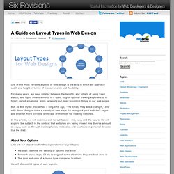
For many years, we have rotated between the benefits and pitfalls of using fixed, elastic, and liquid measurements in a quest to give optimal viewing experiences in highly varied situations, while balancing our need to control things in our web pages. But, as Bob Dylan proclaimed a long time ago, "The times, they are a-changin’," and with these changes come a variety of new ways for laying out your website’s pages and an even more variable landscape of methods for viewing websites. In this article, we will examine web layout types — old, new, and the future. We will explore the subject in the context that websites are being viewed in a diverse amount of ways, such as through mobile phones, netbooks, and touchscreen personal devices like the iPad. About Your Options.
Chrome Frame - Google Code. ViewPorts. Page last changed today Related files: Last major update on 12 November 2013.
Here’s the inevitable compatibility table that goes with my viewport research. It treats the viewports themselves as well as some related items. position: fixed was moved to the CSS test pages. See A tale of two viewports for a further explanation of these terms. CSS pixels Expand and contract with zooming; it’s this pixels that are taken as measurement grid for all CSS declarations. Device pixels Formal number of pixels on device. Device pixel ratio The ratio of physical pixel count and ideal viewport. Layout viewport The initial area of the HTML element. Visual viewport The actual screen viewport through which you look at the layout viewport. Ideal viewport The one you get when using width=device-width.