
ThumbPress. The History of Social Media [INFOGRAPHIC] APIs & Developer Products - January 2011. Web Designers vs. Web Developers (Infographic) A Graphic Guide to Facebook Portraits. Everyone is aware of how significantly Facebook has impacted modern technologies such as online communication, information aggregation, and boyfriend stalking.

Less noticed, but just as profound, is its influence on art. Just as refinements in mirror crafting led to an increase in self portrait production during the Renaissance, Facebook's steady, unrelenting invasion of every crevice in the civilized world has led to a new renaissance in portraiture, notable for its creation by people who wouldn't know good art if it friend requested them.
These office workers and bored teens have replaced Okies and deranged shut-ins as the ultimate outsider artists; not only do they lack formal artistic training, most lack even the desire to create art. However, with this humble, ad hoc genre a complex visual dialogue has emerged, and its unique vocabulary reveals much about the modern world. Click to Expand. INFOGRAPHIC: Social Media Demographics All In One.
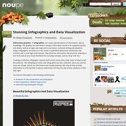
We understand that women rule the social space, but this infographic created by Flowtown helps us understand the people on social media beyond the “who rule what.”

Using data from Google Ad Planner, user demographics of various social sites were revealed. Here are several interesting statistics: (1) Richest: LinkedIn, Reddit and Twitter are three sites that have the largest proportion of people earning more than $150k annually. (2) Youngest: Over 30% of MySpace users are below the age of 18. Would MySpace bounce back? (3) Ladies: MySpace also has the largest proportion of female users. . (4) College: A huge bulk of social media users are studying in college. We’ll leave the rest of the exploration to you. [Click the image to enlarge.]
Cool Infographics - Cool Infographics. Financial Infographics, Savings Account & CD Rates - VisualEconomics.com. How to Evaluate New Twitter Followers (Flowchart) Dunbar's Number, the theory that most people can maintain at most 150 stable interpersonal relationships, faces an unusual challenge in the time of social media.

You may have more people than that add you as a follower on Twitter every month, week or maybe, every day. Half or more are robots, spammers or robot spammers. What do you do when someone starts following you on Twitter? Do you follow them back? Socialmedia.jpg (JPEG Image, 700x621 pixels) Twitter’s Meteoric Rise [infographic] Blog. Facebook Privacy: A Bewildering Tangle of Options - Graphic.
Imagine A Pie Chart Stomping On An Infographic Forever - Smashing Magazine. Advertisement A certain category of design gaffes can be boiled down to violations of audience expectations. Websites that don’t work in Internet Explorer are a heck of a nasty surprise for users who, bless their souls, want the same Internet experience as everyone else. Websites that prevent copying, whether through careless text-as-image conversions or those wretched copyright pop-ups from the turn of the century, cripple a feature that works nearly everywhere else on the Internet. Avoiding this category of blunders is crucial to good design, which is why I am upset that one particular pitfall has been overlooked with extreme frequency. According to statlit.org1, statistical literacy is the ability to read and interpret summary statistics in the everyday media: in graphs, tables, statements, surveys and studies.
The importance of statistical literacy in the Internet age is clear, but the concept is not exclusive to designers. Information is beautiful: 30 examples of creative infography. Google facts and figures (massive infographic) Posted in Tech blog on February 24th, 2010 by Pingdom Google has perhaps more than any other company become “The Internet Company.”
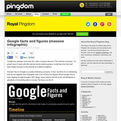
It’s grown hand in hand with the internet and its entire business model has from the start been totally focused on the internet as a delivery platform. And let’s face it, Google is a pretty interesting company. In fact, we think it’s so interesting that we put together this infographic with a ton of facts and figures about Google. Stunning Infographics and Data Visualization. Feb 02 2010 Information graphics, or infographics, are visual representations of information, data or knowledge.
The graphics are used where complex information needs to be explained quickly and clearly, such as on signs and maps and in journalism, technical writing and education. Today, infographics surround us in the media, in published works both mainstream and scientific and in road signs and manuals. They illustrate information that would be unwieldy in text form and act as a visual shorthand for everyday concepts, such as “Stop” and “Go.” Creating an effective infographic requires both artistic sense and a clear vision of what to tell the audience.
You may be interested in the following related posts: Crayons_big1.png (900×900) 14 Exceptionally Interesting Infographic Comparison Maps « App Sheriff. Hey Readers, Win 25 Citrify Premium Licenses How to Participate and Win!!!

:-D . Stay tuned for more premium giveaways coming next by subscribing toRSS feed or Subscribe to App Sheriff - Sworn To Serve by Email. Good Luck Guys! Infographics have been used to deliver data in a very interactive way to people. GoCGR.jpg (JPEG Image, 1134x1512 pixels)