
Metro UI CSS : Metro Bootstrap CSS Library. Sass. CssGaga – 幫助索引. CSS Reset. CSS Storia. Codekit - 为Web前端打造的全能型神器(附推荐各种工具) - 三桂. Codekit - incident57又一华丽丽的工具,目前是beta,官网上介绍中罗列了这些功能特性: 自动编译Less, Sass, Stylus, CoffeeScript, Jade & Haml等文件致力于js文件合并和压缩,以及js语法错误检查同时还支持Compass(Sass伴侣,官网地址:compass-style.org)令人发指的是甚至还能对jpeg&png图片优化自动刷新浏览器(之前推荐过同类的工具:前端开发利器-F5)让你在不同的项目中仅维护同一套文档然而这还仅仅是其中的一部分...
相信对于Web前端攻城师来说,这些功能都是非常受用的 但是.... > 该软件只能跟Mac合体(Mac OS 10.7+) > 收费的...当然这么好的软件还是值得购买的. Sass & less › 網絡暴民 Jacky's Blog. 最近都有接觸到 SASS/SCSS 和 LESS 這兩隻 CSS Pre-processor,功能上都是大同小異的,都是用更「Programming」的語法,去處理 CSS。
20 Exceptional CSS Boilerplates and Frameworks. CSS frameworks have been the foundations of web projects for many years.
However, in the age of responsive design, a framework has even more benefits. A well-built CSS framework or boilerplate can streamline the design process, save huge chunks of development time and ensure your website scales properly on all devices. With so many choices available, though, it can be difficult to choose a framework to build on. It's important to consider the following when making a decision: whether you require a grid, and if so, will it be fluid or fixed? What level of customization do you require? This post details 20 CSS boilerplates, frameworks and systems to help you make that decision. 1. Bootstrap is a "sleek, intuitive and powerful front-end framework for faster and easier web development. " 2. Catering for four layouts (default, tablet, mobile and wide mobile), with three sets of typography presets, Less is a responsive CSS grid system for designing adaptive websites. 3. 4. 5. 6. 7. 8. 9. 10.
Sass / Compass 使用教學 Part 1. 本文是 Sass / Compass 系列教學: 一切就像下面這段介紹 Compass 的影片,現今開發網站者肯定會用到的其中一種語言就是 CSS(Cascading Style Sheets),不過 CSS 其實是一種很冗笨的語言,不僅沒有變數(variables)的功能、也沒有巢狀(nested)的規則,也沒有引用(include, import)的功能,相同的設定經常會出現在不同的 CSS 區塊中,例如配色、高度、寬度、樣式,而且經常一堆 class, id 的樣式滿天飛,如果對某些配色不滿意,或是對某些樣式不滿意,就可能得一個一個慢慢修改或是全域取代,要是 CSS 能夠有更像程式語言的語法與規則的話,也許將會更省事,整體的 CSS 也會更有規劃、組織。
也因為如此,Hampton Catlin, Nathan Weizenbaum, and Chris Eppstein 還有 Alexis Sellier,這些聰明的程式設計師分別發明了 Scss/Sass 及 less 兩種 CSS Pre-Processor,上擴充了既有 CSS 的語法、規則及功能,達成變數、巢狀設計、引用等功能,只需要最小程度的遵守他們制定的語法,再透過 Sass 或 less 編譯之後,就能夠產生 CSS 檔案,你只需要維護遵循 Sass 或 less 語法撰寫出來的檔案,就可以達到快速開發、修改、維護網站佈景的效果! Compass Documentation. Sass - Syntactically Awesome Stylesheets. CSS-Tricks. 20 Responsive CSS Frameworks And Boilerplates. Developing and designing responsive websites is one task that every web designer and/or developer should know as it is one of the latest web design trends especially this year, 2013.
By the way, check out our previous post regarding everything you need to know about responsive web design if you want to learn more about it. There are, however, a lot of tools and techniques, e.g. jQuery plugins for building responsive layouts, that will help every creative when creating such website. To add more resources, here’s a collection of very powerful responsive CSS frameworks and boilerplates for fast, intuitive development of responsive websites. You might want to take a look at the following related articles: Dont forget to subscribe to our RSS-feed and follow us on Twitter – for recent updates.
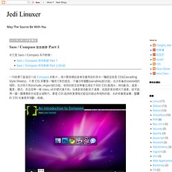
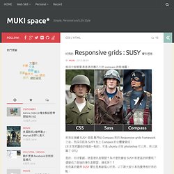
好用的 Responsive grids : SUSY 實作感想 « MUKI space* 相信大家都看過這張流傳已久的 compass 武裝神圖: 而我在接觸 SUSY 這個 專門給 Compass 用的 Responsive grids framework 之後,我深深認為 SUSY 加上 Compass 的合體會變成: (本來想把圖做的精美一點的,可是 ubuntu 沒有 photoshop 可以用,所以就算了 OTL) 是的,你沒看錯,就是復仇者聯盟!
為什麼我會給 SUSY 那麼高的評價呢? 還變成了超強的復仇者聯盟,搞毛阿!! 但我真的覺得 SUSY 實在是無敵噁心好用,以下跟大家分享我覺得他好用的點: Susy: Responsive grids for Compass. All Susy3 API functions draw on the same shorthand syntax, which consists of two parts, seperated by the word of.
The first part describes a grid-spanwidth, location (if needed), and spread (in any order): // <width> at <location><spread> $span: span(2);$span-spread: span(3 wide); // location is only needed with asymmetrical grids $span-location-spread: span(3 at 2 narrow); The second half describes the grid-contextcolumns, container-spread, and gutters in any order: // of <columns><container-spread> set-gutters <gutters> $of-columns: of 6;$of-columns-spread: of 12 wide;$of-columns-gutters: of 12 set-gutters 2em; There are two primary functions, span and gutter, which can be used anywhere you need to calculate grid math. span accepts the full shorthand syntaxgutter only uses the second half (with or without of) Except for span-width and location, all of those settings have global defaults, which can be set in the $susy configuration map: