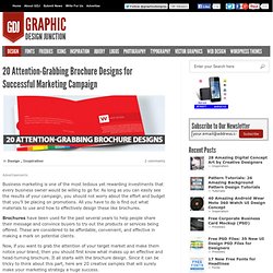

FREE ICONS AND FREE IMAGES. Visual.ly. Brochure. Business marketing is one of the most tedious yet rewarding investments that every business owner would be willing to go for.

As long as you can easily see the results of your campaign, you should not worry about the effort and budget that you’ll be placing on promotions. All you have to do is find out what materials to use and how to effectively design these like brochures. Brochures have been used for the past several years to help people share their message and convince buyers to try out the products or services being offered. These are considered to be affordable, convenient, and effective in making a mark on potential clients.
Now, if you want to grab the attention of your target market and make them notice your brand, then you should first know what makes up an effective and head-turning brochure. You may be interested in the following modern trends related articles as well. Image Source Image Source Image Source Image Source Image Source Image Source Image Source Image Source. PT디자인 Tips(2) Powerpoint has produced more bad design in its day that perhaps any other digital tool in history with the possible exception of Microsoft paint.

In this post we’re going to address the epidemic of bad presentation design with ten super practical tips for designer better looking and more professional presentations. Along the way we’ll see a number of awesome slide designs from Note & Point along with some custom examples built by yours truly. Let’s get started! Also be sure to check out 10 Tips for Designing Presentations That Don’t Suck: Pt.2! Not a Designer? Most of the content on this site is targeted specifically towards professional designers and developers, or at the very least those interested in getting started in this field.
You’ve chosen a visual tool to communicate and should therefore take the time to learn a thing or two about visual communications. Follow the ten tips below and see if you don’t start getting comments about your awesome presentation design skills. Kuler Piknik. PT디자인 Tips. Last week we looked at part one of our two part series on designing better presentations.

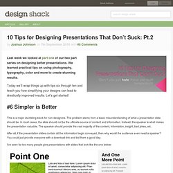
We learned practical tips on using photography, typography, color and more to create stunning results. Today we’ll wrap things up with tips six through ten and teach you how simplifying your designs can lead to drastically improved results. Let’s get started! #6 Simpler is Better This is a major stumbling block for non-designers. After all, if the presentation slides contain all the information begin conveyed, then why would the audience even need a speaker?
I’ve seen far too many people give presentations with slides that look like the one below: You might think I’m being facetious with my design but trust me I’ve seen slides that were far worse. Again, remember that your speech is the reason you’re up in front of people. Use your slides to grab and hold the audience’s attention through attractive visuals. 0to255. Piknik Color Picker. Dingbats > Logos fonts. NounProject.