
Fun with CSS Transforms in Firefox and Webkit. Updated: published: topics: css javascript mobile WebKit based browsers like Safari have had CSS Transforms for quite awhile now, allowing developers to skew, translate, rotate, and scale HTML elements or the entire page with CSS alone.

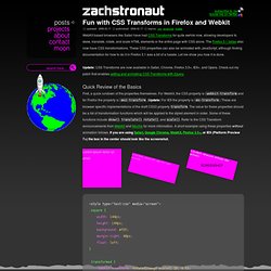
Update: CSS Transforms are now available in Safari, Chrome, Firefox 3.5+, IE9+, and Opera. Quick Review of the Basics First, a quick rundown of the properties themselves. Lorem ipsum dolor sit amet. <div class="square"><p>Lorem ipsum dolor sit amet. Finding the Transformation Properties in the DOM with JavaScript In order to animate these CSS Transform properties with JavaScript, we need to find the HTML element whose CSS properties we want to animate in the page DOM, and then find the specific CSS properties we want to change in the DOM node.
WebKit in particular makes this very easy. Firefox 3.1 turns out to be more stubborn and requires case sensitive style.MozTransform (or the equivalent style['MozTransform']). Deciding Which Property to Use This is tdiv6. Creating Polaroid Style Images with Just CSS - ZURB Playground - ZURB.com. Through a combination of browser-specific CSS (2 and 3) integration and some basic styling, we've turned regular old images into cool looking polaroid style images—with no additional markup to show the text.

Using the Title Attribute Instead of adding additional markup (more headings or paragraphs), we've opted to reuse the content within the title attribute of the surrounding anchor tag. Since it's good practice to use proper title text, and it's really freaking cool to do stuff with just CSS. Note: this is from the CSS2.1 spec, but browsers haven't implemented it fully. Read up on it here. We have to use the title attribute for the anchor because the alt attribute isn't fully implemented by Safari or Firefox. Adding "Random" Tilts Safari 4 and Firefox 3.5 both have support for the :nth-child pseudo-selector (this is CSS3). Read about :nth-child and it's usage here. Although this seems like a bit much, this works to our advantage. Making Them Scale Final Details. How To Create Simple Css Image Rollover Effect. CSS3 Rounded Image With jQuery. The other day I was trying to style CSS3 border-radius to image element and I realized that Firefox doesn't display border-radius on images.

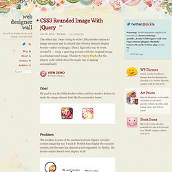
Then I figured a way to work around it — wrap a span tag around with the original image as a background-image. Thanks to Darcy Clarke for the jQuery code which does the magic tag wrapping automatically. View Demo Rounded Images Goal My goal to use the CSS3 border-radius and box-shadow feature to make the image element look like the screenshot below. Problem The problem is none of the modern browsers display rounded corners image the way I want it. The CSS Trick The trick is very simple: wrap a span tag around the image element. Final Solution With jQuery To make things easier, we can use jQuery to automatically wrap a span tag around the image. The jQuery code below will find any element with ".rounded-img" or "rounded-img2" (in my case, it is the image element) and wrap it with a span tag.
Sample Usage I hope you will find this trick useful. Credits. CSS3 box-shadow and image hover effects. The CSS3 box-shadow property is a new way of adding drop shadow effects just by editing a style sheet. There’s no need to use Photoshop! Just open your style sheet in a text editor and away you go. Well, it’s almost as simple as that but not quite. There’s one caveat and that is browser support. The box-shadow property is supported by Firefox and Safari (and Google Chrome), using the proprietary -moz- and -webkit- prefixes, but it’s not supported by Internet Explorer (or other browsers). Box-shadow basics First, a quick introduction and explanation. Horizontal offset of the shadow: a positive value for shadows on the right of the box, and a negative value for a shadow on the left of the box Vertical offset: similarly, a negative value means the shadow will be on top, a positive one means the shadow will be below the box.