

Burst Title. During the previews for a movie I saw recently, there was an advertisement for an Oprah-related something or another.
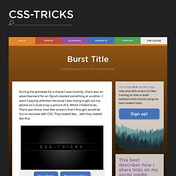
I wasn't paying attention because I was trying to get out my phone so I could snap a picture of it. Which I failed to do. There was these neat title screens that I thought would be fun to recreate with CSS. They looked like... well they looked like this: Turns out you can do it rather semantically. <h1><a href="#">CSS-Tricks</a></h1> I listed out all the vendor prefixes here because using them is required in "real" usage and I worry about people copying and pasting pseudo code. Multiple Attribute Values. Elements can have multiple class names.
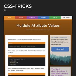
For instance: Then in CSS, you could match that element based on any one of them: .module { }.accordion { }.expand { } You can limit your selectors to match only if several of them are present, for example: // Will only match if element has both .accordion.expand { } But what about other attributes? Class names are unique in the ability outlined above. Checkbox Hack. Adobe-like Arrow Headers. Adobe has some pretty cool header bars for modules on their site.

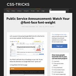
The header bar is divided into left and right sections. The left being an explanatory title and the right being a related link. But let's get super critical of how they did it. First of all, they use a non-sprited image to do it: That means an extra HTTP request just for the headers. Public Service Announcement: Watch Your @font-face font-weight. Let's say you're browsing Google Web Fonts for a free font to use on your website.
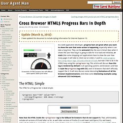
Cross Browser HTML5 Progress Bars In Depth. Update (March 9, 2012):
(Better) Tabs with Round Out Borders. The following is a guest post by Menno van Slooten.

You might notice we've been down this road before, but I quite like Menno's approach here. The end result proves you can get a little fancier with the design than I originally did, with borders, gradients, and shadows and while actually using less elements. HP has a new logo! And they can do it in CSS. Postcard from Paris – css3 keyframes animations in use Postcard from Paris – css3 keyframes animations in use I decided to explore the area of css3 keyframes animations.

The idea was simple – to create a sort of virtual postcard. I live in Paris so obviously I send you my greetings from Paris :). Click here or on the image to view the animation demo. The css3 animations are supported by : Chrome 2+, Safari 4+, Firefox 5+, iOS Safari 3.2+ and Android 2.1+ (source Smashing Magazine). The html structure is very simple : We will use the following images (I will discuss the sparkling effect a little bit later) Let’s start to complete the css stylesheet : Animating clouds To animate the three layers of clouds independently we use the following keyframes. This way we have defined the property of background-position for the beginning, middle and end of our animation.
Intro to CSS 3D transforms. Ceaser - CSS Easing Animation Tool - Matthew Lein. Blur Menu with CSS3 Transitions. There are so many great things we can do with the additional properties and possibilities that CSS3 brings along.

Today I want to show you how to experiment with text shadows and with transitions in order to achieve a blur effect that we'll apply to a menu on hovering over the elements. The main idea is to blur the other items while enhancing the one we are currently hovering. View demo Download source There are so many great things we can do with the additional properties and possibilities that CSS3 brings along. Today I want to show you how to experiment with text shadows and with transitions in order to achieve a blur effect that we’ll apply to a menu on hovering over the elements. The images in the demos are by fabulous Mark Sebastian and they are licensed under the Attribution-ShareAlike 2.0 Generic (CC BY-SA 2.0) License. The Markup Let’s create the HTML structure for our menu first. Now we’ll add some style!
The CSS Now, let’s take a look at each of the seven examples. Example 1. CSS3 Image Styles. When applying CSS3 inset box-shadow or border-radius directly to the image element, the browser doesn't render the CSS style perfectly.

However, if the image is applied as background-image, you can add any style to it and have it rendered properly. Darcy Clarke and I put a quick tutorial together on how to use jQuery to make perfect rounded corner images dynamically. Today I'm going to revisit the topic and show you how much more you can do with the background-image CSS trick. I will show you how to use box-shadow, border-radius and transition to create various image styles. View Demo Image Styles Problem (see demo) Take a look at the demo and note that there is border-radius and inset box-shadow applied in the first row of images.
Workaround. 15 Fresh and Powerful CSS3 Tutorials. CSS3 is here, it’s fun, and allows us to evolve the look of the web as we go. Features like gradients, drop shadows, rounded corners, animations, and opacity are giving us the promise of more fun. In this post we’ve collected some new and brilliant tutorials that will help you in mastering your CSS3 skills.