
Bringing blending to the Web. If you’re a user of our design applications such as Photoshop and Illustrator, you know how you can create very cool effects with blend modes.
An Amazon search returns many books and a Google search on ‘photoshop blending tutorial’ returns more than 200,000 results. This points to a very widely known and used feature. If you’re unfamiliar with blend modes, they are a set of operators that determine how 2 layers are blended together. Targeting the iPhone 4 Retina Display with CSS3 Media Queries - iWalt.com. Four years ago, (eight months before the original iPhone was announced) Dave Hyatt wrote about high DPI web sites on the Surfin’ Safari blog: One area of Web design that is going to become more important in the coming years is high DPI.
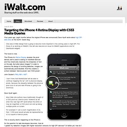
For those of us working on WebKit, this will also become an issue for WebKit applications and for Dashboard widgets. The future is now. The iPhone 4’s Retina Display doubles the pixel density we’re used to seeing on handheld devices and thus drastically improves the sharpness of text on the web. But what about images?
John Gruber’s “Why 960 × 640”: I don’t think that MobileSafari will be able to continue mapping the “px” unit to physical display pixels, because the disparity between the physical pixel size of old and new iPhones is going to be enormous. Dave Hyatt again: Most Web site authors have traditionally thought of a CSS pixel as a device pixel. CSS3 Patterns, Explained. Many of you have probably seen my CSS3 patterns gallery.
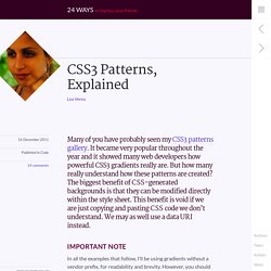
It became very popular throughout the year and it showed many web developers how powerful CSS3 gradients really are. But how many really understand how these patterns are created? The biggest benefit of CSS-generated backgrounds is that they can be modified directly within the style sheet. This benefit is void if we are just copying and pasting CSS code we don’t understand. We may as well use a data URI instead. Important note In all the examples that follow, I’ll be using gradients without a vendor prefix, for readability and brevity. The syntax described here is the one that browsers currently implement. If you are not yet familiar with CSS gradients, you can read these excellent tutorials by John Allsopp and return here later, as in the rest of the article I assume you already know the CSS gradient basics: The main idea I’m sure most of you can imagine the background this code generates: See this example live See this example live.
Ultimate CSS Gradient Generator - ColorZilla.com. CSS3 Gradient Generator. Ceaser - CSS Easing Animation Tool - Matthew Lein. Experiments with background-clip: text. With the CSS property "background-clip: text" (which is currently only supported in Webkit browsers), we can add a background image to a text element.

Today we will experiment with it and create some fun examples by adding CSS3 transitions. View demo Download source With the CSS property “background-clip: text” (which is currently only supported in Webkit browsers), we can add a background image to a text element. Today we will experiment with it and create some fun examples by adding CSS3 transitions. The images in the first demo are by Andreas Preis and the image in the last demo is by Joanna Kustra. The Markup The structure will simply be an h3 heading element with a wrapper: We’ll be applying the class “it-animate” to the wrapper with jQuery in order to show the transitions. Example 1 In the first example we want to add two background images. We’ll also add a semi-transparent white text-stroke where the images will shine through.
For Firefox we want to add some kind of fallback. Example 2. Better border-radius in IE7 and IE8. Quick Fun: CSS3 Filter Effects « GirlieMac! Blog. I quickly played with the brand-new CSS Filter Effects on the latest WebKit Nightly!
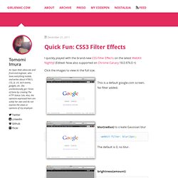
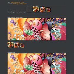
(Edited: Now also supported on Chrome Canary 18.0.976.0 +) Click the images to view in the full size. This is a default google.com screen. No filter added. blur(radius) to create Gaussian blur. Demo: CSS3 Image Styles (Part 2) Demo CSS3 Image Styles - Part 2 Tutorial by Web Designer Wall (@nickla) Normal Image (without the span wrap) Basic Style (with the span wrap) Embossed Style Soft Embossed Style Cutout Style Glossy Overlay.
Css3.0 Generateur. CSS Box Shadow.