
Loading... Effeckt.css. Minimal Monkey - Hello my name is Stephen Burgess. Using CSS3 transitions are great.
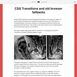
Supporting old browsers, not so great. As I stated in a tweet recently I think that for non-essential animations it’s fine to use CSS3 without a JavaScript fallback. If the user is viewing in an old browser like IE8, then stuff will just pop/snap without transitions. They still get to see all the content, we’re not depriving them of that, they just don’t get the nice transitions. Let’s take a simple image gallery like the one below. This gallery works great in modern browsers but when we remove CSS opacity and transition support there is an obvious issue – the user will continuously see the last image. The other fallback is to use a negative margin, e.g. margin-left: -99999px; That sort of works but in modern browsers there’s no fadeout transitions, or rather the transition happens, but off the page. It’s close but not as smooth as it could be by having the images crossfade. Flexible Google-style loader with CSS.
So, for a while I had noticed the nice sutble loader Google apps use and I was wondering if it would be easy to make with CSS and CSS animations: Yesterday, I realised that you can get this effect by increasing border size until about the middle of the element, as long as the total width stays the same (by using box-sizing: border-box): However, as you can see above, after the midpoint, the border is not curved any more, so does not produce the desired effect.
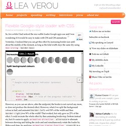
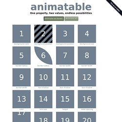
However, what if we split the background colour in half, and animated border-left until 50% of the width and then border-right from 50% of the width? That worked, but only gave us 25% of the effect. This is the finished result: The dimensions are all set in ems so that you can change the size in one place: Just change the font-size and the loader scales perfectly. And yes, it’s not super useful as-is, there are tons of spinners on the Web that you can use instead. Animatable: One property, two values, endless possiblities.
Box-shadow From: 0 0 black To: 0 150px 10px -50px rgba(0,0,0,.5)
Sprite sheet animation with steps(). There is an. Simple version control for designers - LayerVault. CSS3 transitions, transforms and animations. Browser Support for 2D CSS Transforms How to use transforms There are two categories of transform - 2D transforms and 3D transforms. 2D transforms are more widely supported, whereas 3D transforms are only in newer browers. 2D examples This div has been skewed - note that the text is still selectable.
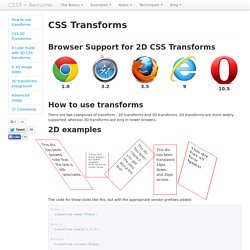
This div has been scaled - again, the text is real text. This div has been rotated - you get the idea about the text! This div has been translated 10px down, and 20px across. This div has all four types! The code for these looks like this, but with the appropriate vendor prefixes added: CSS transforms also be animated using transitions - try hovering on the div below. Hover on me and I'll spin and scale! Your browser doesn't support CSS 3D Transforms :( Try one of the browsers mentioned below. Browser Support for 3D CSS Transforms 3D CSS transforms are similar to 2D CSS transforms. RotateX rotateY rotateZ Hover me. Css3 - How to create a pulse effect using -web-kit animation - outward rings. Transitions and Animations on CSS Generated Content. Generated content means pseudo elements added to the page via the ::before and ::after.
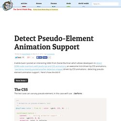
The support for applying transitions or animations to these in the current browser landscape is not great. I think this is a huge bummer, so I'm just making this blog post my permanent home to track the progress on this. Data in this table is from this test case. On mobile, on Safari on iOS 6.1 and down they didn't work, but they do on Safari on iOS 7. Why does this matter? Pseudo elements are really really useful. There is no reason that browsers shouldn't support this. Detect Pseudo-Element Animation Support. A while back I posted an interesting tidbit from Daniel Buchner which allows developers to detect DOM node insertions with JavaScript and CSS animations; an awesome trick driven by CSS animations.
Lea Verou recently posted another detection snippet driven by CSS animations: detecting pseudo-element animation support. Here's how she did it! The CSS The test case can use any pseudo-element; in this case we'll use :before: A simple color animation is assigned to the pseudo-element and a spot-check of generated content will tell you if animation is supported (green) or not (red). JavaScript Detection Thanks to a tip from Ahmed El Gabri, I can present a method to detect pseudo-element animation: var color = window.getComputedStyle( document.querySelector('.testElement'), ':before').getPropertyValue('color') if(color == 'rgb(0, 255, 0)') {} The same principal applies; if the color is green, the animation worked.
Be Heard Tip: Wrap your code in <pre> tags or link to a GitHub Gist! Older Newer. Jquery - Adding pause on hover to setInterval() Stagger CSS3 Animation Timing. Original Hover Effects with CSS3.