
De Nantes à Noirmoutier-en-l'ile avec Alexandra B. Responsive Web Design. Foreword by Jeremy Keith From mobile browsers to netbooks and tablets, users are visiting your sites from an increasing array of devices and browsers.
Are your designs ready? Learn how to think beyond the desktop and craft beautiful designs that anticipate and respond to your users’ needs. Ethan Marcotte will explore CSS techniques and design principles, including fluid grids, flexible images, and media queries, demonstrating how you can deliver a quality experience to your users no matter how large (or small) their display. Contents. ↔ 29 New Inspiring Responsive Web Designs. ↔ The Boston Globe. ↔ Web design, web development, mobile & content strategy by Happy Cog. ↔ Sony USA - Consumer Electronics Products, Movies, Music, Games and Services.
↔ Starbucks Coffee Company. ↔ Clean, responsive web design and content strategy from Park City, Utah. ↔ Sports News, Scores and Fan Opinion Powered by 310 Sports Blogs. Higher Ed Responsive Web Design Trail Blazers say 'Content-First' Gettin' responsive with it.
Over the past couple of years, the advent of responsive web design has changed the way we think about websites. We no longer need to feel compelled to plan around countless devices. Rather, we can plan for a single web experience that works in unpredictable contexts. More often than not, that comes down to the content. Responsive web design, within the larger school of thought around creating adaptive content, gives content folks a lot to think about in that regard. As we know, many higher education institutions have been quick to implement responsive web designs, embracing the benefits and accepting the challenges inherent therein. The answers varied, but there was a common theme: if you’re not thinking about your content when planning a responsive web design, you can’t succeed. (On June 19, we delivered a Meet Content webinar on content planning for responsive web designs. Wright State University Mark Anderson, Senior Web Administrator: Regent College Your Turn.
Showcase of Outstanding Responsive Web Designs. This showcase rounds up a collection of the most inspiring and outstanding examples of responsive web design.
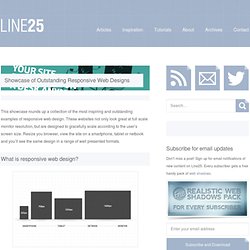
These websites not only look great at full scale monitor resolution, but are designed to gracefully scale according to the user’s screen size. Resize you browser, view the site on a smartphone, tablet or netbook and you’ll see the same design in a range of well presented formats. Websites are no longer viewed only on a computer monitor. Smartphones, tablets and netbooks throw a range of resolutions and different screen sizes into the mix for designers to now worry about. The idea of catering for various resolutions isn’t anything new. Ready for some examples? Alsacréations Sasquatch Festival Earth Hour Cognition Tileables Philip Meissner Interim Ribot Visua Design Laufbild Werkstatt Sweet Hat Club iamjamoy Andrew Revitt Stijlroyal Sleepstreet Pelican Fly. Responsive Design - What does it have to do with my School Website? What is responsive design?
Responsive web design (RWD) is an approach to designing websites aimed at providing the user with an optimal experience across a wide range of devices (desktop, tablet, mobile) and screen resolutions – good responsive design should be device agnostic. The objective is to provide a layout that minimises resizing, panning and scrolling to ensure that readability and navigation are tailored to the different sized screens from which the website can be accessed.
Top (First) Responsive Websites in #highered. How do you like your site?
Web? Mobile? How about Responsive? As my cutting-edge technically-oriented readers already know (but I love you the same even if you don’t yet ;0), Responsive Web Design wasn’t exactly born yesterday. The term was coined in an article written by Ethan Marcotte and published in May 2010 on A List Apart. While Marcotte, the de-facto Founding Father of the Responsive Web Design approach (and its biggest evangelist), has already written a book about it, RWD still doesn’t have an article of its own in Wikipedia where the only reference I found about it was this very short definition: “a methodology for designing web sites that can adapt to a range of screen sizes and device types.” So, it’s no suprise that RWD examples in higher education don’t abound – yet – even though this approach of designing once for all devices (desktops, large screens, tablets and mobile phones) might be the most efficient way to maintain and futureproof higher ed websites. ASU Online Sewanee. ↔ SoFI - School of Fashion Industry.
↔ Best Design Schools in London - Study London. Design is one of the most popular subjects for London's students.

Almost 16,000 design students study in London and over 80% are undergraduates studying for their first degree. London's Most Popular Design Schools Here are the top London universities with the most international students studying design: University of the Arts London - home to six art schools including Central Saint MartinsKingston UniversityRoyal College of ArtBrunel UniversityMiddlesex UniversityRavensbourneGoldsmiths, University of LondonUniversity of East LondonUniversity of Westminster Did You Know? Over 65% of London's international design students study at University of the Arts London – wow!