
Liquid Slider: A Responsive HTML5 jQuery Content Slider. ❍ IcoMoon. IcoMoon is striving to build and provide the best iconography and icon management tool for perfectionists.
IcoMoon's icon library features only the very best icon sets out there. All of our icons are designed on a precise pixel grid. The IcoMoon app lets you build and use your own icon sets in many different formats including SVG, Polymer, PDF, XAML, CSH, icon font or simple PNG/CSS sprites. Web Fonts. Modernizr: the feature detection library for HTML5/CSS3. Unsemantic CSS Framework. Create a Mobile App Icon in Photoshop. This tutorial is part of a three-part series explaining how to design UI elements for mobile applications in Photoshop.
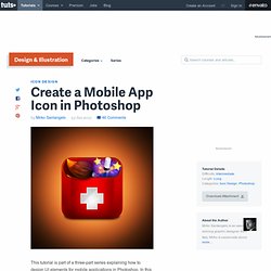
In this part, we will explain how to design an icon for your mobile device's home screen. Let's get started! Tutorial Assets The following assets were used during the production of this tutorial. Wood Texture Step 1 Create a new document. Step 2 With the Rounded Rectangle Tool (U) draw a shape using a red color. Step 3 With the Brush Tool (B) Paint a vivid light red color to create a light spot on the upper right part of the icon. Step 4 Add a black shadow with the Brush Tool. Step 5. Interaction Design Pattern Library - Welie.com. Designing With Grid-Based Approach. Advertisement The main idea behind grid-based designs is a solid visual and structural balance of web-sites you can create with them.
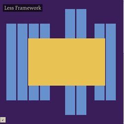
Sophisticated layout structures offer more flexibility and enhance the visual experience of visitors. In fact, users can easier follow the consistency of the page, while developers can update the layout in a well thought-out, consistent way. However, it’s quite hard to find your way through all the theory behind grid systems: it isn’t easy at all. Meteor. Less Framework 4. Every layout in Less Framework is based on a single grid, composed of 68 px columns with 24 px gutters.
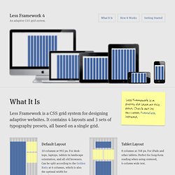
The only measures that change from layout to layout are the amount of columns and the width of the outer margins. Less Framework 4. I called Less Framework "a CSS grid system for designing adaptive websites".
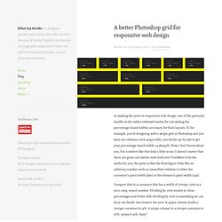
It was basically a fixed-width grid that adapted to a couple of then popular screen widths by shedding some of its columns. It also had matching typographic presets to go with it, built with a modular scale based on the golden ratio. The resources it was originally published with are still available on GitHub. Contrary to how most CSS frameworks work, Less Framework simply provided a set of code comments and visual templates, instead of having predefined classes to control the layout with. A better Photoshop grid for responsive web design. Posted on 20 January 2012 • 90 comments In making the move to responsive web design, one of the potential hurdles is the rather awkward maths for calculating the percentage-based widths necessary for fluid layouts.
If, for example, you’re designing with a 960px grid in Photoshop and you have six columns, each 140px wide, you divide 140 by 960 to get your percentage-based width: 14.583333%. Now, I don’t know about you, but numbers like that look a little scary. It doesn’t matter that there are great calculation tools built into TextMate to do the maths for you; the point is that the final figure looks like an arbitrary number with no immediate relation to either the container’s pixel width (960) or the element’s pixel width (140).
Web Culture: Grid-based Layout Designs. The semantic web has brought on a new generation of Internet technology.

As designers and developers work together to redefine the rules of the web, the number of open-source projects and third-party APIs continues to grow. The opinions of web scholars differ on the use of grid systems. Many argue that setting grid points limits the creativity of designers. Others contend that a grid provides a scientific basis for a design to be perfected. Both sides provide interesting arguments. What Is Gantry? Design patterns. App Icon Template. Free PSDs & Resources for Web Designers by Orman Clark. Free Photoshop browser templates for webdesigners and screendesigners. Design Stencils - Design Pattern Library. Yahoo Design Stencil Kit version 1.0 is available for OmniGraffle, Visio (XML), Adobe Illustrator (PDF and SVG), and Adobe Photoshop (PNG), and covers the following topics: Ad Units Calendars Carousels Charts and Tables UI Controls Form Elements Grids Menus and Buttons Mobile - General Mobile - iPhone Navigation and Pagination OS Elements Placeholder Text Screen Resolutions Tabs Windows and Containers Downloads License This work is licensed under a Creative Commons Attribution 2.5 License.
50 Free UI and Web Design Wireframing Kits, Resources and Source Files. Advertisement Planning and communication are two key elements in the development of any successful website or application. And that is exactly what the wireframing process offers: a quick and simple method to plan the layout and a cost-effective, time-saving tool to easily communicate your ideas to others. A wireframe typically has the basic elements of a Web page: header, footer, sidebar, maybe even some generated content, which gives you, your clients and colleagues a simple visually oriented layout that illustrates what the structure of the website will be by the end of the project and that serves as the foundation for any future alterations.
This article focuses on actual wireframing tools and standalone applications, as well as resources that you’ll need to build your own wireframe: wireframing kits, browser windows, form elements, grids, Mac OS X elements, mobile elements, which you’ll use in any typical graphics editor such as Photoshop or Illustrator. Yahoo! Web Browser Templates. Ultimate Guide to Website Wireframing. Most designers wireframe their designs in one way or another, even if it just involves them making quick sketches on the back of some scratch paper.

Wireframing is an important part of the design process, especially for more complex projects. Wireframes can come in handy when you’re communicating with clients, as it allows them to visualize your ideas more easily than when you just describe them verbally. 20 Steps to Better Wireframing. Possibly the biggest mistake in any development project is failure to plan.
User Profiles. Recent / iOS UI Patterns (beta) Mobile UI Patterns. My Secret for Color Schemes by Erica Schoonmaker. Photoshop.